Up Until Mar 2, 2024
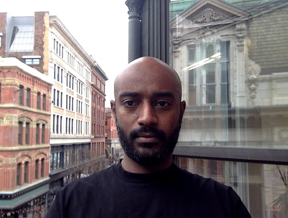
John Caserta
This copy output to PDF from johncaserta.com at 01:44pm on March 2, 2024. This edition was last edited on March 2, 2024.
This book was made with Bindery.js1, a web-to-print framework developed by Evan Brooks.
DomaineSans2 is by Kris Sowesrby.
Burgess3 is by Colophon Type Foundry.
Space Mono4 is by Colophon Type Foundry and distributed free from Google Fonts.
Website and book designed and developed by John Caserta with assistance from Teddy Bradford.
1http://evnbrooks.info/bindery 2https://klim.co.nz/retail-fonts/domaine-sans-text/ 3https://www.colophon-foundry.org/typefaces/burgess/ 4https://fonts.google.com/specimen/Space+Mono
Curriculum Vitae
Summary of work as a designer and educator, based since 2005 in Providence, Rhode Island; info@johncaserta.com
Academic
Leadership
| 2022— | Dean, Division of Architecture + Design | Rhode Island School of Design |
Position Summary & Highlights:
- Four year interim appointment starting July 1, 2022
- Operational oversight of seven academic departments: Architecture, Landscape Architecture, Interior Architecture, Furniture Design, Industrial Design, Graphic Design and Apparel Design; as well as RISD oversight of the Brown/RISD Masters of Design Engineering program
- Assure academic excellence through approval of courses, grants and program materials
- Evaluate faculty dossiers and make recommendations for reappointment, critical review, and promotion
- Co-managed Department of Architecture, including hiring part-time faculty, staff and transitioned department out of receivership
- Modeled co-leadership structure for Department of Industrial Design
- Oversaw divisional implementation of college-wide Social Equity and Inclusion requirement for each undergraduate program
- Worked with deans and Provost on undergraduate credit reduction and faculty teaching reduction with related academic and budget implications
- Participated in fundraising events with Institutional Engagement
- Evaluated capital and operating budget requests
- Participated in the Leadership Development Program (Academic Impressions)
Committees
- Search Committees for Provost; Asst. Dean of Brown/RISD Programs and Program Manager; Chief Marketing Officer
- Financial Optimization Committee
- Budget Finance Committee
- Lifelong learning advisory committee
- Co-Chair, Brown/RISD Programs cross-institutional committee
| 2014–17, 2018–19 | Department Head, Graphic Design | Rhode Island School of Design |
Highlights from 4 years:
- Researched, scripted and implemented new undergraduate core curriculum
- Led faculty rewrite of required three-semester typography sequence
- Supervised three staff members
- Oversaw hiring of five full-time faculty, four term faculty and two staff
- Initiated 1-credit workshop format for College
- Initiated and led renovations to graduate studio workspace
- Initiated and led creation of exhibition/event space for Department
- Commissioned and oversaw schematic designs for student and faculty spaces
- Staffed 110 courses/year; Added 15+ new electives into curriculum
- Oversaw NASAD accreditation process for BFA Program
- Scripted 2018 Academic Program Review response
- Twice oversaw launch of Department website, risd.gd
- Garnered press and fostered substantial social media following
- Led effort to generate faculty departmental decision-making protocols
Faculty Appointments
| 2016– | Rhode Island School of Design, Associate Professor |
| 2012–16 | Rhode Island School of Design, Assistant Professor |
| 2006–12 | Rhode Island School of Design, Critic |
| 2011–12 | University of Connecticut, Adjunct Faculty |
Courses
| Electives | Design & Politics, The Web & Democracy, HTML Output, Call for Proposals, Graduate Open Research |
| Workshops | Web Programming, Digital Bits, Expressive Form with HTML/CSS, Serendipity in the Digital Library, Data-Driven Design |
| Core courses | Graduate Typography 1, Typography 1 & 3, Senior Degree Project, Graduate Studio 1, Graduate Thesis 2, Design Studio 1, 2 & 4, Form & Communication, Visual Systems, Making Meaning, Relational Design |
Committees
| Academic Policies; Brown/RISD Dual Degree Oversight Committee; RISD Research Committee; Search Committees for Dept. of Furniture, Registrar, RISD Design Director and Creative Director |
Education
| 2004 | MFA in Graphic Design, Yale University School of Art |
| 1995 | BA in Journalism (Visual Communication), University of North Carolina at Chapel Hill |
Professional
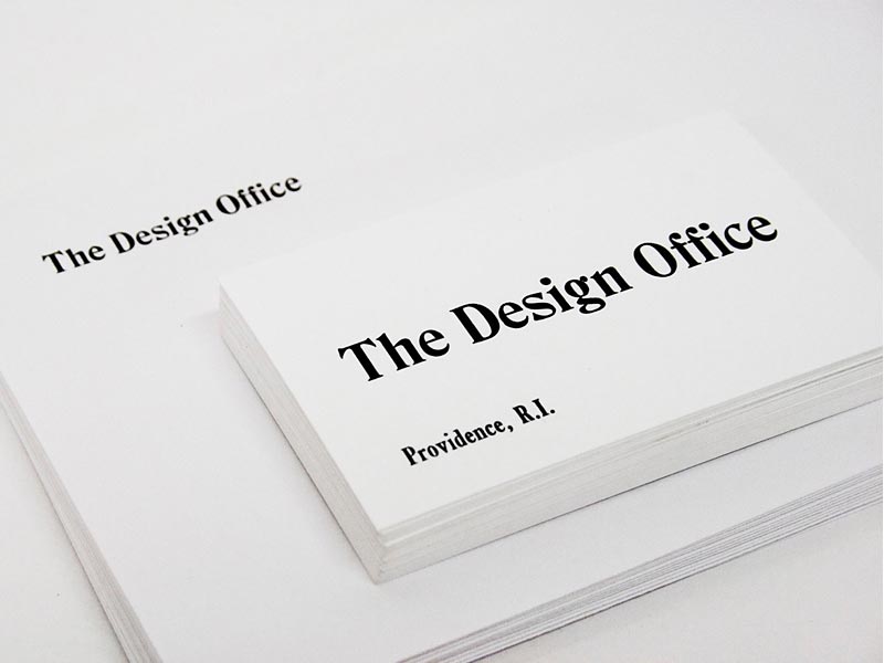
The Design Office
| 2007–21 | Founder and Director of a work and project space for designers in downtown Providence |
- Co-working space housing 70+ independent practitioners since inception
- Shared working library
- Publisher & distributor of projects
- Post-graduate fellowship program
- BIPOC fellowship program
- Open-source software projects
- Public events and workshops
- Support for member projects & critiques
- Archived at thedesignoffice.org
- Closed on July 1, 2021. More
Custom Flow Solutions
| 2009–12 | Partner and Designer for company designing automated charts and graphs for media companies including Thomson Reuters and The New York Times |
John Caserta Design
| 2005–12 | Principal of a solo design practice focusing on information design and websites for new media; Providence, R.I. |
| Clients: Rockefeller Foundation, Antenna International, Creative Time, Max Protetch Gallery, Canary Project, American Battle Monuments Commission, Thomson Reuters, Watson Institute at Brown University, The New York Times, Macromedia/Adobe, Visa USA |
Early career
| 2000–01 | Quokka Sports, Creative Director |
| 1996–99 | Chicago Tribune, Design Director, Interactive News |
| 1995–96 | Atlanta Journal-Constitution, News Graphics Staff |
Bibliography
Authored
| 2021 | Eye on Design “What Leading Designers, Educators, and Writers Want to See in 2021.” January 2021. |
| 2020 | Reimagining Elections.” Video essay for Common Cause R.I. |
| 2018 | Talk Listen Door. with Schumann, Verity, eds. The Design Office |
| 2017 | “Dear Class of 2017,” Design Observer. |
| 2017 | “Question the Classroom.” Design & Culture. Vol 4, #1 |
| 2016 | “Kingdoms of God” with L. Widder. Manifest #2 |
| 2015 | “Which 2016 Candidate Has the Worst Logo?” Politico |
| 2015 | “Thesis Book Project.” Design Observer |
| 2015 | Two browser-based images, Printed Web #3 |
| 2014 | “Documentary Icons.” Icons and essay for The Noun Project |
| 2014 | “The iPhone is the new Model-T.” Essay for AIGA.org |
| 2013 | “Insights per Minute: On Obfuscation,” Design Observer |
| 2012 | “Can one size fit all?” The Noun Project blog |
| 2010 | “Instructions,” and “Khmer Rouge.” The Encyclopedia Project. Vol. 2, F–K |
| 2010 | Ira Rakatansky: As Modern As Tomorrow. with Lynnette Widder, eds. William Stout Publishers |
| 2009 | “It’s a Jungle Out There: What do Meat Labels Mean?” Meatpaper, Issue Six |
| 2007 | “Keys.” Tuesday: An Art Project. Issue 1:2 |
| 2007 | “Pig slaughter, Montenero Val Cocchiara.” Meatpaper, Issue Zero |
| 2004 | “Black and White, then, Color.” Multi-purpose. Winterhouse Editions |
| 1999 | “Consistency vs. Variety.” Design. Vol 71 |
| 1999 | “Online Newspapers.” Design. Vol 70 |
Quoted / Cited
| 2022 | Boston Globe “Graphic design professors unimpressed by R.I. license plate choices” |
| 2022 | Washington Post “A Missouri county’s ‘cluttered’ seal was ridiculed online. It prompted a global search for a replacement.” |
| 2021 | Eye on Design “Many of the Design Community’s Gathering Places Shuttered During the Pandemic. What Did We Lose?” July 2021. |
| 2021 | Noun Project Blog “Creator Spotlight: John Caserta”. June 2021. |
| 2021 | Mold “Graphic Design and Local Food Ecologies”. March 2021. |
| 2021 | Eye on Design “How Polished Branding is Shaping a New Generation of Public Parks”. February 2021. |
| 2020 | Communication Arts “Redesigning Creative Workspaces”. March 2020. |
| 2019 | Fast Company “Are traditional design degrees still relevant?” |
| 2019 | Eye on Design Design Education is Moving Toward Specialization—Can Colleges Keep Up? |
| 2019 | Providence Journal “…plan to replace ‘wave’ license plates” |
| 2019 | Texas Monthly The Texanist Column |
| 2018 | Eye on Design An Idealistic Answer to Faceless, Rent-a-space Co-working |
| 2018 | Christian Science Monitor The story behind the 2018 Winter Olympics emblem |
| 2017 | risd.edu Textiles Revolution Looms Large |
| 2017 | AirBnB Design. “Modern Pictograms for Lottie.” Salih Abdul-Karim |
| 2017 | Noun Project blog. “Icons in Motion”. Modern Pictograms |
| 2017 | Scratching the Surface podcast (No. 36). Interview Jarrett Fuller |
| 2017 | Texas Standard. “New NBA Team Logo Spurs Critiques.” Michael Marks |
| 2016 | Billboard. Graphic Design Experts Weigh In on Pandora’s New Logo” Lyndsey Havens |
| 2016 | Eye on Design. “Design in 2016 Should’ve Been…” Madeleine Morley |
| 2016 | Eye on Design. “How Does RISD Teach Graphic Design…” Katie Chang |
| 2016 | Linux Insider. “Google’s New Fonts Chip Away at Written Language Barriers.” John P. Mello Jr. |
| 2016 | Graphic Magazine. “Notices” and RISD GD part of alumni profile |
| 2016 | “Physical and digital spaces of daily interaction.” Interview with Jonathan Pierini |
| 2016 | Associated Press. “Designers weigh in on Rhode Island’s new logo?” Michelle Smith |
| 2016 | Providence Journal. “Local designers say logo gave wrong message” Mark Patinkin |
| 2015 | ThinkProgress. “Why Did The ‘Peace For Paris’ Image Go Viral?” |
| 2015 | Boston Globe. “A slow climb back for Providence” (The Design Office) |
| 2015 | Through Process. “Episode 25: Go Be Brave: With L. Hitchcock & J. Caserta” |
| 2015 | Quipsologies. “Modern Pictograms” website |
| 2014 | Box it up. “Letterboxes” Basheer Graphic Books, Singapore |
| 2014 | Deskmag. “Coworking in Providence, Rhode Island” Amanda Gray |
| 2014 | Providence Phoenix. “DesignWeekRI” Philip Eil |
| 2014 | Type Object. Barbara Brownie. Included “Spatial Typography” and “Letterboxes” |
| 2014 | Providence Phoenix. “Let’s work together” Philip Eil |
| 2013 | Bauwelt. Journal Issue 20.13 “Ira Rakatansky” review |
| 2012 | Quipsologies. “Locally Made” |
| 2013 | Providence Phoenix. “Locally Made” Philip Eil |
| 2013 | Providence Phoenix. “What to do with the Superman building?” Philip Eil |
| 2013 | Pictos. “Modern Pictograms.” Index Books, Barcelona |
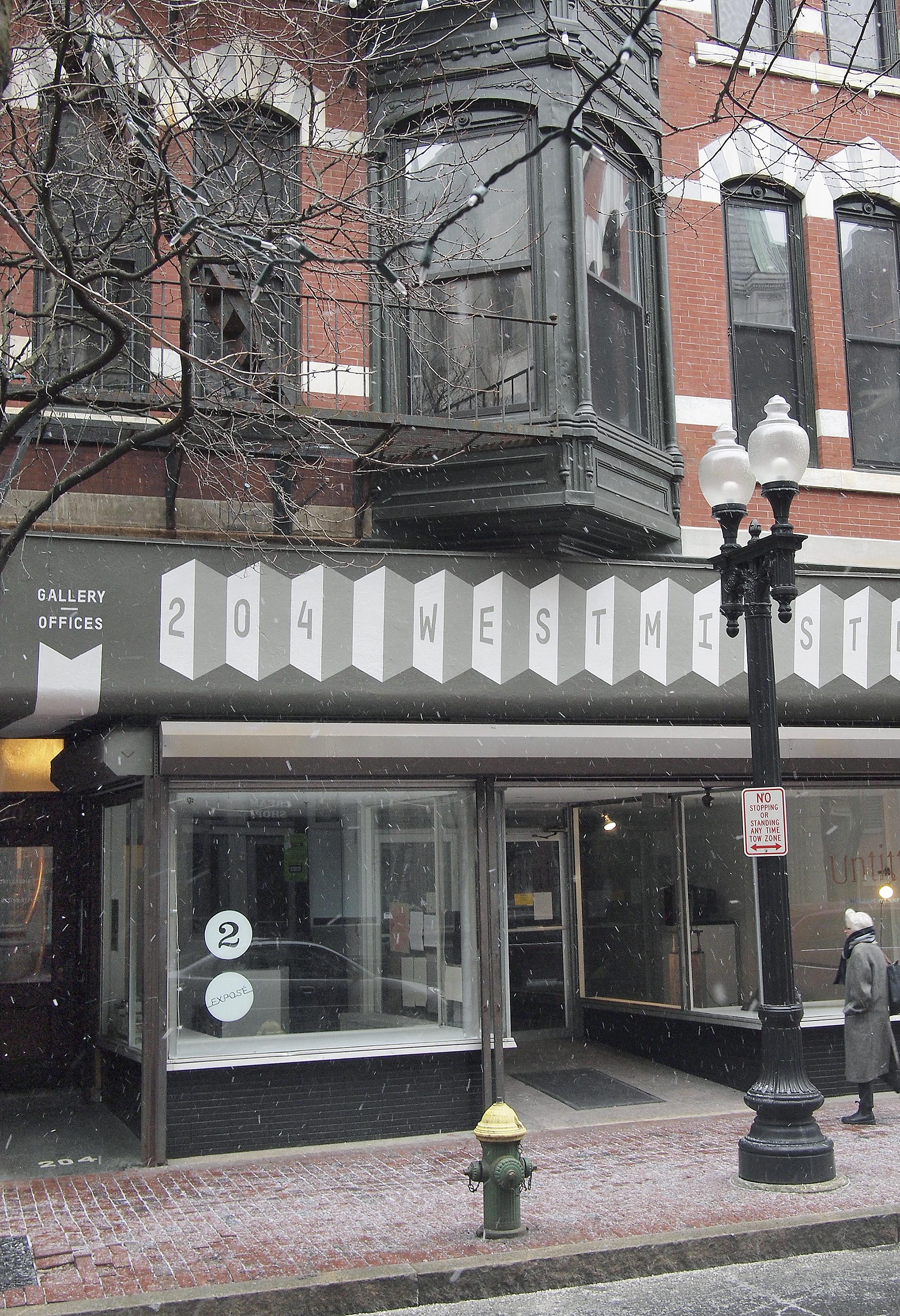
| 2012 | Downtown Providence. “Independent Design at 204 Westminster” |
| 2012 | The Next Web. “This new typeface was made just for interface designers” |
| 2012 | Quipsologies. “Modern Pictograms” |
| 2012 | Apartment Therapy. “The Design Office’s Vintage Modern Workspace” |
| 2012 | Rising in the East: Contemporary New Towns in Asia. Newtown Publishers |
| 2011 | Quipsologies. “Flatfile” |
| 2011 | Architect’s Newspaper. “Life Drawing”. Review of Rakatansky book |
| 2011 | Quipsologies. “Fall Leaves” |
| 2011 | GoLocalProv. “The Design Office: RI’s Creative Collaborative” |
| 2010 | Apartment Therapy. “Rakatansky’s Mid-Century Modern Masterpiece” |
| 2010 | Architecture Research Quarterly. “Books Received” |
| 2010 | Apartment Therapy. “New Book, Ira Rakatansky” |
| 2010 | ReadyMade. “As Modern As Tomorrow” |
| 2010 | 3D Typography. Mark Batty Publisher. “Letterboxes” |
| 2010 | idN Magazine. Eco-Graphics Issue. “Letterboxes” |
| 2010 | Providence Journal. “Still Modern at 90” |
| 2010 | San Francisco Chronicle. “Providential Find” |
| 2009 | Apartment Therapy. “Letterboxes by The Design Office” |
| 2009 | Coudal Partners Blog. “Case Study: John Caserta” |
| 2008 | Providence Business News. “R.I. artist Recognized for Map of WWII invasion” |
| 2008 | Providence Business News. “Design Community is Growing in Ocean State” |
| 2003 | Digit. “Smart Art” |
| 2002 | Macromedia Showcase: Flash Interface Design. Macromedia Press |
| 2002 | eDesign. “XML in Flash.” Profile of work from Quokka Sports |
| 2001 | Communication Arts. “Quokka Sports Network, Nothing But Net” |
| 2001 | Color Harmony for the Web. Rockport Publishers |
| 2000 | The New York Times. “Motion Without Sickness: Web Animation Comes of Age.” |
| 1997 | Redesigning Print for the Web. Hayden Books |
Public Lectures / Panels / Juries
| 2015–21 | Providence Public Library, D.B. Updike Prize, juror |
| 2020 | Common Cause R.I., “Reimagining Elections”, panel |
| 2020 | Youth Arts Movement, Zoom autobiographical lecture |
| 2020 | Design × RI “Design Week”, portfolio reviewer |
| 2019 | XXXI NYC, Web to Print workshop and discussion |
| 2019 | Cooper Hewitt, “Maximizing the platform: Publishing strategies for discoverability and agility” |
| 2018 | RISD NY Alumni Club, “Design & Politics” |
| 2017 | Yale Odds & Ends Book Fair, “Bindery.js: Web to Book” |
| 2017 | DesignWeekRI, “Creating Collaborative Community” lunchtime conversation |
| 2017 | Design × RI Hall of Fame Award, juror |
| 2016 | NCMPR (Comm College Marketing/PR) Dist. 1 Keynote: “Growing in all directions” |
| 2016 | AIGA NY, “Designing the Future of Design Education” panel |
| 2016 | “Make it Yours” lecture with Design Office members, R.I. Commerce Corporation |
| 2015–17 | National Screening Committee, Design, Fulbright-Hays Program, U.S. Dept. of State |
| 2015 | AIGA Biannual Design Conference, “Browser to Book” lecture & panel |
| 2015 | University of Massachusetts at Dartmouth, lecture of recent work |
| 2015 | University of Delaware, Visiting Designers lecture |
| 2015 | RISD, “Artisan-Toolmaker” panel |
| 2015 | California College of the Arts, “Browser as Tool” lecture |
| 2014 | DesignWeekRI, “Organizational Systems” lecture and panel |
| 2014 | RISD Museum, “Critical Encounters: Design & Education” panel. Moderator |
| 2013 | Brown University Library Digital Scholarship Lecture Series, “Data-Driven Design Systems for the Web” |
| 2013 | AIGA Rhode Island, “Making of Modern Pictograms” lecture |
| 2013 | RISD “Intersection of Design and Manufacturing” panel |
| 2013 | RISD Museum, “Pedagogies Past/Present/Future” panel |
| 2013 | Michigan State University, “Visiting Scholars Lecture Series” |
| 2012 | RISD Research Colloquium, “Teaching Digital” lecture |
| 2012 | WordCamp Providence, “Wordpress for Teachers” lecture |
| 2012 | RISD Museum of Art, “Designers on Design” lecture |
| 2012 | Harvard GSD, “GSD Talks: Ira Rakatansky” panel |
| 2011 | A Better World by Design. Moderator, “Graphics that Inspire” panel |
| 2011 | Design Innovation Grant, RI State Council for the Arts. Judge |
| 2011 | Pecha Kucha, Providence. “Office Furniture” |
| 2010 | RISD Alumni Lecture Series with Ira Rakatansky |
| 2010 | Providence Preservation Society. “20th Century Buildings of Providence” panel |
| 2010 | Queens College, CUNY. “Vernacular Architecture of the Alto Molise” |
| 2010 | Pecha Kucha, Providence. “Favorite Photographs of Ira Rakatansky Buildings” |
| 2005 | Center for Documentary Studies at Duke University. “Works in Progress” |
| 2004 | The American Press Institute. Panelist, “Assessing Online Story Design” |
| 2003 | AltPick Awards. The Alternative Pick’s Awards for New Media Design. Judge |
| 2002–04 | SNDies. Society for News Design’s monthly and annual competition. Judge |
| 2001,02 | University of North Carolina at Chapel Hill. Speaker, “Multimedia Bootcamp” |
| 1999 | University of California, Berkeley. Panelist, “Online Journalism” |
| 1998 | The Poynter Institute. Speaker, “Visual Edge” photography conference |
| 1997,98 | Society for News Design’s annual conference. Speaker and panelist |
| 1997 | AIGA Biannual Design Conference. “The Future of News” lecture & panel |
| 1994–97 | NPPA Electronic Photojournalism Workshop |
Academic service / External class visits
| 2023 | Qatar University, author of new BFA in Graphic Design curriculum (in progress) |
| 2023 | Parsons Communication Design, Senior Project critic |
| 2021 | Program reviewer for Drexel Graphic Design BS Program |
| 2020 | Program reviewer for FIT Graphic Design BFA Program |
| 2020 | Parsons Communication Design, Senior Project critic |
| 2017 | Tama Art University, Exchange Program visit and lecture |
| 2017 | N.C. State class lecture & critique, “Graduate Seminar” |
| 2017 | CalArts class lecture & critique, “Design Entrepreneurship” |
| 2017 | Review of book manuscript for Fairchild Books (Cezzar) |
| 2016 | Review of book manuscript for Focal Press/Routledge |
| 2016 | Program Reviewer for Department of Design, Lebanese American University |
| 2015 | Met School Providence, Class visit |
| 2015 | Lecture to RISD Museum Docents, Faculty Biennial |
| 2015 | Univ. of Massachusetts at Dartmouth, Visiting Critic, Senior Degree Project |
| 2015 | Univ. of California at Davis, Class visit |
| 2015 | Program Reviewer for BFA Graphic Design Program, California College of the Arts |
| 2014 | Boston University, Visiting Critic, Junior Reviews |
| 2013 | Brown University Creative Scholars Group, Ian Gonsher adviser |
| 2013 | Boston Architectural College, “Proposals and Presentations” class talk |
| 2013 | RISD Painting Department: Junior Year Reviews, Holly Hughes |
| 2013 | RISD Advanced Architecture Studio: Computing Drawing, Carl Lostritto |
| 2012 | Univ. of Connecticut, Visiting Critic, Senior Degree Project |
| 2012 | Boston University, Visiting Critic, Senior Degree Project |
| 2010,11 | Roger Williams University. Professional Practice Lecture |
| 2009 | Clark University. Presentation of my work |
Grants / Awards / Recognition
| 2018 | AIGA 50 Books, 50 Covers, Talk, Listen, Door w/The Design Office. |
| 2012,14 | RISD Professional Development Fund |
| 2014 | Print Regional Design Annual. Winner, “Locally Made” |
| 2014 | R.I. State Council for the Arts. Winner, “Design Innovation Grant” |
| 2014 | Communication Arts Typography Annual 4. Winner, “Locally Made” |
| 2013 | AIGA Best of New England. Winner, “Poster & Bookmarks” |
| 2012 | Providence Revolving Fund Storefront Grant |
| 2007,11 | RISD Part-time Faculty Association Technical Development Grant |
| 2008 | Graham Foundation for Advanced Studies in the Fine Arts with l. widder & Risd |
| 2008 | Society for News Design Malofiej Awards. Best of Show, “Sector Snapshot” |
| 2004 | AIGA 50 Books/50 covers. Winner. Multi-purpose |
| 2004 | J. William Fulbright Foreign Scholarship Fellowship in the Arts |
| 2004 | Institute of International Education. Miguel Vinciquerra Fellowship for Research |
| 2003 | Knight-Batten Awards for Innovations in Journalism. Winner |
| 2001 | Communication Arts Interactive Design Annual 7. Winner, Information Design |
| 2001 | Flash Film Festival, New York. Winner, technical merit, “NCAA Brackets” |
| 1998 | How Magazine, International Design Annual. Merit award for multimedia |
| 1997 | Editor & Publisher. Best Overall News Site, “Chicago Tribune” |
| 1997 | Editor & Publisher. Best Design, “Lost Mariners” |
| 1997 | Newspaper Association of America. Best Online Newspaper, “Chicago Tribune” |
| 1997 | The Society for News Design. Winner, Page Design |
| 1995 | UNC-Chapel Hill. Stuart Sechriest Award for the top graduate in Visual Journalism |
Group Exhibitions
| 2017 | AIGA Rhode Island, “SeeUs” |
| 2016 | RISD Expose, “Uncommissioned: Recent works from The Design Office” |
| 2015 | Providence Preservation Society. “Most Endangered Properties 20th Anniv.” |
| 2015 | RISD Architecture Gallery. “Six Lines” |
| 2009–18 | RISD Faculty Biennial, RISD Museum |
| 2011,12 | Providence Preservation Society. “Most Endangered Properties” |
| 2012 | Mota Italic Gallery. “New Vintage Digital Vernacular Letters” |
| 2007–11 | AS220, Providence. Photo Lottery Biennial |
| 2007 | Newspace Center for Photography, Portland, OR. “Among Us and Curious” |
| 2007 | Missy McLamb Gallery, Pittsboro, NC. “Progeny” |
| 2005 | Town Square Meeting Hall, Montenero, Italy. “Untitled Art Show” |
| 2004 | S.F. Center for the Book. “Reading the Future: Experimental Books from Yale” |
| 2004 | “Multi-purpose,” Graphic Design MFA Exhibit, New Haven, CT |
Affiliations
| 2020– | Board of Directors, DownCity Design (Providence) |
| 2016–19 | Member of Common Field |
| 2015–19 | AIGA Rhode Island Advisory Board |
| 2012– | Member of AIGA |
| Citizen of Italy & USA |

An iPhoto Tour
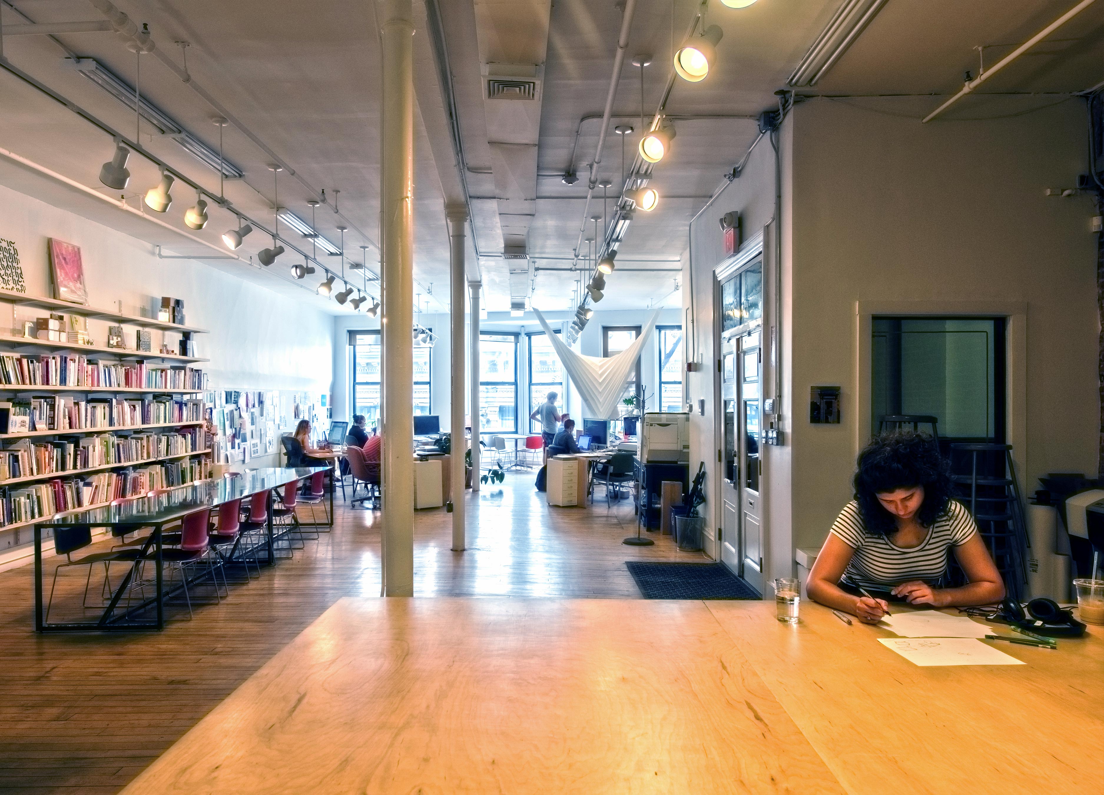
Collecting work for this book has taken me back through a decade of documentation. The most informative tool in this process has been my iPhone photo archive, totaling 45,212 images and spanning ten years. The pictures show the bulk of my RISD career (which started in wintersession 2006), the birth of both of my children (2009 and 2014), the entirety of my married life (2007), and the entirety of The Design Office (2007) — my professional footprint. Life and work have had no boundaries — in iPhoto but also in real life, myLife. Observational snapshots are interspersed with pictures from the classroom. Food collides with politics. Consumption and production are at times indistinguishable.
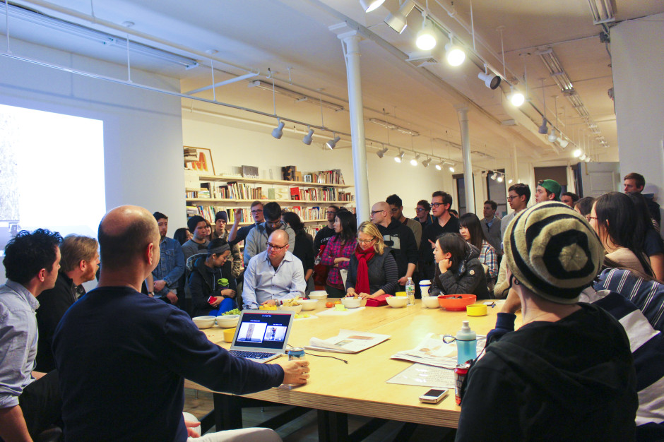
The stream of disparate images is a metaphor of faculty life itself. I place fewer and fewer hard divisions between classroom teaching and professional practice, between Department and College, between analog and digital, between self and the collective, between past and present. The Design Office, a workspace for designers that I founded ten years ago this month, surfaces regularly in this mix. It is where I generated software tools to aid the classroom, came up with course ideas, and tested many of the organizational and collaborative methods that I put into play at RISD as Head of the Graphic Design Department. The Office has hosted events and workshops that have mixed students, alumni, professionals, and local designers.

Two projects, Web to Print and HTML Patterns, are ongoing lines of inquiry that exemplify how my work weaves in and out of academic and professional spaces. Web to Print began at The Design Office in 2013, was worked into a commission for a RISD Museum exhibition that summer, led to a spring 2014 RISD course titled HTML Output, was published later that year as a widely distributed print-on-demand book, evolved into robust open-source software (which outputs this website to a book) and has inspired a course using these principles at CCA in San Francisco. Experiments lead to courses that lead to projects that lead to lectures that lead to published artifacts that lead to alumni who create more courses, and so on.
HTML Patterns began in the classroom in 2012. As a recently hired Assistant Professor, I was looking for a way to teach design students HTML and CSS. I settled on drawing as the way to do it. Coding patterns was also part of my spring 2014 HTML Output course. I invited RISD Textiles Professor Brooks Hagan to the class so we could discuss systems of patterning with the Jacquard Loom. This conversation continued into a wintersession course he was teaching with Joy Ko. The patterns were included in a RISD exhibition and symposium on tools. Brooks commissioned a new pattern from me for his Weft, now available online.

These projects are indicative of how I like to operate. Research interests lead to speculative/initial forms that I then bring into the academic environment to pursue. This involves students, faculty, and fosters critical development. Collaborators join in as the projects instantiate themselves. The work develops locally, and in the College, but it impacts the GD profession at large. As evidenced in my curriculum vitae, the web to print work has been presented at conferences, is cited by others and has been distributed by Printed Matter, William Stout Books and European retailers. I was asked by the peer-reviewed journal Design & Culture to submit an article about this method of research. It was published in January of 2017 with the title “Question the Classroom.”

I was Department Head in Graphic Design at RISD for three calendar years starting in January of 2014. In this period, I conceived and led three major initiatives: a collaborative rescripting of the undergraduate curriculum, a redesign of spaces to promote community (graduate studio, Type Shop, Department Commons/Admin Offices, faculty hub, student co-working), and finally, the hiring and welcoming of three new faculty.
The changes were precipitated in large part to encourage human connection, sharing and experimentation — starting from the stellar reputation that my colleagues had built. Our curriculum redesign was less about new content and more about new systems. The new core studio course requires a weekly pre-class meeting by the five instructors. The teachers discuss content details and pedagogy, sharing strategies for critique, assignment mechanics and more. This has had many benefits. We benefit from our colleagues’ advice and editing because they will need to help their students. And we are much more agile in the types of faculty who can teach and how we welcome them to our culture. And the core curriculum itself is based upon faculty research ideas offered as discrete units of study.


I am institutionally minded. In a highly disciplinary College this isn’t always easy. But I believe that open and visible processes are necessary before action is taken — and action is an important part of the creative process. When I was appointed Department Head, I looked at the budget and saw unspent money allocated to remove a wall on the 5th floor of the Mason Building, where the Graphic Design and Textiles graduate programs were located. This wall closed off the Graphic Design Graduate studio and classroom from the elevator area and the bathrooms. Flat file cabinets and other storage was in the hall. The Textiles Graduate studio also shared that floor, but was behind their own door. There was a couch near the elevator, and the students shared the bathrooms. It was clear that there was more to this project than simply taking a wall down. There were security issues, shared space with Textiles, noise issues and the unknown layout of the studio once the wall were to be demolished — assuming that the whole wall would come down. In short, I had to back up and figure out what was needed, and if it made sense to do it at all.
I had an initial round of one-on-one conversations with the Head of Textiles (Brooks Hagan), the Dean of Fine Arts (Anais Missakian, who used to be the Head of Textiles), Nancy Skolos (former GD Dept. Head and Dean), GD GPD Bethany Johns and a team from facilities. I was able to build up a list of concerns, desires, and a general consensus to pursue more information. I then asked Interior Architecture Professor Peter Yeadon to join the team as a paid consultant to create a schematic design for the new space. Involving faculty on a design project itself was unusual, oddly, and took some convincing. Peter taught upstairs, worked in a co-working space in Brooklyn and is a faculty member who respects the learning environment. He was an objective, but knowledgeable, guide to understand how space could be reconfigured to benefit everyone.
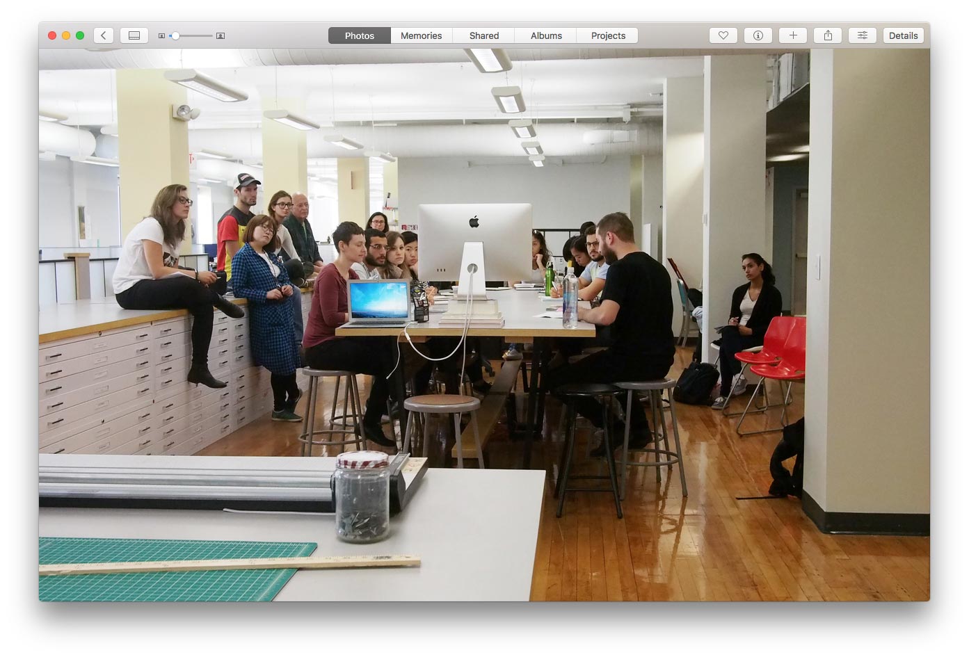
Peter’s work went through a few revisions. All the while Brooks was involved, able to show the work to all involved via 3D models. Peter’s designs generated excitement and something concrete to discuss. We ended up opening up the space and creating communal work and production tables for Graphic Design. We also moved the GD students to a pre-pay printing system (students pay a fee at the beginning of the semester) to encourage collaborative work. A proper production space was made to encourage physical making. The pin-up walls were freed up, no desks were lost and Textiles installed a proper sink closer to their space. Removing a wall created more conversation and more collisions — which isn’t always friction free. But without shared things, there is little interaction. The space is light years better for Graphic Design, but is also better for Textiles. Progress for some should be progress for all.
As Department Head, I worked closely with all areas of the College: Admissions, Media, the Registrar, Facilities, Careers, Global, other academic departments and more. I also served on the Brown-RISD Dual Degree Committee, a search committee for the Registrar and a search committee for Design Director of RISD Media. This past June, I travelled to Japan with Gwen Farrelly to meet with the faculty and students at Tama Art University.

I have shown that I work well with others in the College to solve problems with everyone’s interest in mind. Former RISD Industrial Design Head Soojung Ham and I organized faculty trades to offer courses to each other’s Departments. Liliane Wong and I co-sponsored a course on exhibit design with one of our adjuncts. I worked with other heads and Academic Policies to set up 1-credit workshops. RISD Printmaking Head Henry Ferreira and I worked through logistics around sharing 48 Waterman. The studio went from a Graphic Design-only shop to a shared studio managed by Graphic Design. These discussions involved our faculty, technicians, the Registrar, Continuing Education and the deans. This was done to the disappointment of some of the GD faculty, but with great benefit to the rest of the RISD community.

My interest in the commons, the public and sharing more generally has grown since being Department Head at RISD and running The Design Office for ten years. I have become more active politically. My assignments now often include civic components. For example, the sophomores are designing four flags to be sited on the Providence River. My juniors are making sense of Federal Government labor research. The same group is animating poems to be sited inside of city busses. My current elective The Web & Democracy aims to use the web to manifest the ideals of the democracy amidst the onslaught of privatization. Can we correct the wrongs that have gotten us here? Taking my attention away from the private sector and into the public has created new avenues for my teaching and practice. This past summer I designed the campaign materials for Nirva LaFortune’s City Council campaign. Images of her campaign materials mix with early summer purple flowers. Work within the College bleeds to the outside, then back again. Nirva and Councilwoman Meghan Kallman will visit the Web & Democracy class this semester.

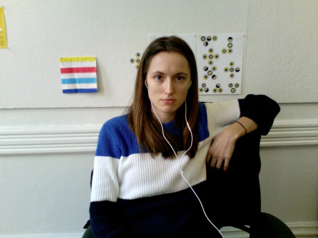
My journey through iPhoto led to many surprises, but maybe none more touching (professionally) than seeing a group portrait I took on the last day of class in my first semester on the full-time faculty. It is a testament not only to the power of photography, but to the intensity of classroom teaching. We spend more time with students than with anyone else at the College. The importance of this is not lost on me the more that I do it. I value my relationships with students and over the last ten years have seen students become peers. I have written an updated teaching philosophy that describes how I approach the classroom specifically.
The blurring of personal, academic and professional is what has made my work at RISD and life in Providence so productive and fulfilling. I am fortunate to have had this little camera in my pocket for these last ten years to document the journey. It has been useful for me in collecting materials for this book, but I also hope the work itself makes an impact.
Philosophy of Teaching Design
Design evolves at the speed of technological invention. With each twist and turn in how design is made, we get to make new types of work. This is a boon for the design professor. Institutes of higher learning are rare forums in which to try what is new to gain insight on what we already know. We do not need to choose between experimenting with new inventions and honoring tradition. As a teacher, I teach history and tradition through engaging with the design problems of the present.
The tools we use have always shaped the work. One could argue our disciplines formed around a certain expertise and commitment to certain tools. The communities and forms that developed from those tools become distinct and worth educating others in. Graphic Design is concerned with messaging, and its core tools for centuries have been typography and printing. The designer is there in the middle to form the message. I have been working with the Web (embedded in this is the computer and the network and the browser) with the belief that it changes greatly how we make design, but not why we make design.
When I was hired, then Graphic Design Department Head Nancy Skolos asked me to teach students how to program websites. In thinking of an approach, I looked to the printing experiments of Dieter Roth, Paul Elliman and Karel Martens. What I valued in those artists was the presence of a loose more playful way of making systematic form. Their content derived from observation and collection, creating plates based on their found environment. A desire to bring their process forward led to a series of browser-based drawing assignments that reinforced traditions in impression-based printing. The humanist values of close looking and play (and all that it leads to) can be taught in many ways; so why not teach it using the tools of today.
I graduated college in 1995, having witnessed the birth of the World Wide Web. Every five years the web (and the Internet more generally) evolves at Moore’s Law. The only way to learn a medium that changes at this rate is to tinker with it. Former Xerox Parc Chief Scientist John Seely Brown has written quite a bit on learning in a world of constant change. He writes, “you are constantly constructing new information on the fly by experimenting with things.” This approach is not so different than the cross-disciplinary pedagogy of the Bauhaus or Black Mountain College.
“Our central consistent effort is to teach method, not content; to emphasize process, to invite the student to the realization that the way of handling facts and himself amid the facts is more important than the facts themselves. For facts change…” —Black Mountain College Prospectus
I have used the classroom to teach what I want to learn, not just what I already know. In 2014, I taught a course called HTML Output, where the students and I explored the Web browser as a general purpose design tool. Learning alongside of students is exhilarating, if not humbling. By teaching what I do not know, I am able to model the process in which I teach myself.
This fall, I have given sophomores and first-year graduate students an assignment to design flags to be flown on the Providence River, sited on public property outside the Design Center. I plan to make a website of the results and share them with the city (and the public). The city is open to flying the flags as an act of civic pride. The assignment is an opportunity to pursue some of my own ideas on public space and symbolism alongside the students. The students also need to design and write with an external audience in mind — one that speaks to the public audience.
Designers must learn to become comfortable with the anxiety of the unknown. Rather than circumvent this anxiety by overprescribing a strict process, a good course of study should help to break down assignments into an essential question with a set of constraints held together by learning objectives. When questions are well formed and given proper context, students will develop meaningful responses. Students should form their own pathways, design processes, and end works alongside each other. Their solutions should vary from each other. This difference should be celebrated and discussed by the class.
I am accustomed to five hour studio courses that run once-a-week. Over ten years, I’ve settled upon the following ways to make use of each class:
Discussion: Talk about the work made for class. This can happen in writing (simultaneously in a Google Doc or Skype or as a solo act), in small groups, individually with instructor or TA, or with the whole class. I try to avoid group critiques as they keep most students idle. Students should be a part of the discussion; the teacher need not comment on everyone’s work, but it’s best if everyone has an opportunity to give and receive feedback.
Show and Tell: Show off new influences. Bring in something that expands the student’s understanding. Inspire them. Ideally the material relates to the course or the unit, but maybe it’s a new book or project that just came out. I make ample use of guests and resources from the College and city.
Activity: Students should do something in every class. They should be active by playing with a new tool, using a resource on or off campus, getting the homework started, etc. Anything that gets the class making work is a good thing.
Amidst a society seemingly moving and innovating at light speed, what interests me are the elements of the human condition that somehow remain the same. While it is necessary to embrace new technologies in order to continue evolving — as a society and within our field — I see these constant shifts as opportunities to reframe longstanding universal lessons of effective pedagogy and art making: the value of careful observation, iteration, and critique; the need for human contact; and dialog between both peers and generations. The forms that result from these principles are what keep me engaged as a maker and a teacher.
Modern Pictograms
A set of graphic symbols licensed as a single font or as single icons. Started in 2011, the evolving set has also bred an assortment of ancillary projects with other designers.
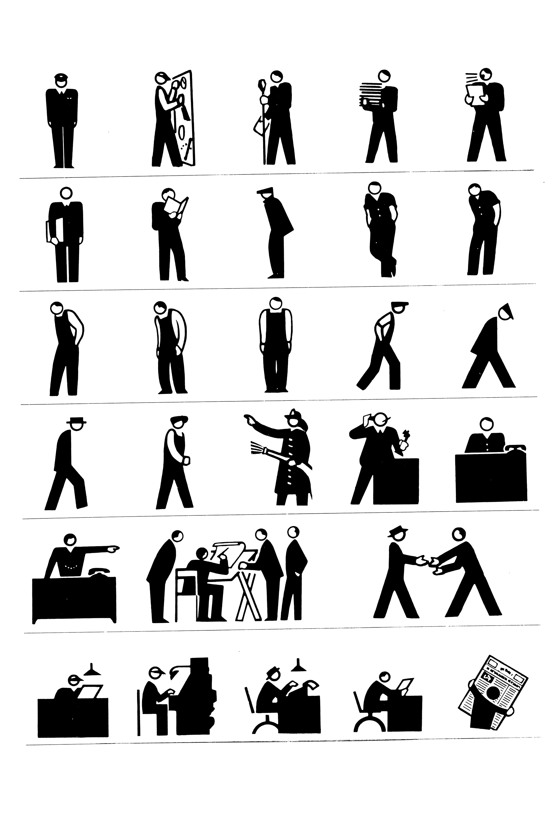
Modern Pictograms grew from the need to have crisp and consistent icons on the Web. In 2010 I was working with Andrew LeClair on Flatfile, a Wordpress theme for artists. We wanted to let artists customize the color of the theme pretty easily; including the icons to email the artist, to post to Twitter and Facebook. Embedding fonts was supported in newer browsers, so having a small set of icons in a font solved our color customization problem. Most icons at the time were pixelated images and rarely worked well together (see figure 1).

There was only one icon font available at that time: Pictos. The price for licensing it was too high, so I decided to draw my own. What started as a few icons for the Flatfile theme (released in 2011), evolved into a free font of 80 icons — the first free interface icon font available on the Web.
The font was distributed by various services and embedded into tools. Encouraged by its popularity, I added another 200 icons and licensed the updated version for $25 in 2013. I continue to add drawings to the set, driven less by the needs of interfaces and more by the symbolic meanings that can be read into everyday objects.
Given advances in web browsers, I now draw icons in layers for easy animation and color use.
Drawings
The initial version 1 set was drawn to work small, down to 18 pixels for the Flatfile theme. There were no retina screens, either. Some of the icons worked fine larger, but many were simply too crude. When I began to add new icons to the set, I revisited some of the originals. The driving principle for the drawings was – and continues to be — low contrast weight like a body font but with details like a display font. Details fall away at smaller sizes, but come through at larger ones. A good example of this is the lock icon, with its tapered dashes, which bring out the shape of the knob when seen on retina screens or enlarged.
Version 1 of the font is still available on FontSquirrel. It has been downloaded more than 290,000 times. The Design Office hosted a project page with a link to the free download.


Version 2 website
A single serve website was launched in conjunction with the release of version 2 of the font. There have been three sites since the 2013 launch, each with its own mission. The version 2 site was there to showcase the set and sell fonts. One way I described the font was that it is the Helvetica of icon fonts — usable in most situations and fairly neutral.
The website design was meant to play up a Modernist aesthetic while not falling into the visual troupes of Modernism. The site was geared toward encouraging web developers and designers to buy the font and specimen. Site developed with Greg Nemes.

Version 3 website
By 2015, the icon market became saturated – many fonts from major companies and frameworks were available for free. Ruben Rodriguez of The Design Office and I worked up a new site that emphasized the breadth of meanings of the icons. The website switched from a marketing site into a tool that highlighted a searchable tagging system, so icons could be found easily through typing. Users could buy single icons (as SVGs) or the font. Users could suggest icons right from the site as well. The site was a specimen, encouraging existing buyers to return to find new meanings in the set.

Version 4 website
In 2017, the Modern Pictograms website was updated to show off some of the collaborative projects that have resulted from the icons. AirBnB Design has animated a bunch of icons and made their files available. The website aims to show off the craftsmanship of the icons and their potential uses. The drawings have become more symbolic in nature; suitable for presentations, signage or most any use online or off. See the website.

Resulting projects
Version 2 specimen
Designed with Micah Barrett, the offset printed specimen folds up into an iPad sized booklet. Given away at lectures and sold online, the specimen aimed to get the icons offscreen and into high resolution and physical space.


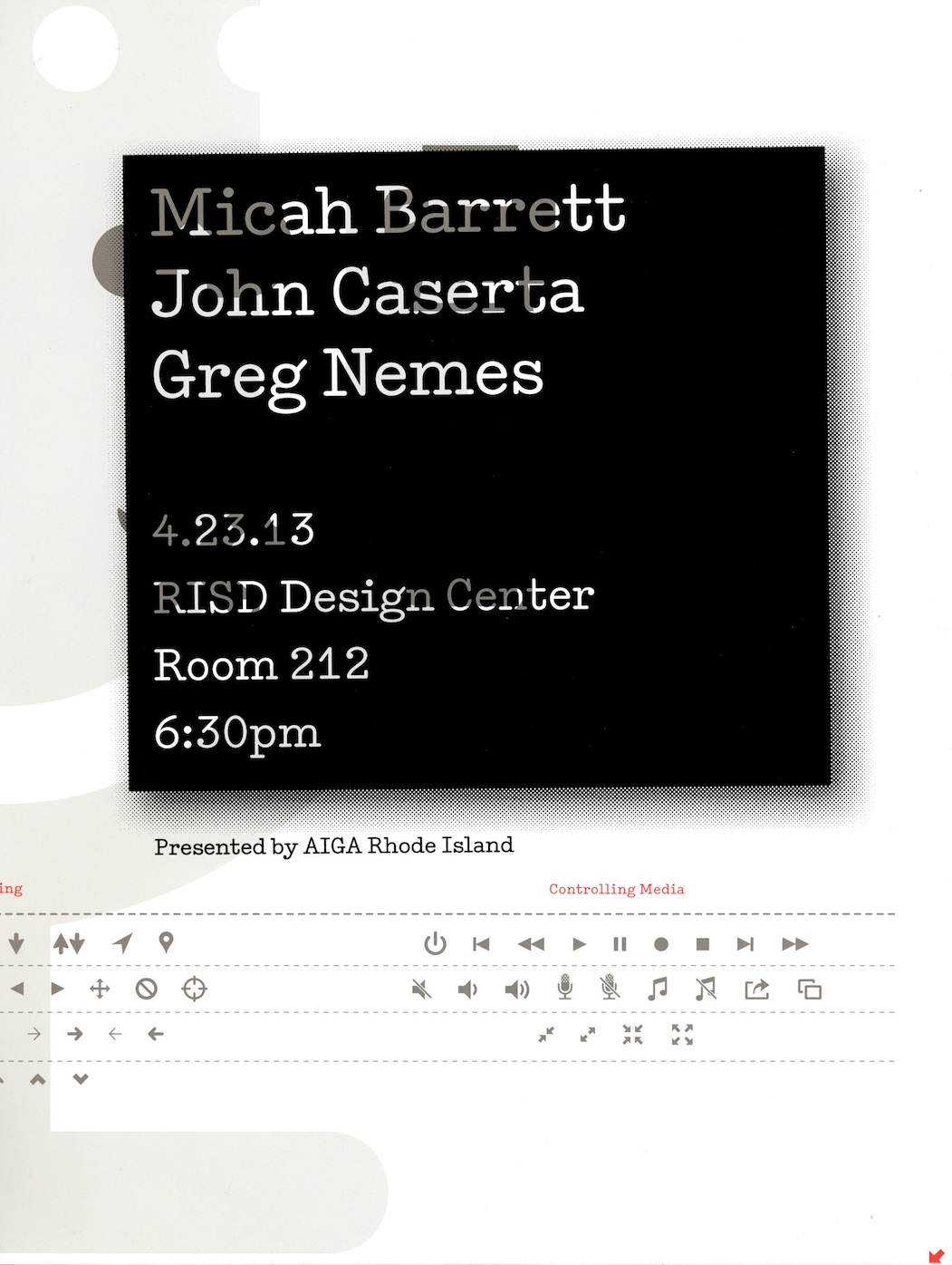
Lecture and poster
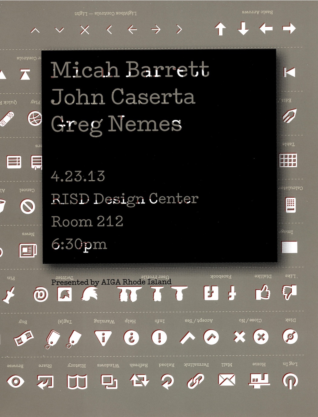
Micah and I made flyers from the press sheets to promote our talk for AIGA RI.


Airbnb animations
The Noun Project and Airbnb Design collaborated to bring Modern Pictograms into motion. Airbnb has developed an open-source animation tool for designers called Lottie. Read about the process of animating the icons for Lottie on Airbnb design’s blog.

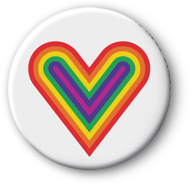
AIGA RI Button
Created to support LGBTQ rights for Valentine’s Day, the heart symbol was put on buttons and made into a print for AIGA Rhode Island’s See Us exhibition.
Snowglobe Risograph print
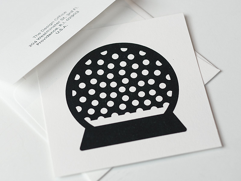
Printed with Benjamin Shaykin at The Design Office, the snowglobe print marked both 2017 and the latest addition to the set. Risographs create a misty surface, a printing process appropriate to render the dreamy snowglobe. Buy the print
Lasercut office supplies
I have lasercut some of the pictograms to see how they might operate back in real space. Certain ones have a pseudo-functional element to them. The paperclip is usable if it’s rotated. The key opens no doors, but works on a keyring. The scissors could be used to stab someone, but not to cut anything. The unlock icon cannot lock a locker, but it can claim a locker – becoming a symbol of trust, the opposite of what it was intended to do.

Candy Cane Risograph prints
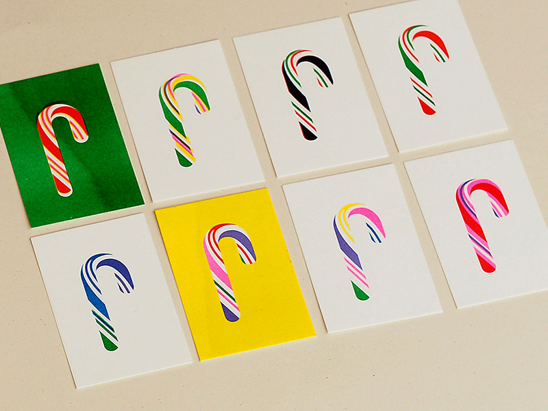
These eight six-color prints marked the release of version 2.78 in the winter of 2018. This release promoted support for layered SVGs, making it possible to easily target parts of the normally red candy cane.
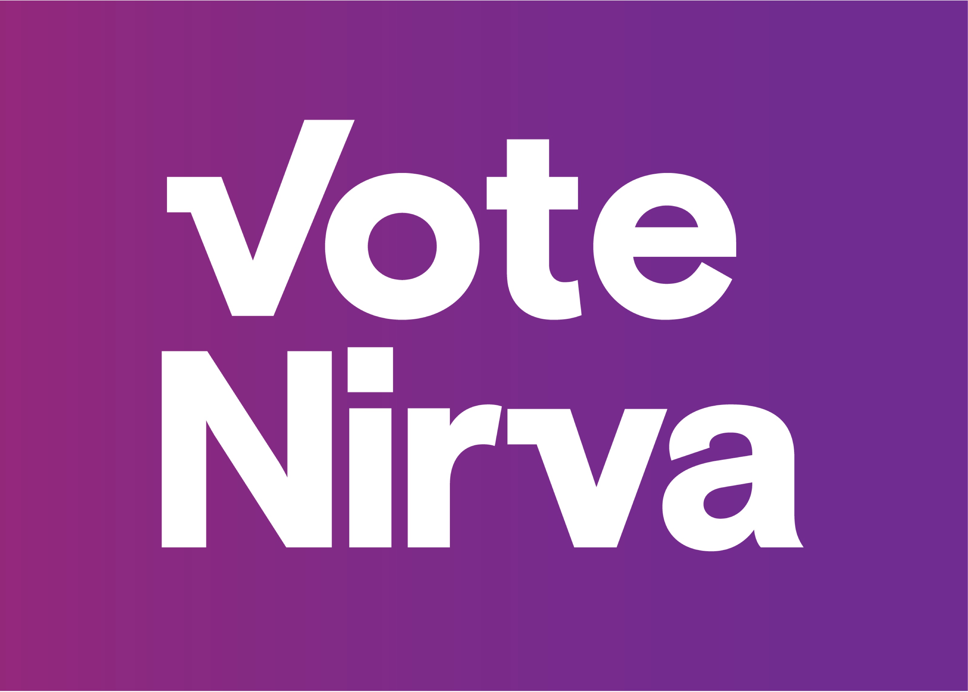
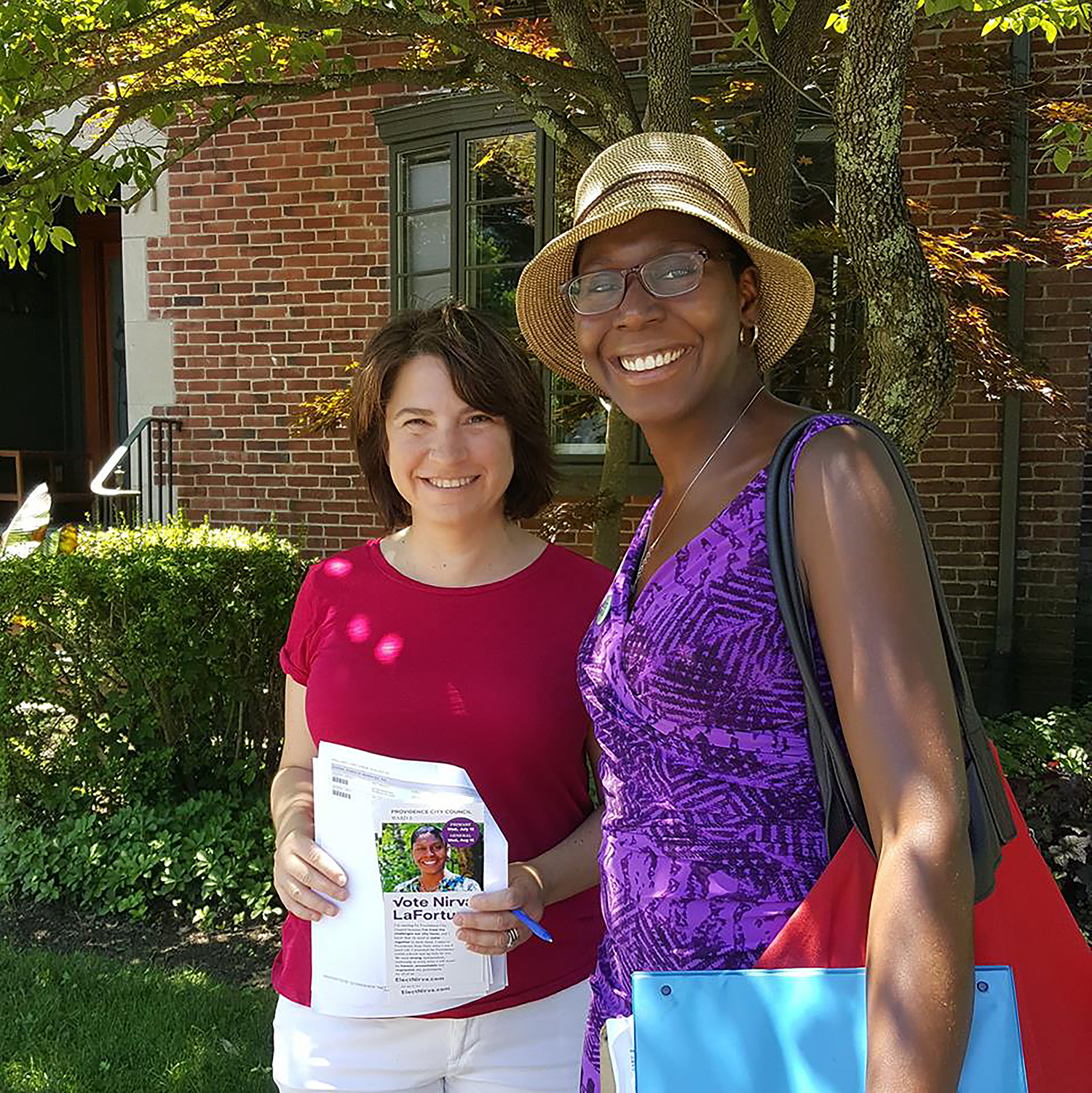
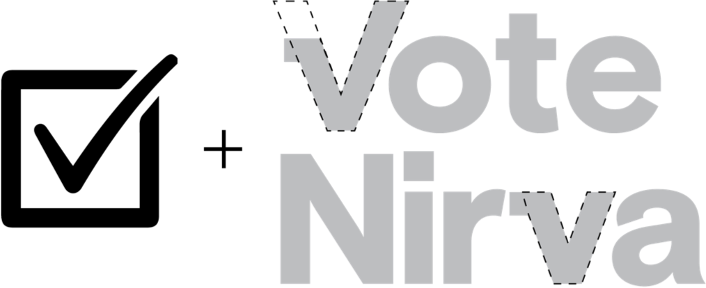
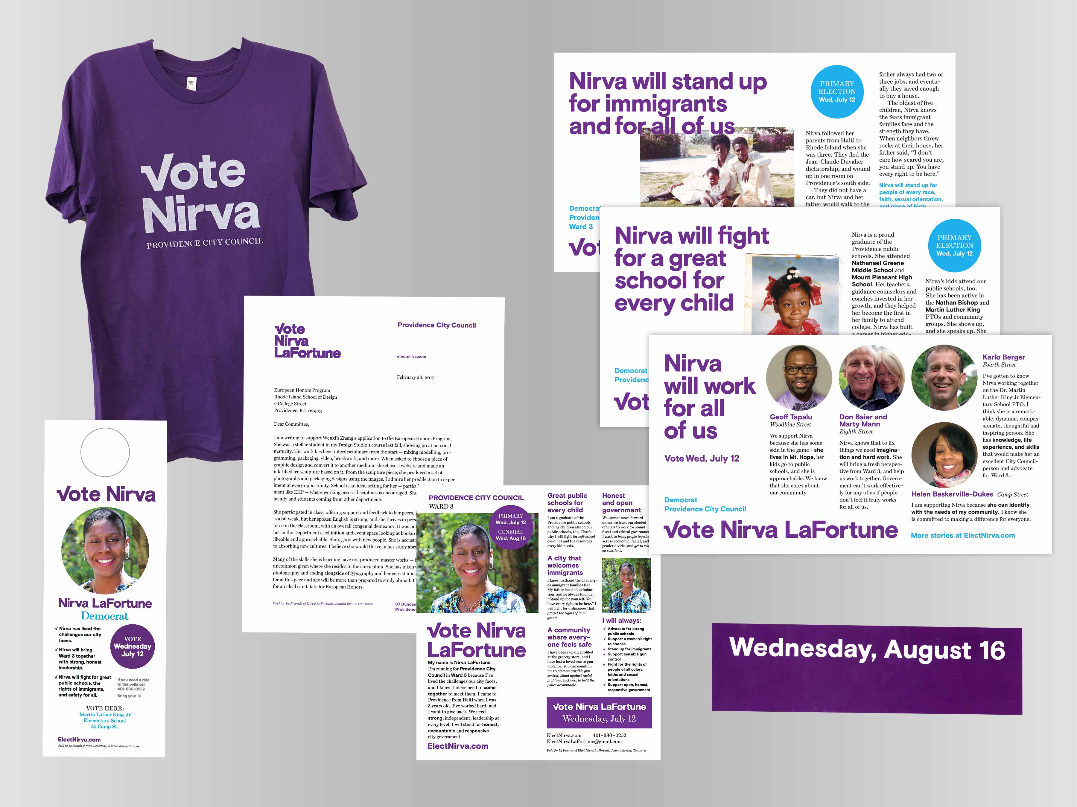
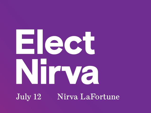
Vote Nirva LaFortune
Campaign identity for Democrat Nirva LaFortune, who ran for a seat on the Providence City Council in a special summer 2017 election. She handily won both the primary and the general election.
In the spring of 2017, Providence Ward 3 Councilman Kevin Jackson was ousted in a recall election. Providence native Nirva LaFortune stepped up and ran on the platform that she would bring the various factions of the Mt. Hope and Summit neighborhoods together. Having a female candidate (and person of color) run so quickly after Hillary Clinton’s defeat energized many of us. I also knew Nirva, and was convinced she would represent the people well. I jumped in to help, working with Campaign Manager Kath Connolly to create the identity and templates that could be used to target the neighborhood. She won both the primary and the general election. Did the graphic design contribute? Maybe.
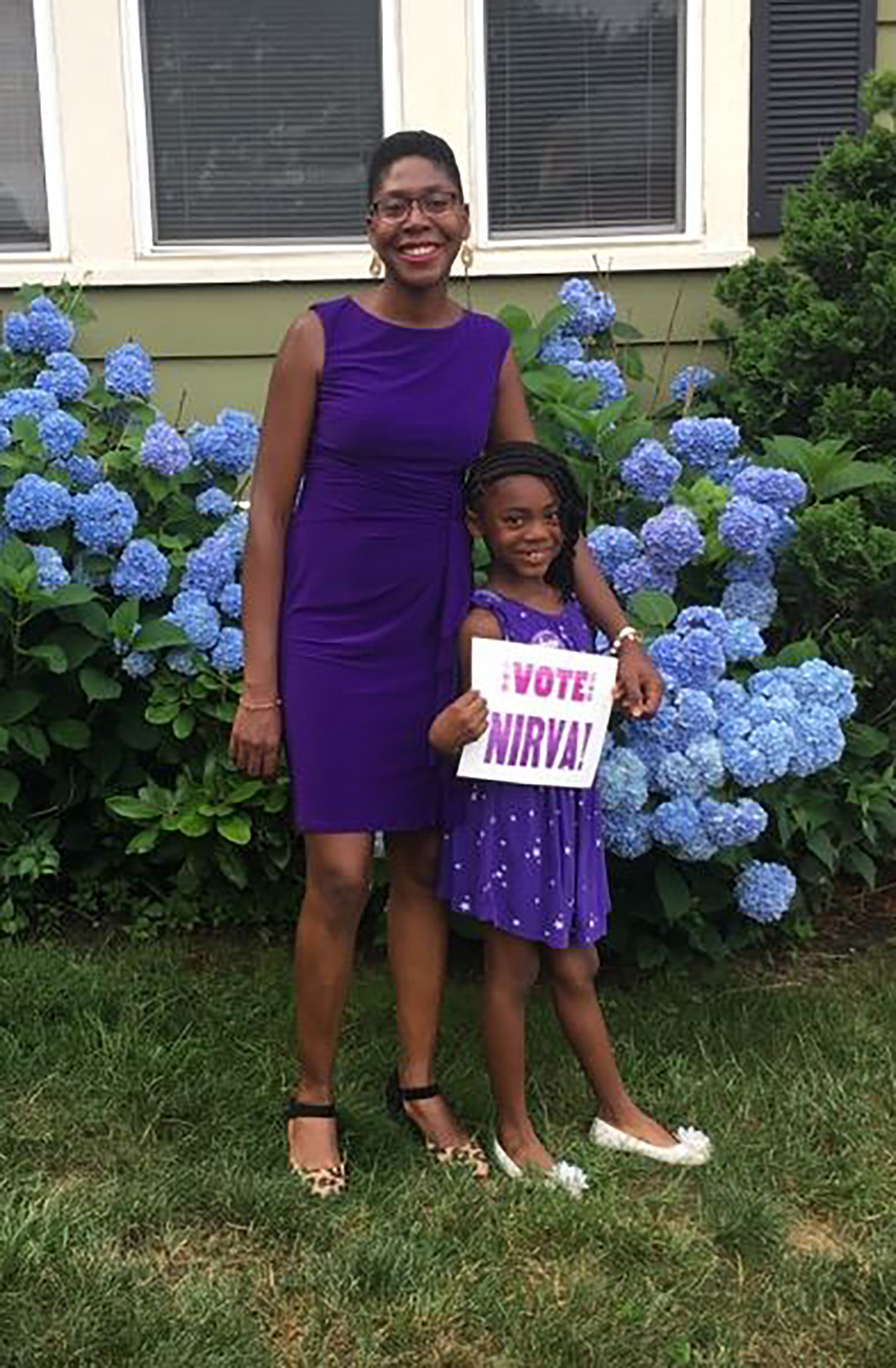
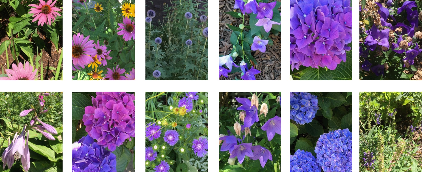
Purple
Nirva loves purple. It is a part of her everyday look. More than the typography, the color purple was identifiable with Nirva. People dressed in purple to support her, and even made their own signs in purple.


Typography & Mark
I will fight was a slogan she used often. It was important to have the typography be strong. The typeface is Basis Grotesque, a font I licensed previously for The Design Office. After choosing it for its punchy clean modernity, I noticed it had a checkmark in it. I adapted the mark so it would work as a capital “V” and for the lowercase “v” in Nirva. Given the purple, I didn’t mind getting a bit playful or overtly political with the checkmark.

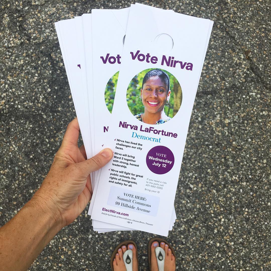
Ephemera
A lot of paper gets printed in a local election. Door hangers, mailers, letters, and more. I was not creating all of this, but would set up templates for key materials. The font and the purple were what could hold it together. We did not produce t-shirts, but we made one to see what it would look like.
Animated / Social
Animated slogans and the wordmark on purple were used on Facebook and Twitter. Facebook sharing was used quite often, particularly in the days before voting. I generated animated and static typographic treatments and put them in a folder for campaign staff to use when they wished.


Web to Print
A series of projects that use the Web browser as a general purpose design tool; websites that output to flyers, posters and books.
The web browser has evolved quite a bit since it appeared in 1991. First there was text-only, then images, then table layout, then CSS, then javascript, then font embedding, and now almost anything is possible. I have been designing websites since the mid-1990s and they used to be just that, websites. Occasionally there were print and web deliverables for a project running in parallel.
In 2012 a couple things happened: The Design Office moved to a new space that would allow events and public programming. And the Web was becoming a more important way to distribute information than paper (we were passing the tipping point). Immediately after opening the new space, we started hosting events. We would create posters to promote them. But the poster became a fetish/speciality object (identity for event) more than a useful piece of promotion. The core visual character of the poster would make its way online as an image (with a “like on Facebook” button below it).
When we began to run events about once-a-month, a custom poster was too much and so I looked to our Website to communicate the details of the event (with some flair), but also to see if a printed flyer could be printed from the site.
This body of work comes out of a desire to see more avant garde websites: ones that have the voice and sophistication of a printed poster, but can be accessed on the computer at a URL. By producing a paper bi-product of the browser version, it would make the screen version better – holding it to the standards we’ve come to expect from printed ephemera.
And fundamentally, I do not want to give up on the physical environment. Coffee shops should have posters, flyers and the like. The majority of posters in coffee shops are made by printmakers and illustrators – as designers have moved their work onto the screen. A printed website is an interesting offering to that culture, I think. And the piece of paper tends to outlive the web counterpart. The original DO web template is no longer, web font providers for other projects have gone under, a tool that embeds Google Sheets data on websites is no longer supported. In short, at least half of these projects can no longer be browsed.
I continue to investigate this browser as a general purpose design tool. Below are projects that fit within this investigate — some done collaboratively.
Design Office events
This format was used from 2013 until 2015 to promote events at The Design Office. It used Wordpress to edit the content and had custom styles for printing to paper. The flyers varied in composition depending on the content. The screen versions of the posters would feature animated gifs or variations on the same imagery. Although the webpages output to flyers, the website itself changed depending on screen size. Some examples of event layouts are below.


DO Summer Fellowship - 2014
Single page website created with Catherine Schmidt to promote The Design Office’s summer fellowship program – which was in its first year. The URL was sent to heads of MFA programs around the country with the note: print this webpage to a tabloid piece of paper. A scrolling feature distorted the sun icon into abstract shapes.


HTML Output
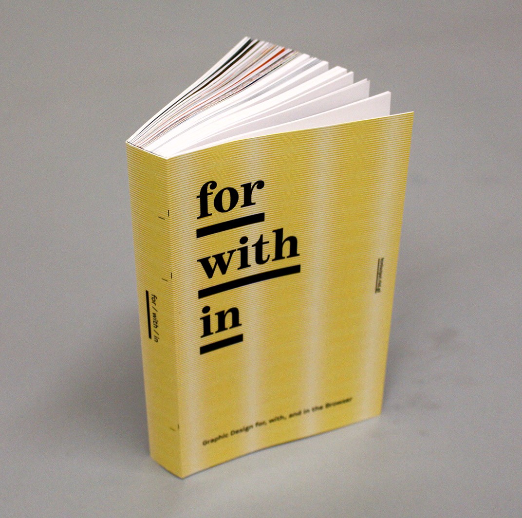
for/with/in is a website and book that collects projects, interviews and code produced by the students and myself within a three-month course at RISD. The course and final project investigates the web browser as a general purpose design tool. The website outputs to a book. Book printed by IngramSpark and was available from Draw Down Books, Printed Matter and William Stout Books.


DO Summer Fellowship - 2015
Single page website for The Design Office 2015 summer fellowship. Designed to print to a letter-sized flyer for posting. The main typography was a css animation using a color flare. Depending on when the flyer was printed, the color was different.


Spring 2016 Electives
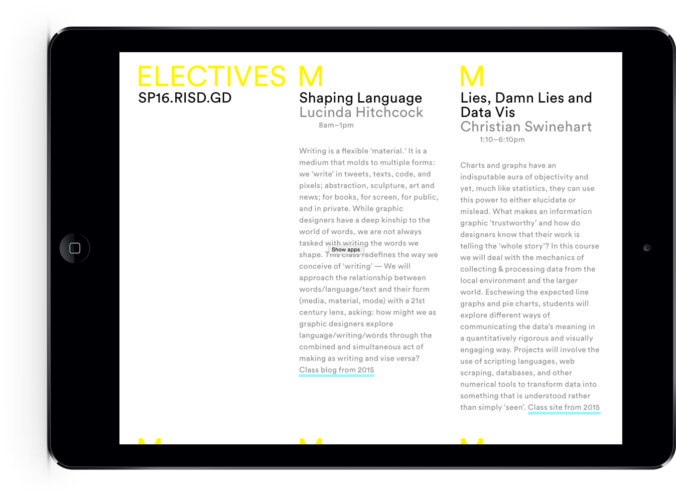
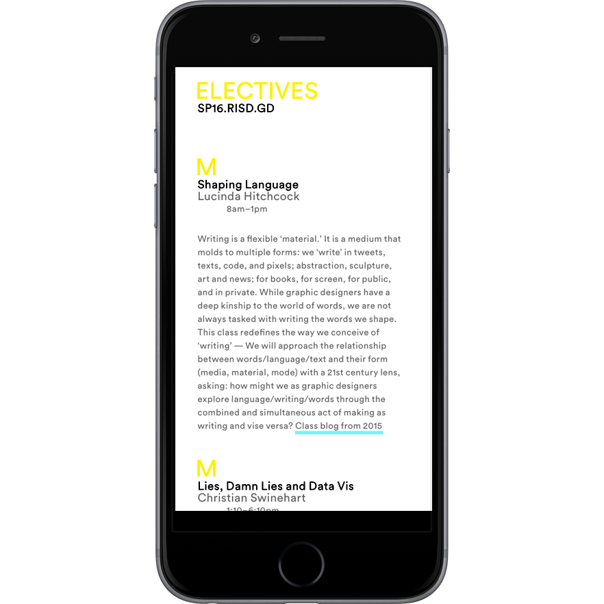
With electives gaining importance at RISD GD – as sites for research, specialization, experimentation — it seemed appropriate, and celebratory, to announce our elective offerings. Given the community is based only in two buildings, a digital poster seemed like the right format. But also useful to that community would be a single serve website, where the information could be reviewed in depth no matter where the student was located. The information would also be of interest to the greater design community: What is RISD offering? What is the state of Graphic Design education? I designed a web to print solution to satisfy both scenarios. The website used Google Sheets as its content source, so edits could be made to course information by several people, and it is formatted for mobile, desktop and a 35″ × 47″ poster.

Cyan, Magenta and Yellow Google Images overlay
How does Google understand color? How do words and color relate? These questions led to a variety of Google Image searches. Ultimately, I enjoyed how the results of a color were almost monochromatic… search for yellow produced a virtually yellow page. This print combines the three primary colors used in printing: cyan, magenta and yellow. Each page is output to pdf from Google Chrome and overlapped in Photoshop. Printed on a rug by Society6.


Locally Made Daily Guide
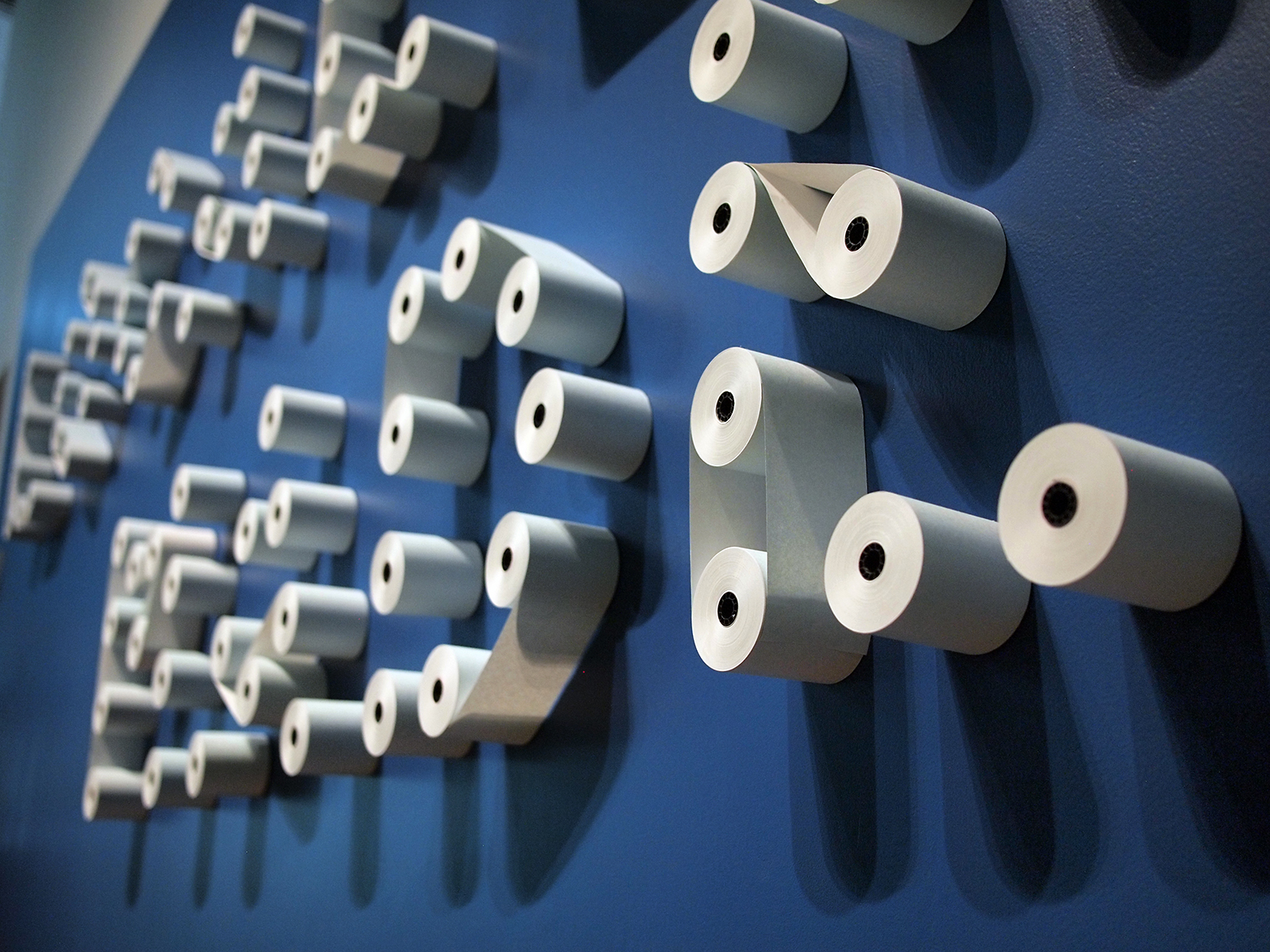
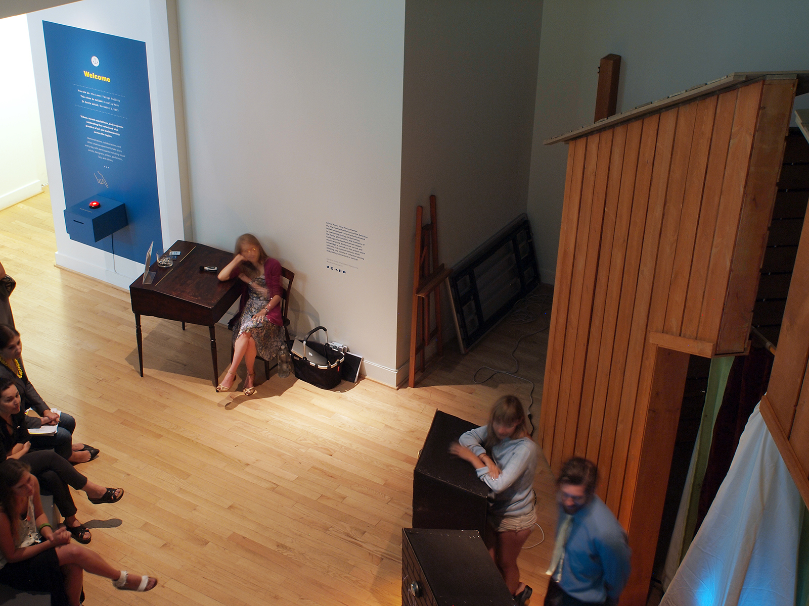
Exhibition graphics and print-on-demand daily guide for the summer 2013 RISD Museum show, Locally Made. A receipt printer outputs an up-to-the-minute guide of the day’s events, the weather, and show information. In collaboration with six fellow Design Office members. See three videos showing the daily guide.


RISD GD Notices
‘Notices’ is a tumblr theme that generates a simple website, printable pdfs and an animated full-screen slideshow. Designed so notices reach people in real space, but features a rolling archive in the cloud. The flyers can be distributed around campus, overprinted with other imagery and printed by folks offsite. I initiated the project and commissioned Andrew LeClair and Adam Lucas to design and develop the project.


Bindery 2.0
This site (and book) have been generated with the latest version of Bindery.js, developed by Evan Brooks. The current 2017 version balances ease of production while giving the more technically oriented designer options to rotate, index work and more.

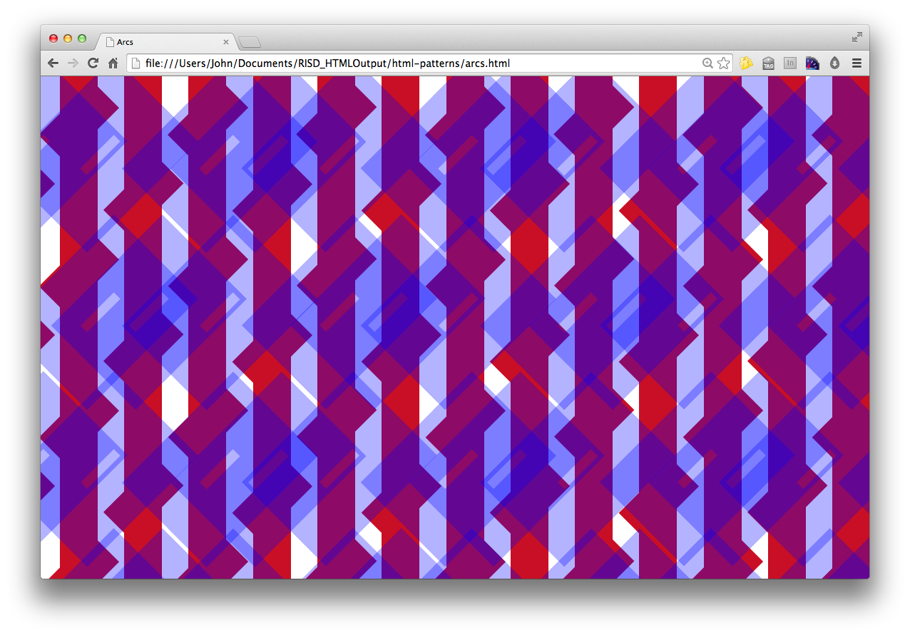
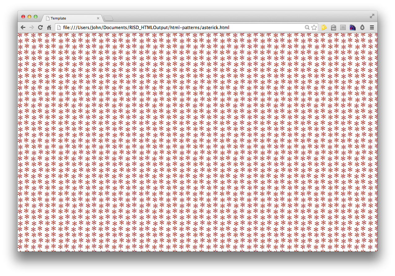
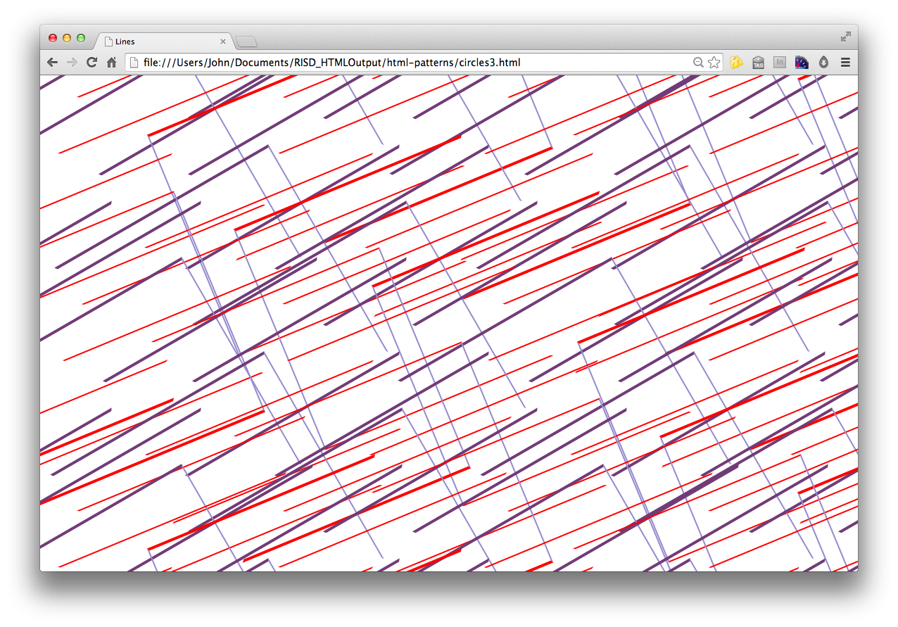
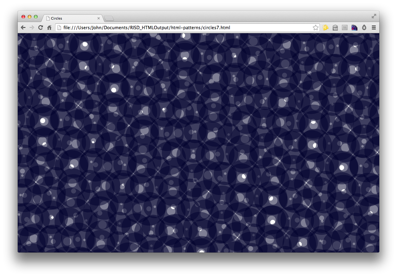
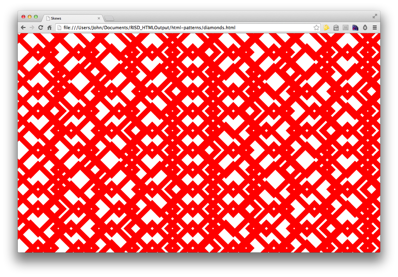
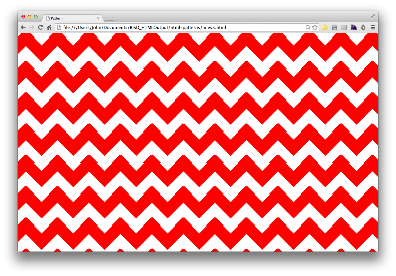
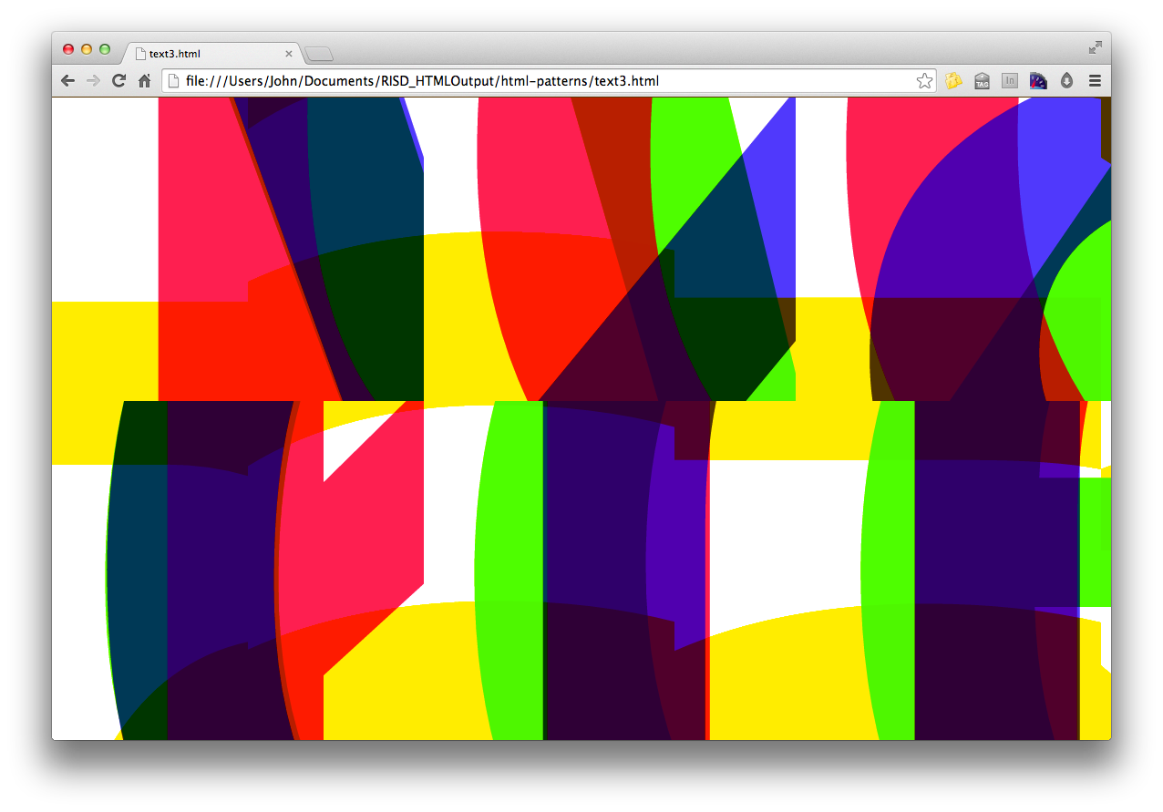
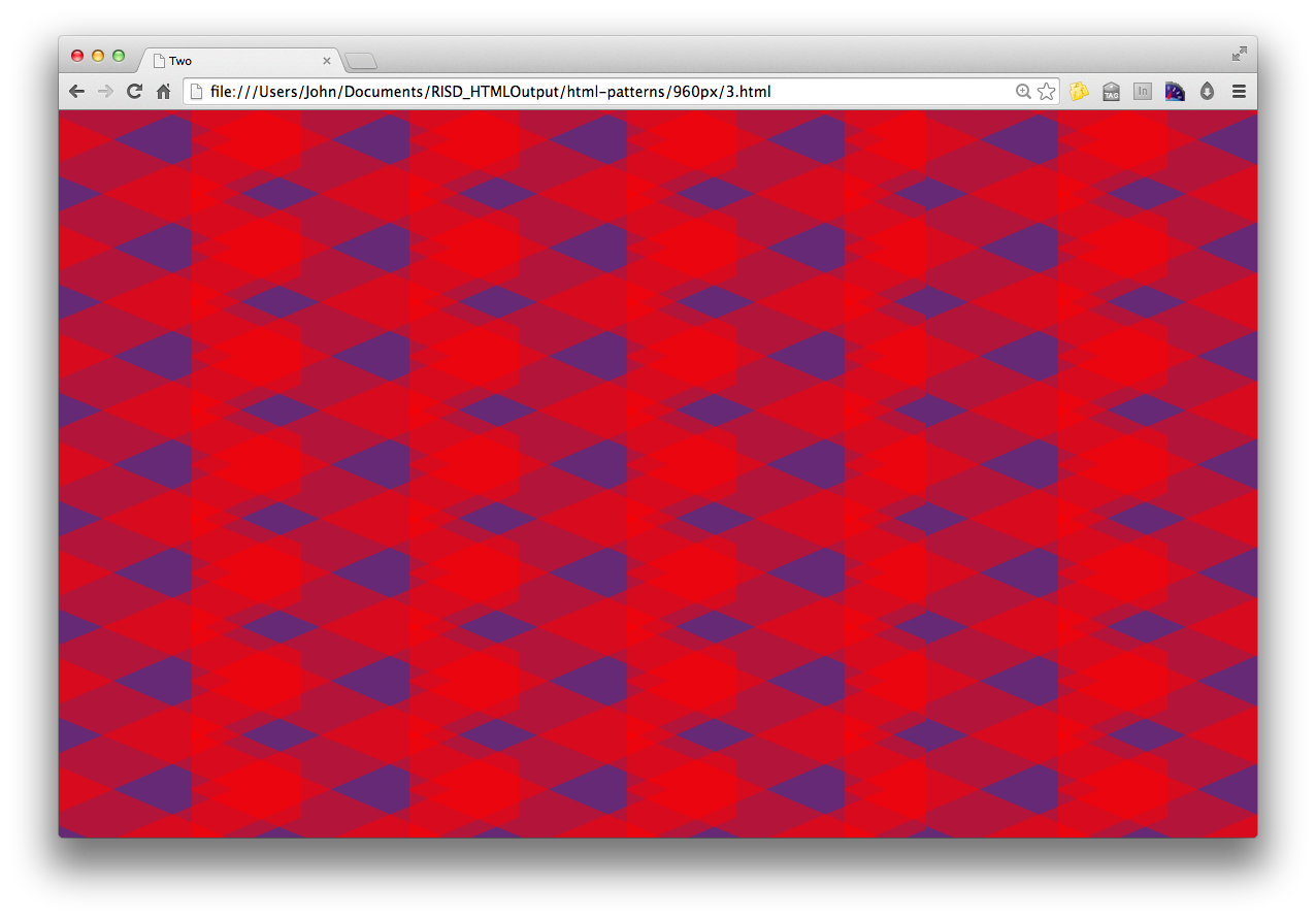
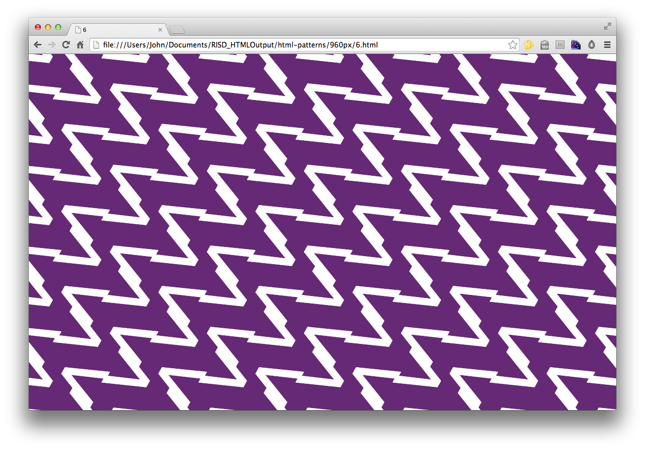
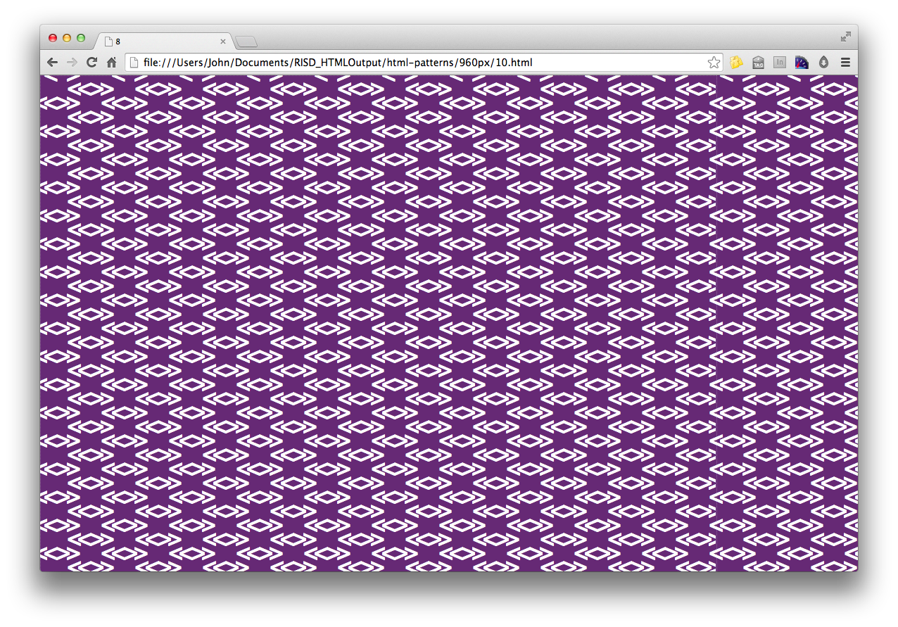
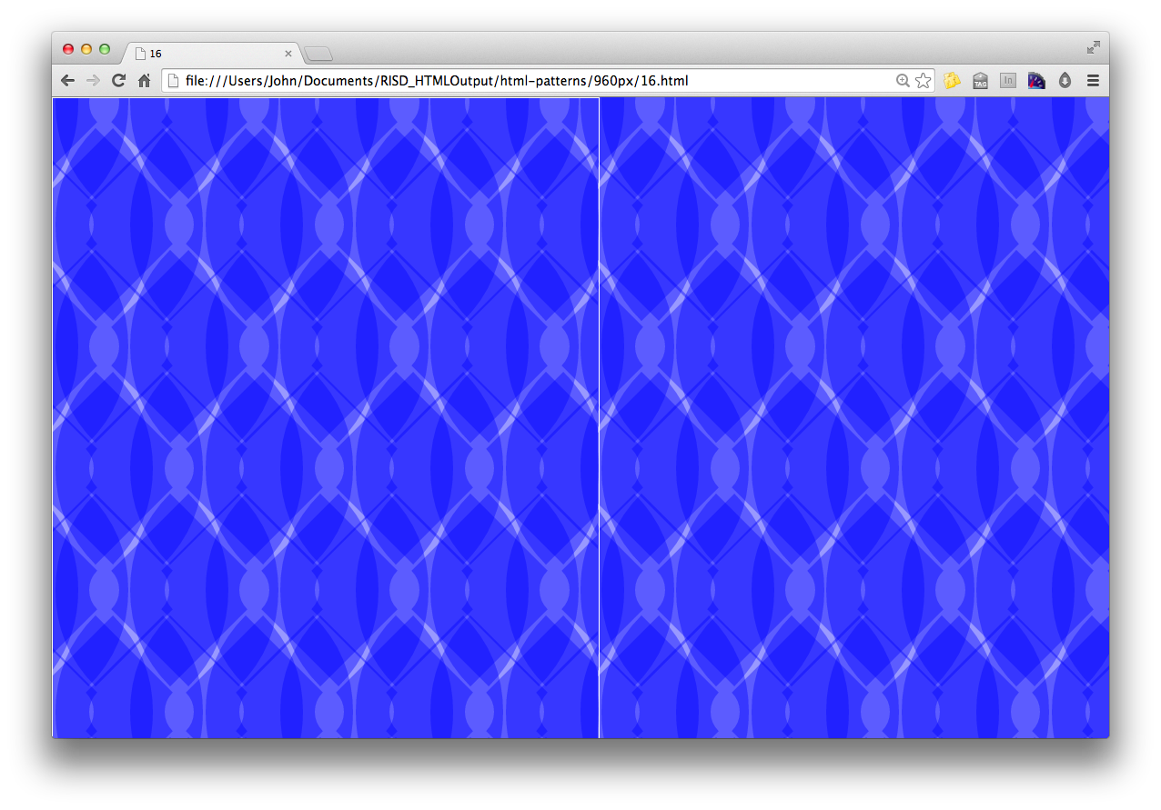
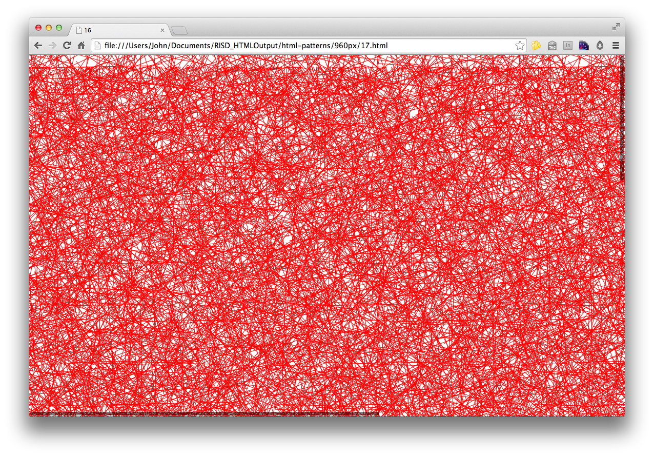
HTML Patterns
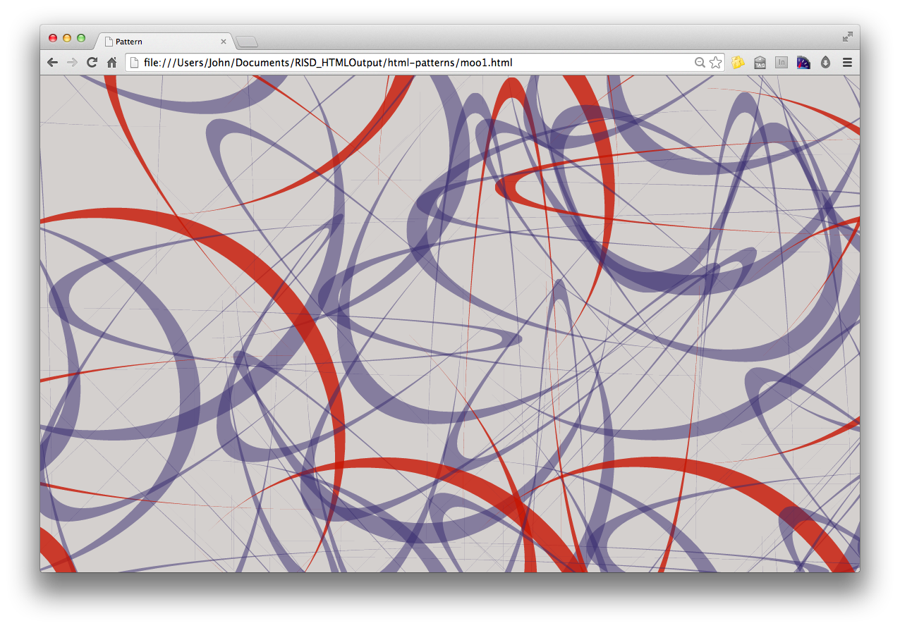
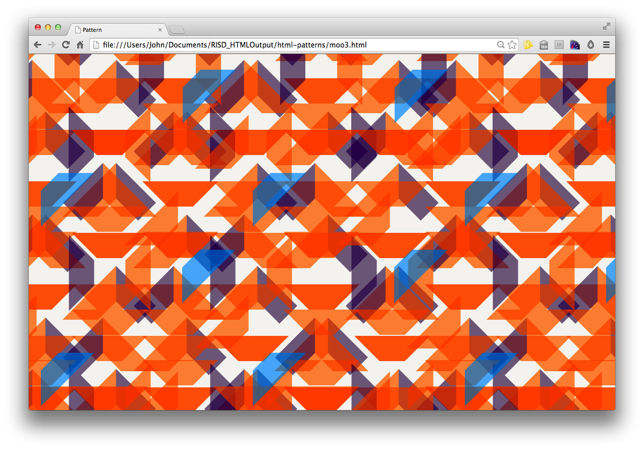
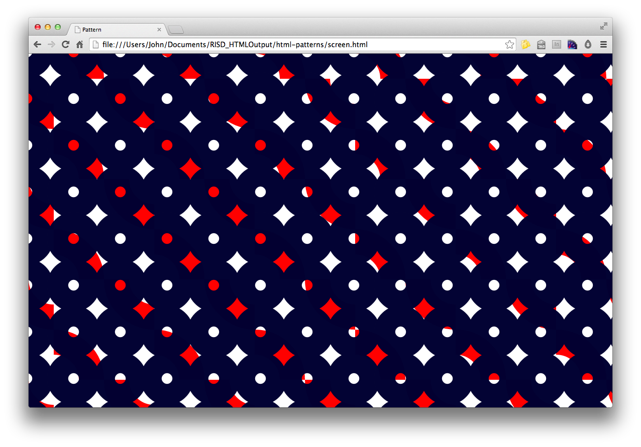
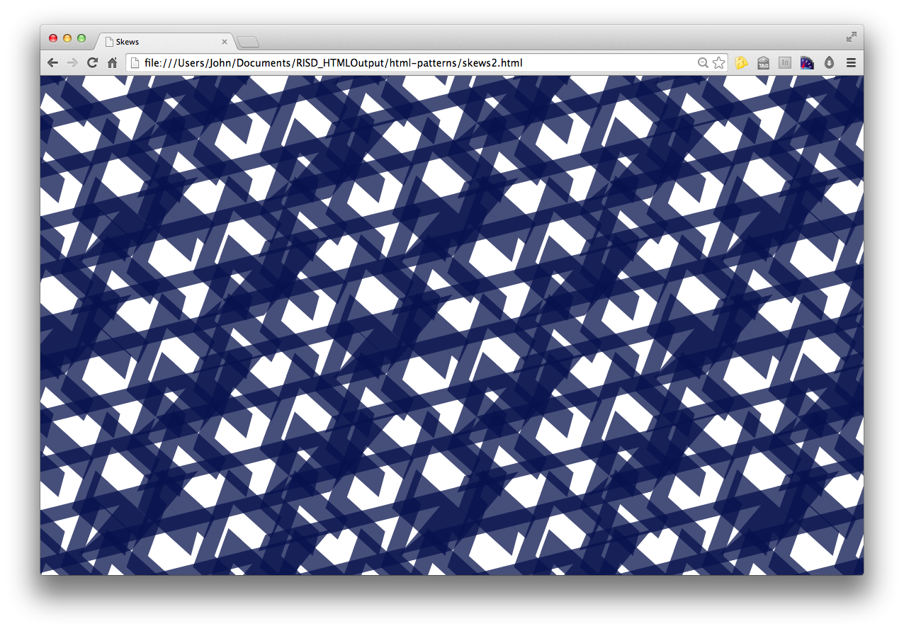
I began making patterns in the Web browser as a way to teach students HTML and CSS. The technique is a satisfying way to generate repeating form, leading to digital wallpaper and woven textiles, now manufactured and distributed by online platform Weft.
Patterns should be greater than the sum of their parts. How they get made traditionally is by making a module and repeating it systematically. While playing with the web browser’s inspector tool in 2012, I realized I could see the whole pattern change immediately by changing the module’s parameters. Many variations could be seen quickly. It was not the speed of it that was noteworthy, but the opportunity for play and discovery. I took this discovery into the classroom in the fall of 2012 and have continued to teach this technique as a way of building layouts in the browser. It’s a nice method to generate patterns, too. My colleague Brooks Hagan, a professor in Textiles, commissioned a pattern for his new online weave-on-demand platform Weft.
Various patterns
The following are screen captures from the browser. You may look at the HTML and CSS in the Github repo

Greeting Cards
Print on demand cards printed by Moo, Inc. in Rhode Island and sold at RISD Works.


Six Lines exhibition
I was asked by colleagues at RISD to participate in an exhibition curated around the theme of artisan and toolmakers. My tool of choice was the browser itself, so I used it as an excuse to print out patterns at larger scale and to create a pattern with letter croppings. There was a panel in conjunction with the event as well. See the video recorded from the event.


Woven textiles
Brooks Hagan, a colleague at RISD in the Textiles Department, asked me to contribute a pattern in conjunction with his new site Weft, a woven textile on demand site. See more on Weft. Below is an introduction to the work on their website.
Working primarily in programming web languages, artist and graphic designer Caserta uses computer code to create a wide-ranging array of projects. He remarks, “I think of code as a set of instructions. The instructions don’t have to be complex or rigid to be effective. I use code to arrive at unexpected solutions — not to execute upon statically generated mockups.” Indeed, it’s often through the creative and playful exploration of code that Caserta’s projects usually take formation. He explains, “HTML/CSS and Javascript are easy to manipulate, but lead to such unexpected outcomes. The key is to be open to what they produce… Noodling around in the code is what leads to novel structures, hierarchies and forms.”
For his collaboration with Weft, Caserta used Chrome’s Web Inspector, manipulating and experimenting with code to create a graphic pattern. Reflecting on the design, he notes, “It’s an overlapping box-diamond structure that seemed really simple at first, but I found that quite a lot of complexity came across. For example, there’s this sense that you could lose the repeat and lose yourself in a section of it.” He summarizes, “And once you start applying color, there are a lot combinations that can come through and make it unique.”

The pattern I produced for textiles began by drawing with colored chalk on bricks in my backyard. The almost 2 to 1 ratio encouraged marks that would at times seem systematic, but given the manual task, not need to have been. The same process, it turned out, could be done in the browser. I started with a system, then begin creating more and more exceptions.


The Design Office
In 2007, I founded a shared workspace for independent designers in downtown Providence. Ten years later, it occupies 2,800sq/ft, has housed more than 45 people, has run 60-plus events and has initiated dozens of projects.
In 2007, I founded a small shared workspace. Since 2012, it has quadrupled in size and since its inception housed more than 45 graphic designers, industrial designers, type designers, architects, photographers and programmers. The Design Office provides just enough infrastructure to enable peer to peer collaborations and learning. Common areas and resources keep the curated group of practitioners connected, while everyone is working on their own businesses and bodies of work.
The mission of The Design Office is to satisfy the creative needs of independent designers by providing office space, shared equipment, community and resources. In addition to providing the essentials, it initiates and supports collaborative projects and proposals. Although run as a co-working space, it looks more like an arts collective: members are curated, decisions are collaborative, and the organizational emphasis is on pushing out work that challenges conventional design troupes (in form, method context).
The organizational structure itself has been my primary project. How does a group of people organize itself … better itself? What do we share, and how do we share it? These questions and more have propelled me, and the organization, into its second decade.
Additional reading
- Read a profile of the space from AIGA’s Eye on Design
- Read my introductory essay about The D.O. written for the ten year anniversary book
Workspace
The primary function of the Office is to be an ideal place to make design work. The workspace is filled with books, process material, finished projects, members and visitors. The Office is a space where those who love what they do come to get their best work done. How can the space encourage interaction while protecting individual momentum? How does the Internet contribute to what is primarily a physical community? See more about the space on the web.


Members and Fellows
Membership is required to have regular access to the space. Members work out of the Office, contribute to the culture, organize events, and create uncommissioned works – while also running their own independent professional practice. Members have come with design-related degrees from Stanford, CCA, Yale, Brown, RISD and elsewhere. Sadly for us, members often move on to other cities to start companies, teach, move with their spouse or to start anew. Although there is natural turnover in the membership, it’s been slow. Fellowships can also infuse the space with fresh ideas. Fellowships are 1-3 month grants to designers in need of support on a project basis or while in transition. A list of members and fellows may be found on the website.
More than 45 members and fellows have been a part of the space since 2007


Community events
Whether sharing skills and discoveries, or simply gathering the larger design community, public events play an integral part to the Office’s mission of life-long learning. Members initiate and host events of all sorts. We’ve hosted paper football tournaments, software demonstrations, UX and Wordpress meetups, lectures, community discussions, and more. See a list of previous events on the website.


Collaborative projects
Since the beginning, the needs of the group have led to member collaborations. Graphic matter (cards, posters, ephemera), signage, furniture, gifts, exhibitions, open commissions, have all led to collaborative work. The projects are listed on the collaborative research and shop sections of the website. Some recent ones are below.
1-inch buttons, 50¢
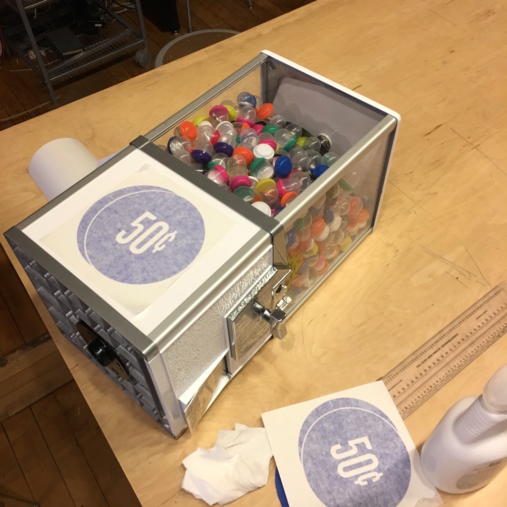
Members and friends of The Office designed 1-inch buttons — for sale in a gumball-style machine for 50¢ each. Designs range from left-leaning political commentary, to visual aphorisms and typographic pleasantries. Members were emailed and asked to design a button in less than two days. The prompt was the following: “A button is seen up close and on your person (or bag). How can you engage another human? How do you show you’re part of a tribe?” The buttons were designed in response to AIGA RI’s See Us call for submissions. The exhibition, held in the RISD GD Commons, made for an ideal site for a self-service device. We ordered Busy Beaver’s Button-o-Matic machine and placed the object within the show. The machine is currently site at New Harvest Coffee in downtown Providence. Read more


Common Flag
For Flag Day 2016, The Office put out an open call for submissions for designers to design a flag “that everyone would feel proud waving.” Submissions were posted to twitter at the hashtag #commonflag2016 or on Google Drive. The submissions were shown in an exhibition later in the summer. The project found its way into my teaching practice as a unit within the sophomore Design Studio course. Read the call for submissions.


Creative direction
For ten years, I’ve been the defacto designer of The D.O., making or directing the various emphemera, websites and publicity material. Other members have certainly pitched in and contributed to the voice as well. Our look is inspired by the 1880s building where we work.


RISD GD Commons
Conceived, planned and directed new event, exhibition, administrative and community space for the Department of Graphic Design at RISD.
The GD Commons is the epicenter for the RISD Graphic Design Department – housing administrative offices, space for gatherings large and small, events and exhibitions. More than a repository for finished works, the space encourages the creation of new work (in the broadest sense), and present-tense experiences for the GD community and beyond (when desirable). The five large windows allow for lots of looking in and out. The activities that occur within the space are a show. The Commons is meant to support the more open undergraduate curriculum in terms of gathering students and the undertaking and siting of 21st century projects.
Core principles
- The Commons is the largest non-classroom / non-studio academic space in the Department, and as such, is ideal as a meeting point / interstitial space for activities that reach beyond both classroom and studio. It is neither a gallery or a classroom, but may, in spurts, take on activities that resemble those areas.
- The Commons should encourage daring new works and activities that benefit the GD Community.
- The Commons is part public and part private, because of its visibility to those inside and outside the community.
- What happens in the Commons is by default open and visible. Activities there should not block or exclude the GD community (or ideally the greater community). Exceptions include sponsored events or when used for administrative purposes.


Programming the space
As Department Head during the planning and initial two years of the space, I organized regular events mixing various members of the RISD and Graphic Design community. The GD Commons, as a flexible space, has been used in the following ways during my tenure as Department Head.
- Hackathons/Workshops
- Large Department meetings with students (all sophomores, etc.)
- Large Student gatherings (planning shows, etc)
- Short-term critiques (student to student, classroom)
- Lectures
- Curated exhibits
- Book fairs
- Office Hours for part-time faculty
- Performances
- Workshops (outside guests)
- Co-hosted public events with AIGA or outside entities
- Symposia or round tables
- Standing table/area for meetings
- Shelves, display info for visitors, etc.
- Interdisciplinary ideas/events/etc.
- Graduation/Open House/Scheduled events
- Open Conversation between students and accreditation team
- Brief email checking, waiting (piazza)
More information
Schematic design
The north riverside corner of Design Center had housed four offices, a small land-locked waiting room (pin-up space), and two storage rooms in a 1450sq/ft footprint since 1987. Graphic Design was the only large department without a decent sized space — usable for shows, ad-hoc events, meetings, gatherings, scheduled events, etc. This renovation carved open the many dividers created in 1987 when Graphic Design moved from Market House to Design Center. The resulting open space was created by carving away all of the toxic materials from the 1987 renovation to expose the core materials. The light-filled river-front piazza and more visible/accessible offices for the Department Head and Coordinator facilitate exchange, connection and community. Storage needs have shrunken to virtually nothing, and there was space in the building for the two faculty to move upstairs.

Project Team
Given the complexity of the project, and the likelihood for scope changes and difficult decisions (around cost, features, vision), I assembled a team that could meet with the architects, project managers and construction personnel regularly.
- John Caserta, Dept. Head and principle contact
- Lucinda Hitchcock, Ad Hoc Events Adviser
- Doug Scott, Gallery Adviser
- Jiminie Ha, Adjunct Faculty w/gallery experience teaching in fall
- Susan Mazzucco, Admin/Coordinator
- Greg Nemes, Adjunct Faculty in Grad Studies and Co-Founder of Work-Shop
- Lisa Maione, Ad Hoc events coordinator, grad student
- Jose Menendez, graduate student, gallery assistant
Supporting Projects
After the renovation began, we were able to start defining component projects to support the space, design furniture and design elements that would encourage flexibility in how the space gets used.
Mounting work
I asked Jiminie Ha, who ran a gallery in Chinatown, and was to teach a course titled Design and the Gallery, to propose systems to mount work. We didn’t want to favor printed work, but wanted to anticipate the mounting of books, posters and other print ephemera. The team collected ideas on a tumblr blog, and worked with Jiminie to evolve her ideas into usable systems. We arrived at flush-mounted latches that could support cables and string. This idea was originated, in part, by two of our students Lukas Eigler-Harding and Jon Rinker.


Administrative offices
The two more streamlined offices were designed to give a view out onto the Commons, and to be more visible to students and others. Custom cabinetry by Work-Shop makes ideal use of the space. Faculty mailboxes, various sliding doors, and there is even a custom door separating the department coordinator from the department head.


Signage
I commissioned and oversaw BFA senior Lukas Eigler-Harding’s typographic treatments for the Commons. We extended the system to the rest of the building.

Curtains
I asked fellow RISD faculty member Paul Soulellis to design curtains for the administrative offices. Intitially, we discussed making a “call for submissions” curtain that could be used to promote the call. His design was so on point – a Google Image Search for curtains — we decided to no longer have the call, but to simply use his design. The curtains were made custom by Print-all-over-Me and have yet to be hung (privacy not deemed necessary as of yet).

Benches
I commissioned Work-Shop to construct benches that could inhabit the window area. We decided to straddle the radiator and allow the benches to vent. The benches were designed to be moved by two people for exhibit use and for conversations. Lucinda Hitchcock designed a myriad of patterns, ultimately deciding on the angled lines. See more on Work-Shop’s website


Shelves
There are many visitors to the Department. As a way to communicate what happens, I commissioned Various Projects in New York to fabricate two custom sized shelves to mount on the wall ajacent the meeting area. The shelves house work from alumni, faculty and students. Opposite of the array of recent work is a reading shelf, books contributed by faculty for students.

BFA Core Curriculum
In 2013, I began the work of restructuring the BFA core curriculum at Rhode Island School of Design. This lays out the thinking behind that work.
I entered the RISD Graphic Department in 2012, at the tail end of a thorough external review. The reviewers offered valid insights and criticisms for the faculty to consider. As a response, I volunteered to research curricular and pedagogical routes that were the right fit given our value system. A blog and presentation led to an extensive write-up and a series of conversations with faculty, students and alumni in the semester that followed. A committee of Department pedagogues met regularly to tighten up the details. The culminating document presented to the dean, the Curriculum Committee, and ultimately to all RISD faculty, proposed inquiry-based core studios, elective four-week tools workshops, and a more expressive and rigorous type sequence. Given Nancy Skolos’ ascension to dean in the aftermath of John Maeda’s unexpected resignation, I offered to administer the changes as department head — a position I held until December 31, 2016.
The curricular work — which is ongoing — has been well received internally and externally. We have benefitted from better scheduling and sequencing of core courses, like History of Graphic Design, Color and Type III. The new studio, Design Studio, has allowed for open experimentation in both content and pedagogy. Discrete units from this course have been made from, and broadened into, full length electives. The 1-credit workshop series has been adopted by other departments at RISD. These changes have been made without breaking any part-time faculty contracts, and by encouraging full-time faculty to engage more deeply in their research interests.
More info
- Read the report, written with Lucinda Hitchcock
- Hear an interview with myself and Lucinda Hitchcock about the curriculum
- Read AIGA Eye on Design’s profile of RISD GD
Design Studio
The core studio — proposed in 2014 and began that fall — is a series of two 3-credit classes in sophomore year and two 6-credit classes in junior year, would run across four semesters. The objective of the four-semester Design Studio sequence is to build discipline and self-reliance around research, to allow space for asking questions, finding precedents, forming groups, learning skills, working with a wide variety of faculty, and shaping what students have learned into contemporary forms while addressing relevant and contemporary questions (problems). Faculty teams offer prompts and resources to create the framework of the design problem, and the students will choose the medium and formats appropriate to the line of search, inquiry, problem being solved, and so on. All 65+ students work on one faculty member’s unit. This format elicits faculty collaboration and peer support through weekly pre-class meetings that tighten language and cover possible teaching strategies for the unit.

Design Studio is a nimble, agile structure that can handle the many changes in our profession, allowing for better cross-pollination between new faculty and senior faculty, and will touch on current topics, methods and cultural phenomena. Staffing the courses was a pleasure, placing new adjunct faculty into a team where they could introduce their line of inquiry to the faculty and students. Senior faculty support newcomers and newcomers offer new thinking to senior faculty. As new tools, theories and cultural issues arise, the course can adapt itself through the introduction of new topics and/or people.

Course description
Graphic design occupies an ever-expanding, ever-redefined territory at the intersection of verbal and visual languages. Its media spans everything from websites to postcards, film to signage, typefaces to billboards. Its methods make use of both sides of the brain: pairing logic, critical analysis, research, and planning with intuitive search, mark-making and visual expression. Graphic designers are inquirers, observers, poets, editors, curators, analysts, researchers, commentators, and critics.
Rather than attempt to codify this expansive landscape, or to delineate a sequential path through it, this course takes this ambiguity as license for experimentation, discovery, and play. You will encounter and engage the tools, materials, and processes of graphic design in functional context, as means to self-directed ends.
The emphasis will be on methodologies of making — observation, analysis, ideation, translation, curation, research — and on developing a personal voice and approach.
Design Studio will take the form of a series of question-based units, each initiated by a faculty member and contextualized by a presentation, event, or workshop. Units may span the entire term, a few weeks, or a single class period. Design Studio is a fast-paced course that necessitates a self-directed, open-ended, experimental and playful mindset. Units will not define outcomes or prescribe processes, but rather will aim to inspire lines of enquiry, challenging students to explore unfamiliar subject matter, tools, media, and processes by their own initiative.
The new curriculum has led to widespread and visible discussion within the field of design education. This includes a few podcasts, press online, published writing by myself, public discussions on design curriculum and consulting work with on my part with CCA in San Francisco and LAU in Bierut.
More on Design Studio
- See website for Design Studio 1, 2016
- See website for Design Studio, 2015-17
- See website for Design Studio, 2014-16
- Read the Design Studio Teaching Guide
1-credit tools workshops
The Friday 1-credit workshops focus on the tools and craft of design. They are guided hands-on making sessions that provide enough training, community and resources so students may continue working on their own with that tool afterwards. Although there is no one pedagogy that works for all workshops, the term workshop denotes a hands-on approach, where instructor leads students through exercises or tasks in person, thereby setting up assignments that may be reviewed the following week. Workshops put the tool at the center. The workshop should open up conceptual doors by showing students what is possible with a tool. The emphasis should be on training, best practices, looking at precedents, experimentation, and building a community around a tool (whether physical or digital). It is not just the how of a tool, but the why and what’s possible.
Learning Objectives
- To build skill and craft around a specific tool in design
- To build communities of students and faculty around certain ways (and places) of making
- To serve larger number of students who want access to skills
- To complement the more open format of Design Studio, where specific formats are not emphasized
- To mingle different age groups, experience levels and majors
Research electives
While Department Head, I added more than a dozen new electives. The electives got into more details than the required courses, looking at specific disciplines or working methods. Many of the upper-level electives had a publishing component built into them, placing the work that happens in the classroom beyond the educational ‘white cube’ into the larger discourse. These research electives engage design methods and forms beyond those that exist in professional practice. This has turned out to be a real boon for our graduate students as well. Chris Novello’s Computer Utopias, Christopher and Kathleen Sleboda’s Newly Formed, Jiminie Ha’s Design and the Gallery, Paul Soulellis’ Experimental Publishing Studio, my HTML Output course and Lucinda Hitchcock’s Shaping Language, arose from ongoing discussions with the instructors around their interests and how the class setting could be a place to further their ideas. Through my encouragement, these courses have built research into their learning objectives — making the classroom an ideal place to support faculty and to determine the future of our profession.


Documentary Icons
I was asked by The Noun Project to initiate a collaborative collection — a new venture where the Noun Project community could draw for each other, adding icons to a central repository. I came up with the concept for documentary icons having an interest in the detailed 20th-Century iconography.
This write-up keeps the original tone of the collaborative collection; which was essentially a solicitation for participation.
Overview
This collection harkens back to the 1930s pictographic style, when icons were drawn as a type of early documentary photograph – descriptive of everyday actions, but more suitable for reproduction with the coarses printing presses of the era. This realistic (but not without humor, voice or wit) type of drawing is visible in Rudolf Modley and Gerd Arntz’s archive (see figure 1). We can get a sense of the culture by seeing a slightly simplified version of the hair, clothes, mannerisms and industrial objects of the time.
This Noun Project collaborative collection asks designers – wherever in the world you may be – to help build a collection that documents people doing what they do today – whether funny, awkward, honorable or mundane. What I hope to see is a snapshot of contemporary global culture using a timeless pictographic style.
Think of them as documentary icons, akin to the small format photographs taken in the subsequent era Henri Cartier-Bresson, Robert Frank, Diane Arbus, and Lee Friedlander.
Process
- Use a smart phone to capture someone performing an activity you would like to document and share with others. Consider the angle from which you take the photo, since you’ll be drawing over the photograph. Be sure to capture the full human figure. Look for details that make your moment unique. You may want to take more than one picture to capture certain elements at the correct angle. Smartphone cameras use a wide angle lens, so leave room around subjects as well.
- Place your photograph into your drawing program of choice and reduce it so the person’s total height would be 100px if standing up.

- Lock the photograph and draw over the person using an outline stroke (so you can see what you’re drawing over). Use only as much detail as you need, but enough to capture the activity. Removing detail later is fairly easy. Use the photograph as your guide, but vary from it if the drawing doesn’t read so well.

- Convert your outline to a black fill and see if the icon is clear enough. Simplify the human head to a more generic blob, keeping hair or eyeglasses if desirable. Show human skin or contrasting element with a white fill and a 1pt black stroke. Smoother edges allow the icon to scale more easily. I recommend using rounded rectangles, circles and lines with rounded edges to help soften your drawing without overusing the pen tool.
- Be sure to outline your strokes and combine shapes before saving to SVG.
Submit!
See the icons, learn more and submit to the collection at The Noun Project.

Projects: 1994—2014
Summarizing the period before joining the full-time faculty at RISD. There are many links to my previous website, a Wordpress theme that I developed to archive projects.
Screens
Saying you design websites is akin to saying you design for paper — there are many types of websites. I’ve had a fairly information design approach to design; focusing on conveying archival information, creating web applications, charts, etc. This sort of thinking led to two open-source Wordpress themes: Flatfile (2011) and Charrette (2013). I also designed a gallery plug-in for Wordpress called Contact Sheet.
When running my own independent practice from 2002 until 2012 I worked on a bunch of websites. An equally prolific period was working at The Chicago Tribune and freelancing the year after I left (1999-2000). Some of the projects are archived on my Flatfile site. See websites archive
I also produced a set of touchscreen graphics, worth a look since they were designed just before the iPhone was released. These were done in Flash and I worked with a few designers and developers to create them in just under a year for the new Normandy American Cemetery Visitor Center in France. See touchscreen archive. I also did more than my share of CD-ROMs. There are only two that I documented.
Information graphics
Explanatory graphics, aka information graphics, were a central part of my career from 1995 until 2012. These projects are the ones that I’ve saved from that part of my career. Notable here is a set of financial graphics for Thomson Reuters that I did with Hanaan Rosenthal.
Photography
I have put together a few photography projects over the years; my involvement with the camera peaking in the mid-2000s while on a Fulbright in Italy. My love of sheet film continued for a few years in Providence, held together by a project of the architecture of Ira Rakatansky, photographed with Thad Russell.
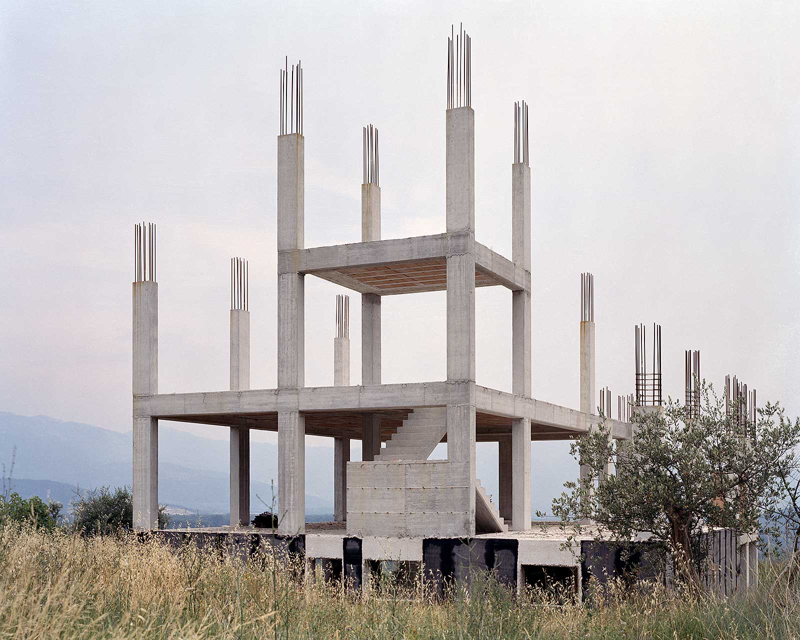
Typefaces
I’ve collaborated with type designers for years, resulting in a few speculative projects and a few small distribution projects.
Books
I have had the chance to work on a few books: speculative and published.
MFA Thesis
I was a graduate student at the Yale School of Art from 2002 until 2004. A few projects are documented on my flatfile site as well as website constructed specifically for the thesis project, titled Take Your Time, projects exploring slowness. Design Observer asked me to write a story about it. You may read it here.
Graduation Letter, 2019
Since 2016, RISD yearbook have asked department heads to write a letter to their graduating students for the yearbook
There are many reasons not to do things. Things — like calling my uncle on his birthday, going to a friend’s opening, cancelling my Hulu membership, making ‘my own’ work, or even writing this brief text for the yearbook. It’s really not for lack of interest that things don’t get done. With this yearbook text, for example, I’ve been having a hard time thinking of a good concept. I’ve been worried that writing something bad is worse than writing nothing at all. Am I really going to submit a half-work, a paragraph that predictably gushes about this year’s Graphic Design graduates?
The big concepts have come and gone. The stuff of genius, like, a belabored ascii art masterpiece or an edited version of a previous letter. I also thought about giving my space to someone who could use the platform. I considered making an emoji to communicate love for the college graduate (a heart with graduation cap, perhaps). I spent time getting into the editorial mindset; asking Julian for the concept of this year’s edition. I sought clarification of purpose (should this text inspire, be witty, be self-deprecating).
What is the winning formula here? What exactly is this text supposed to say anyway? What are other department heads writing? I should probably look at a bunch of these from previous years. How long should it be? Surely I have more time or some way out of this.
My best advice to students is always to start the ‘thing’ as soon as possible and to see where it goes. My conversations with my uncles always go to unexpected places. Going to a friend’s opening leads me to new ideas and deeper relationships. So, why not start this letter? I’ll begin with how proud I am of the Graphic Design students — yes, you. You made a wealth of meaningful work and friendships over these past few years. The exhibitions this year were amazing. You made a lot more than individual pieces of design. You made the Department worth showing up to. This place without you is not a place at all (come back and visit in June). I’m proud of each and every one of you for being willing to face yourselves by making your own work – whether you finished all the things you wanted to finish or not. Pat yourselves on the back. Getting to the end is an accomplishment in and of itself.
Pick up a copy of the essay in the printed yearbook by emailing csi@risd.edu. The above version is an edited version of what appears in the printed yearbook.
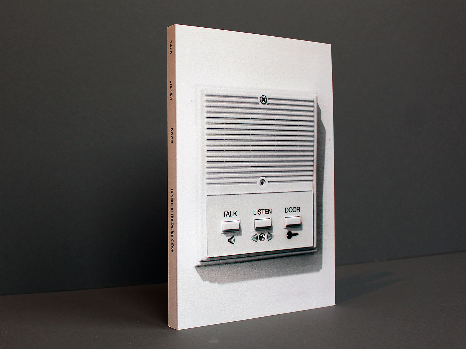
What is The Design Office?
This essay introduces The Design Office’s ten-year anniversary book. It is a genuine attempt to answer the title’s question — what is The Design Office — which has never been an easy answer to give.
In the early days, I described The Design Office by what it wasn’t: “It’s not a design firm.” Starting a service-oriented firm is the customary path for a designer. Graphic Design is colloquially explained as the intersection of art and business. By describing The Design Office as “not a firm,” I hoped to situate the group primarily in the arts. Until we retired our phone line two years ago, The Design Office was listed in the “arts organizations” section of the Providence Yellow Pages.
“It’s graduate school for the rest of your life,” worked well as an answer until recently. This answer assumed that who I was speaking to attended an MFA program in design or might have a positive association with graduate education. Graduate school attracts motivated practitioners that question conventions and chart new territory. They share space and resources, but create independent bodies of work. I was only three years out of the Yale MFA program when I started The D.O, and I was hoping the framing of the Office as graduate school for life would help manifest a community similar to my peers from Yale.
This answer worked for a while, but The D.O. feels less like graduate school now. This is to the credit of Sarah Rainwater, Nic Schumann, and Greg Nemes, who have grown their independent practices into small businesses. The D.O. at age ten also houses The Morisawa Drawing Office, another three-person company. There are more business concerns raised on the 3rd floor of 204 Westminster than graduate school conversations. We even have a water cooler. It’s also rare to see people working at night, or on weekends. Working at the graduate school pace is hard to sustain it turns out — so I don’t use it to explain what The D.O. is anymore.
Another way I describe The D.O. is as “a zero-profit organization that supports designers.” This can be shortened to: “it’s a support system for designers.” The term zero profit aligns it with non-profits, but it’s not formally a non-profit. It’s primarily member funded and does not earn any profits. Membership dues pay for common needs: equipment, furniture, and events. Another critical need is labor: running the space is done on trade, as are infrastructure projects, upkeep and basic management. Membership dues fund more than the basic expenses though—they are a shared investment in each other. I hope that The D.O. supports more than just the current membership as well—through advocating for a certain type of design, through collective action.
The term “collective” is a good term, too, but I rarely use it to describe The Office. Collectives are often a set number of people with a set agenda. Our members share more values than not, but they don’t often operate as one. Collaborations occur — we are co-located, but The Design Office rarely authors work as a collective body. “Co-op” is not an apt description because the ownership isn’t shared.
Nevermind the fact that The D.O. is a co-working space—and there is certainly a demand for and awareness of co-working spaces. But I don’t feel comfortable describing The D.O. solely as a co-working space because of the negative connotations with co-working spaces in the creative community. Designer Jason Alejandro mentioned us in a tweet and wrote we were “a co-working space, but not in a bad way.” Ben Shaykin picked up on that immediately, and it was part of our Twitter bio for awhile. If I describe The D.O. as a co-working space, I usually say “it’s a curated co-working space.” This is true, and more nuanced. We have an application process that requests a resume, website of work, and paragraph with reasons for wanting to join. Existing members meet prospective members, and there’s essentially a vote. The curated nature of it assures the continuity in the workspace, prevents quick changes and invests current members in the process.
In terms of how we publicly explain ourselves, we’ve had three websites—each with their own taglines. In 2008, we used: “a place where individuals work together.” This was followed in 2012 by: “a place for independent designers in downtown Providence.” The current version, dating back to 2015, reads: “a shared workspace in downtown Providence, RI.” The first and third embrace more disciplines than design. The space is set up for designers, and best serves designers, but it has benefitted from the presence of programmers, photographers and other non-designers. We have always listed current members and there is always the potential for new disciplines to emerge from who is here or who enters the room.
At times the members themselves wonder what The Design Office is, and what holds it together. We have done a variety of things over the years. What I return to over and over again (physically and metaphorically) is the space itself. It is possible to work on a laptop at home or at a coffee shop or on a train. But if you’re a designer, you will inevitably want to plug in and focus for awhile. The Design Office should be the best place to get work done. It has shelves of books for research and inspiration. It has equipment: printers, scanners, rulers and cutting mats. It has custom-designed desks, tables, a phone booth. It has high ceilings, good light, historic retail architecture and is in the city center. And most importantly, it has thoughtful, hardworking, self-directed people. As the option to not be adjacent to others becomes easier and easier, the need for humans to share a room together becomes greater and greater—and that’s what The Office is best designed to do.
This essay appears on pages 23 – 25 in the book, Talk Listen Door, available for purchase from Draw Down Books.
Dear Class of 2017,
Letter to RISD graduating class of 2016, published in the RISD yearbook, updated a year later and published on Design Observer.
Just because you’re getting a degree in Graphic Design doesn’t mean you’re required to get a job as a graphic designer—or that you have to do it for the rest of your life. There may be a time when you stop payment on your Creative Cloud subscription and put away your laptop altogether. What I think is valuable about a graphic design education is that it prepares you to do more than enter the profession. Graphic Design, at its core, is a collection of methods that play out uniquely based on the particulars of the project and the personalities involved. This process transfers well to other professions.
Michael Rock argued in the essay “Designer as Author” that design is part of the message. How the message looks, how it’s seen, where it’s seen, how it’s made, all contribute to its meaning. Form does not just follow content, form is part of the content. This definition of authorship is often misunderstood (as Rock himself pointed out in a subsequent essay) to mean that designers are most valuable when they generate their own content. The misreading and riffing on the original phrase led to another two decades of other “designer as…” idioms, many by luminaries in the field.
Inspired myself by what designers are capable of, and by the activities I’ve seen designers enter into over the years, I’ve put together an extensive list of “designer as” aphorisms for you to consider as you begin your journey in and around the field. Maybe you will find yourself using design more than you describe yourself as “a designer”. A good design process, like a good education, provides no fixed pathway to success. The best part of designing are the unexpected turns. Be open to them, and to where those can take you—maybe even to one of the professions below.
- Designer as producer
- Designer as editor
- Designer as printer
- Designer as curator
- Designer as conductor
- Designer as interviewer
- Designer as social activist
- Designer as revolutionary
- Designer as leader
- Designer as mayor
- Designer as ambassador
- Designer as mediator
- Designer as librarian
- Designer as stylist
- Designer as data visualizer
- Designer as organizational consultant
- Designer as dilettante
- Designer as algorithm generator
- Designer as forger (falsifies documents)
- Designer as forger (melds metals)
- Designer as linguist
- Designer as talk show personality
- Designer as educator
- Designer as restaurateur
- Designer as butcher
- Designer as baker
- Designer as artisanal candlestick maker
- Designer as tie maker
- Designer as recipe collector
- Designer as entrepreneur
- Designer as CEO
- Designer as COO
- Designer as C3PO
- Designer as futurist
- Designer as bullshitter
- Designer as importer
- Designer as mob boss
- Designer as brick layer
- Designer as naturalist
- Designer as journalist
- Designer as clown
- Designer as con artist
- Designer as graffiti artist
- Designer as degenerate
- Designer as religious leader
- Designer as pun writer
- Designer as namer
- Designer as fundraiser
- Designer as decliner
- Designer as thinker
- Designer as dramatist
- Designer as therapist
- Designer as life coach
- Designer as parent
- Designer as armchair quarterback
- Designer as backseat driver
- Designer as wanderer
- Designer as investor
- Designer as listmaker

On Campaign Identities
I reflect back on my response to Politico’s request for a design assessment of the 2016 campaign identities.
We gain a lot in hindsight — it’s an opportunity to reflect upon a previous best effort; to understand your own self better. Michael Bierut just wrote an essay reflecting on the Hillary Clinton campaign identity. This prompted me to dig up what I sent Politico in the spring of 2016 as a response to their request for reactions to the Presidential candidates’ logos.
My response emphasized voice: that a logo draw out the essence of a candidate. This seems so incredibly naive as I read it today. Trump is now our president and the GOP runs Congress because of how they marketed themselves to voters. In retrospect, I see how a successful campaign identity is the one that helps the candidate win. What will convince someone to believe the rhetoric of the candidate? A political campaign needs to be just as convincing as any other piece of marketing. There is a promise made, a suggestion. It does not need to be fulfilled.
Clinton’s graphic identity was incredibly contemporary, incredibly well-executed. But it did not result in victory. Would there have been a graphic identity that would have helped Clinton win? Would that have been equally as distasteful as Donald Trump’s? It’s a riddle, but one worth pondering.
Below is the original text that I sent Politico:
So many candidates, so many logos, so many problems. It doesn’t matter what the candidate believes in, there is a greater need to check the logo off the grand list of to-dos when getting a candidacy started. Moreso than bad typography or a lack of finesse, the great disappointment in the presidential candidate’s logo is a lack of voice. Most of them simply belong to a hoohum lineage of campaign logos. It’s borderline mandatory to use red, blue and to drop a star or arrow into the candidate’s name itself.
Successful logos should bring out the personality of the person as much as his/her political ideology. So much of this happens in the typeface alone. Jeb and Bernie appropriately use their first names typeset in informal, approachable serif fonts. The bubbly exclamation point in Jeb Bush’s logo makes him seem goofy, but maybe he is. Trump’s typeface could be more Trump Toweresque. It’s a pretty uninteresting sans-serif font. It’s good to see the website add a shiny gradient. That way we understand that the candidacy follows up from the person himself.
Hillary’s logo uses political colors and a touch of the election ballot arrow. But it is too diagrammatic to offer some sense of the woman. The logo reads as this: “take this blue rectangle on the left and move it to the right of this other rectangle. Then we’ll be done.” Or as one of my female colleagues at The Design Office said, “I want to like it, and I would like to like to like her, but I don’t like either.” And although the Clinton logo is one of the least emotive and least evocative of the person or the ideology, it does give itself an opportunity to take on meaning as the race evolves.
Question the Classroom
This article, published in the journal Design & Culture, encourages instructors to design their academic experience to avoid the tension between instruction and research (personal work).
Designers who teach generally split their attention between two competing concerns. The design professor must balance the needs of the student with the need to further his or her own body of work. These seemingly opposite forces too often take their toll upon the quality of both. Artist and educator Ben Shahn (1957, 12) cites this passage from a 1956 Harvard report on the arts in education: “In too many cases, the artist-teacher gradually develops into something else: the teacher who was formerly an artist.”3 This result would not be so devastating if teaching design weren’t so dependent on its connection to practice.
Being stretched thin may be a common condition, but it is solvable. Just as the designer in the workplace must learn business acumen, the designer in academia must learn to shape the school. The core systems that dictate how work is done should be continually questioned and tweaked to support the growth and progress of all involved. Given the heavy teaching loads that most design faculty carry, the classroom construct itself is ripe for a redesign.
In the last three years, my colleagues and I in the Graphic Design Department at Rhode Island School of Design have altered our relationship to the classroom by creating spaces for sharing and exhibition, by using faculty research questions as the core curriculum, and by forcing team work via curriculum sharing. When rethinking the classroom, we asked: What should class look like? What should be required versus elective? How and where do we share what we do in class? How do we learn from each other? The pursuit of these questions has collapsed the walls between faculty research and teaching and turned the department into a resource, not a strain upon our individual efforts as makers. The work formed with students during the semesters spills out into summers, weekends, and winter break, and, ultimately, into valid forms of research.
As a major shift in what we teach, our core undergraduate studios adopted faculty research questions for its curriculum. Each instructor in the course poses a question that also allows his or her own work to evolve. The question is discussed with fellow faculty before building out a lecture, assignments, learning objectives, and other support material. Each year the curriculum changes in response to who is teaching and what they are pursuing in their own practice. The faculty model for students how to form and develop a line of inquiry.
We have found that getting students accustomed to questions – being comfortable with the anxiety of the unknown – is more suitable for this era than attempting to summarize best practices in our field. The ideas of former chief scientist at Xerox Parc John Seely Brown have been important in altering our view of the classroom from content dissemination to the pursuit of inquiry. “Questions become more important than answers,” he wrote. Inquiry-based learning, “creates a motivation to learn and provides a set of constraints that make the learning meaningful” (Brown and Thomas 2011, 83)1.
These are some examples of questions that have been posed by faculty. Is design necessarily useful? How do you communicate to two billion people in five seconds? How do the tools we use influence the things we make? How can symbols unify a group of people? These questions take the present areas of interest from faculty and ask students to explore that territory on their own, inevitably bumping into precedents, adjacent fields, and new skills.
In a unit entitled “How can symbols unify a group of people?” we asked students to design a flag that could fly atop the nine-story building that houses the Graphic Design Department. This first-semester unit introduced students to basic ethnographic research methods, the role of symbols in communication, and the medium of flags specifically. An exhibition of seventy flags was mounted in the newly renovated GD Commons for the ten days before the 2016 US presidential election. Every member of the Graphic Design Department was asked to vote for the flag they most wanted to represent them.
Although I initiated the unit based on my interest in symbols, community building, and urban design, my colleagues added more complexity as it developed. Faculty and students alike layered on additional questions: How well can the designer make the case for illegible symbolism? Can we predict what will connect to an audience? Does one’s favorite design always win? What values are most relevant to communicate to the public?
When a question is well formed and given proper context, students will develop meaningful projects in response. They generate their own lines of inquiry. Harold Taylor (1960, 13), former Director of Education at MoMA, wrote: “The activity of thinking begins when an individual is impelled to think by the presence of questions which require answers from him. He begins thinking when he is involved in experiences which require him to place these in some kind of order.”5
The inquiry-based undergraduate design studio, which runs for two years at The Rhode Island School of Design (RISD), is followed by research electives: semester-long investigations into an area of the professor’s choosing. Research electives give faculty an opportunity to take students more deeply into unexplored territory. In the research electives, faculty members are as engaged in constructing new work as the students. Various elements of the course may spin off into other projects or be publishable after some refinements. With this pedagogy, the classroom is integral to the instructor’s practice, collapsing the classroom versus research dichotomy into one integrated public act.
Newly Formed was one such course offered at RISD in the spring of 2016. This course asked students to experiment with new processes that compel students beyond the comfortable routines of form generation and exploration. Students responded to two assignments per week, generating visual forms in response to themes provided by the instructors, Christopher and Kathleen Sleboda. The results from the course found their way into broadsheet newspapers, an exhibition, and a print-on-demand book available on Draw Down Books (Sleboda 2016).4
Newly Formed joined a suite of other courses that put a faculty research topic in front of students with the intention of sharing findings with the field. The book and website for/with/in, published results from the spring 2014 course HTML Output, looked at the browser as a general-purpose design tool. Students developed software that outputs a book directly from the web browser. The code from the project was distributed freely online. The college also paid for a small print run to facilitate distribution at respected physical and digital bookstores. Teaching web design became forward-looking instead of focusing on what has been done. Designer and educator David Reinfurt explains this pedagogy:
In a field changing so rapidly, teaching is not an exercise in shoring up its boundaries, it is about understanding something by doing it, then trying to understand a set of core technique around it. There is no point in teaching it. You try it and see what results. It’s a forensic exercise (Reinfurt, in conversation with Charlotte Cotton 2011).2
Design research has more distribution venues than ever: the web and software applications, small-scale publishing, print-on-demand objects, exhibitions, niche magazines, installations, and public talks. There are few limitations to where design work can live. Reinfurt’s view of pedagogy, I believe, applies to research venues as well. Rather than “shoring up” sanctioned research venues, it is to our advantage to experiment with many forms of distribution – and to do this with our students when possible. Non-peer reviewed arenas for publishing demand that we clearly communicate the value of those venues both within our schools and to fellow design educators. Sharing what happens in the classroom shortens the learning feedback loop. The instructor may incorporate feedback into the next iteration of the course, or into his own research after the class has ended.
University and art colleges are culturally critical, and possess the potential to offer insights as valuable as professional practice. How can design educators use their privileged position within the Academy to produce work that others value? The educational mission of the university is best served when faculty can explore their research interests in the classroom, delving into the unknown with students and sharing those results with all who are interested. For those who believe that such a proposition is too self-serving, I argue that dealing with the unknown is the most important skill we can teach our students.
References
- Brown, John Seely, and Douglas Thomas. 2011. A New Culture of Learning. Self-published. Printed by CreateSpace.
- Reinfurt, David, in conversation with Charlotte Cotton. 2011. “The Photographic Universe: The Role of Photography.” Conference at Parsons School of Design.
- Shahn, Ben. 1957. The Shape of Content. Cambridge, MA: Harvard University Press.
- Sleboda, Christopher. 2016. Reformed, Newly Formed.
- Taylor, Harold. 1960. Art and the Intellect. New York: Museum of Modern Art.
Letter to the Editor
Submitted Jan 29, 2017 to the Wall Street Journal editorial board. Although unpublished, I believe the letter holds some ideas about education worth sharing.
Sent via email on January 29, 2017 and unprinted. The article that I’m responding to has 182 comments online as of October 7, 2017. I remain pessimistic of the quality of web comments. It is too easy to submit a comment online, and requires a significant commitment by the commentor to arrive at his thoughts through writing and editing before submitting the letter. There was a culture of invested conversation in early blogging, when both the culture of print remained and there were editors looking after every story and approving comments. What to do with the promise of Web conversation, I don’t know.
The purpose of an education is to see through the conjecture and implausible techno-fantasies penned in David Gelernter’s recent Journal op-ed piece, “A High-Tech Rebirth From Higher Ed’s Ruins”. Would it to be too much for Gelernter to mention an institution, a course, or a faculty member to substantiate his characterization of college as a catastrophic failure with ‘slanted readings and random garbage’?
His portrait of a dying industry could not be further from my experience in higher education. Colleges are dense ecosystems of learning and research that have propelled decades of innovation. Students learn from faculty, from each other, from the vast resources at hand, and by being at arms length from the marketplace. Colleges are vital centers for thought that ask students to form opinions and put themselves into the debate. There are facts to be learned, yes, but there are many ways to interpret and make use of those facts. To be educated is to have knowledge to draw from today, but also to have the capacity to learn in perpetuity.
Underlying Gelernter’s networked future is a belief that education exists to serve the marketplace. Education falters if it is not valued as a good onto itself. What catastrophe awaits our society if we dismantle higher education in favor of limited certificate training with ‘software templates’ from think tanks, churches and biotech companies. The marketplace teaches only what the marketplace needs. As artificial intelligence improves, an education steeped in the humanities will become more important, not less. There is proof that college functions, just ask the many college-educated leaders in our workforce today.
Browser as Tool
Introduction to the book, for/with/in, a collection of projects using the web browser as a general purpose design tool.
The graphical browser turned 20 years old last year. NCSA Mosaic supported 256 colors images in gif format using the newly minted img tag. Designed as a project to structure and share academic content, The World Wide Web quickly evolved into a distribution hub for designs intended for the printed page. Static designs and image assets were downsampled and placed online as additional output.
The web browser of this decade has reversed this workflow — the web now pulls larger audiences and elicits greater design attention. As a rendering engine, the browser itself can display live type and shapes with output almost indistinguishable from print-based tools. APIs, animation and user input are a few reasons why the browser has become a more satisfying place to site projects — even for non-browser consumption. As a design tool, the browser allows for direct engagement with its display through the web socket and Web Inspector. As Dan Michaelson states in our conversation, “cars don’t let you change their design while they’re running, but web browsers do.”
The recent advances in the web browser are so robust, that it has become my go-to tool in developing almost any project. Working within an IDE or the Web Inspector allows for both loose and measured adjustments with several taps of an arrow key. I first discovered this in 2011 while teaching students HTML and CSS. I had them design patterns in the browser. By altering numbers in the Web Inspector, whole layouts shifted, causing reflows and unexpected crops. Each tap of the keyboard producing a radically different outcome.
And as it turns out, this pleasure and discovery translates to more everyday design problems: flyers, posters, and books. Creating designs through the manipulation of text and numbers provides real-time feedback in the browser — leading to many unexpected visual and programmatic outcomes found on this website.
The iPhone is the New Model T
I was invited by AIGA to write a short essay in conjunction with its 100th anniversary. The essay was meant "to spark conversations within the design community and beyond by sharing personal experiences, reflecting on design history, examining the practice today or imagining the role of designers in the years to come."
The essay is viewable in its original context at aiga.org
In 2007, I left the solitude of a home practice and founded The Design Office, a shared workspace in downtown Providence, Rhode Island. I was looking for a community of like-minded, independent practitioners and wasn’t finding one through online groups and coffee-shop dates. And in the seven years since establishing the Office, there’s an identifiable community of designers. This community has been built through consistent physical interactions at the bookshelves, in the kitchen, around shared tables, with the tools and by doing the work itself—whether in collaboration or just in close proximity. For more than thirty members, The Design Office has been a place worth going to every morning.
If you were to look down from the third-floor window of The Design Office 100 years ago, you would have seen a lively street culture. People were everywhere: walking, riding streetcars, at newspaper stands, in bank lobbies, in open-air carriages and standing on the sidewalk talking (as evidenced by the photograph directly below from The Library of Congress). The Providence downtown of 1914 was a model of a thriving public space.

The century that followed was the age of the automobile, which atomized the city center in favor of individual spaces. As I consider our field during AIGA’s centennial year, I believe the iPhone is the new Model T – an invention that promises great freedom, but often times separates us from those immediately around us. The car is a physical separator, and the smartphone is a temporal one: you’re no longer guaranteed a shared attention space when you’re inches away from someone.

Architects and politicians, seduced by the ideals of the automobile, gutted the infrastructure of many American cities in the 20th century. Seeing how difficult it‘s been to reinvigorate the public space in Providence, we designers need to take more than a celebratory or evolutionary view of the smartphone. It’s a device that can lead to many possible futures, most likely dystopic ones like those portrayed in Spike Jonze’s Her or Pixar’s Wall-E.
If critically engaged, the smartphone could facilitate authentic human connection in the same physical and attention space. There are many ways to initiate these connections: through speculative design, by reframing commissions, through pedagogy and by how we structure our work environments. We need design that gathers people. We need design that spurs discussion. We need design that encourages us to look in all directions – not just down.
If we become further individualized, how will we unite over the great challenges that will inevitably face our society? Common space does not need to look the same as it did 100 years ago, but it must exist somewhere. The interface design that’s most needed in the next century is the kind that brings people back together.
Deliberate Obfuscation
Insights per Minute was a series of one-minute recorded essays on some aspect of design. Commissioned by Design Observer
My wife is a writer, not a graphic designer. Showing her my work usually elicits a look of confusion. I can understand why. The text is scattered or overlapping, images are obscured, color is scarce and the design’s overall message isn’t always clear. Some might call it design for designers. I prefer the term deliberate obfuscation – penned by writer William Stafford. This phrase appears in a poem alongside other things you would find in his journal. Among them: Odd things, like a button drawer. Mean Things, fishhooks, barbs in your hand. But marbles too, he writes.
I define design as an act of purposeful assembly. However what’s assembled doesn’t have to be universally or immediately understandable, but made in a form that one might learn to appreciate over time. Writers understand the value of the reader in completing the meaning of the text – so why is design any different. At least this is the point I keep making with more and more success at home.
The recording is available on SoundCloud
How can I help?
Two thematically connected assignments that were interspersed throughout the 2019 RISD junior second semester studio, Design Studio 4. Can be adapted and used by any school or community.
“People are the solution to the problems that confront us. Relationships are all there is. We have to stop pretending individuals can go at it alone. We humans want to be together. When a community of people discovers that they share a concern, change begins.” — Margaret Wheatley
Learning objectives
- To work quickly
- To create work with a feedback loop
- Test/activate skills learned so far (methods)
- To cooperate and share ownership over work/ideas
- To contribute to one’s own environment
This unit will be run as a series of one-day activities where students are asked to contribute to communities in which they belong.
Assignment 1: Make an offering
Make an offering to the RISD GD community — an investment of yourself to the group you are a part of to better connect you. It can be spatial, virtual, ephemeral, social or of another kind. Consider signs, food, digital connection,space improvement, joy, humor, etc. An offering from you all to the greater group.
Process
- Kickoff lecture (see pdf)
- Collect in groups of 2 or 3 (instructor will form)
- List all the groups of which you’re a part of (including family and personal ones). Read your list to your groupmates and discuss how each of those groups is run and how you contribute to one of those groups.
- Tour the building, come up with physical and digital ideas for what you could offer the GD Community.
- Quick rapid fire share session at end of class.
- Implement by Wednesday of next week.
References
- John Caserta, Collaborative Forms pdf
- Parker Palmer, Healing the Heart of Democracy
- Margaret Wheatley, Turning to one Another
- Bonnie Honig, Democracy in Despair
- George Monbiot, Out of the Wreckage: A New Politics for an age of crisis
- Cooper Hewitt. By the People: Designing a Better America
Critique questions
- How did you work together as a group?
- Did what you made get seen? How did you make it seen? What were the reactions?
- What did it offer? How did it affect relationships, positive will toward each other or other human benefits?
- What would you change based on the feedback?
Assignment 2: Donate a service
How can you help someone else? This assignment asks you to offer a service to someone else. You will donate five hours of your time to someone else.
The best way to find yourself is to lose yourself in the service of others. — Mahatma Gandi
Process
- Intro talk
- In section, pair up and form a list of at least 25 things you can do to help. Form a list of at least 25 things of things you need. Note design/professional needs versus non-design ones.
- Use the list as the source of a conversation. Create the parameters of your trade. How detailed should your guidelines be? Is the end goal the most important? What if it takes more time? Should the work be done together?
- Trade five hours of your time in service of someone else.
- Communicate the results of the trade to the class and in an archival manner for your teacher/reflective document
Learning objectives
- Learn a new skill by having it performed for (with) you
- Learn how to work in a client/service format
- Learn how to express/communicate your needs, wants and shortcomings
- Learn how to cooperate to achieve independent goals
References
- Miranda July, Somebody app and film
Critique questions
- How did it turn out? What was the gap between expectation and reality?
- Did you put more time in? If so, why, and how much?
- Did you learn something about your partner?
Assignment 3: Design for conversation
How can you help the world? One way to do so is by connecting with people you don’t know and talking. Design can be used to help start a conversation or form a conversation. Certain aspects of design may attract someone like yourself or attempt to change someone’s mind, but what message and applications might make those unlike yourself curious and open to talk? This assignment asks you to create a discursive wearable: something that appears on your body that would elicit a curious reaction or engage someone in conversation.
References
- Ethan Zuckerman, Ted Talk on Xenophilia
Web Programming 2018
Four session workshop that uses drawing to teach HTML and CSS.
This workshop combines the tactical skills needed to structure web pages with a looser more playful compositional mindset. Students are introduced to the structural elements and properties of HTML and CSS through hands-on demos and take-home assignments. Tight technical HTML drawings in week one give way to looser, full-screen abstract compositions in week two. Weeks three and four make use of animation and interactivity using CSS3 and jQuery.
Course particulars
- Assoc. Professor John Caserta, jcaserta@risd.edu
- Rhode Island School of Design, Graphic Design Dept.
- GRAPH-3188-(01-03) is a 1 credit elective studio
- Spring 2018, Fridays, 1:10 – 6:10pm in DC 404
- https://github.com/risd-gd/wp18
- Instructor: Assoc Prof John Caserta, jcaserta@risd.edu; Office hours by appointment
- TAs: Miro Kroner, mkroner@risd.edu
Course objectives
- Be comfortable creating and editing HTML and CSS
- Be familiar with jQuery
- To be comfortable finding solutions to what you don’t know
- To be comfortable solving code problems, and to be just as comfortable adjusting your design to adapt to the code
- To better work with developers
- To adjust existing themes, work with others
Learning Outcomes
- A series of coded drawings and mini-projects that focus on web layout and interaction
Schedule
Week 1
Setting up
- Create a Github account using your risdemail address. you can change that later.
- Download Atom
- We’ll add you to RISD GD Github Team for the class
- Download Github Desktop
- Clone the repository to your desktop once you have access
The web in context
- Browsers, Internet vs Web, URLs, Servers
- Browsers read HTML. HTML describes content, is structure.
- HTML, CSS, Javascript
- NYTimes with no CSS
Week 1 Lessons
- Part 1: Basic HTML
- Part 2: CSS Basics
- Part 3: Basic Layout
- Part 4: Positioning
- Assignment 1: Draw five small objects using HTML and CSS.
Week 2
Review assignment 1
Sync your work, pull up each other’s drawings in browser. Let’s airplay a few and see together.
Week 2 Lessons
Assignment 2: Grid drawing
Week 3
Review assignment 2
Week 3 Lessons
Assignment 3: Animated composition
Week 4
Review assignment 3
Week 4 Lessons
Demos
- Webtype and Type overview
- Sketch, wireframming
- CMSes (Jekyll) and “real” websites
Assignment 4: Single serve website
Supplies needed
- HTML editor (atom, textwrangler)
- Github
- Download GitHub Mac client and clone class repo
- Safari or Chrome browser
Method of Instruction
This course is a hands-on workshop. Students will watch short demonstrations on a projector, then be asked to practice the concepts and code introduced. Homework will be given each week and due the following week.
Students are to sign up for one 4-week intensive session. Students are welcome to continue working after their session is over and/or visit in office hours or other sessions (as space allows). Grades will be give at the end of the semester.
Course Policies and Expectations
Please show up to class on time with your homework already committed to the class repository. Although we are facing our machines during class, please avoid doing non-course computer activities except during breaks. If you finish an exercise early, help a classmate, extend the complexity of the exercise or take a break outside the classroom.
Readings / Resources
Articles and code help is being placed contextually within the Github course repository and on an open Arena channel. Please add to these resources as it may help others in the course.
Disability Statement
Rhode Island School of Design is committed to providing equal opportunity for all students. If you are a student with a disability that may require accommodations to complete the requirements of this class, I encourage you to discuss your learning needs with me during the first week of the term. Once an approval letter from the Office of Disability Support Services is submitted, accommodations will be provided as needed. For more information on how to receive accommodations, please contact Disability Support Services at 401 709-8460 or disabilitysupportservices@risd.edu.
Inclusivity Statement
No learning can truly occur without accepting each other’s differences — those that we inherit and those that we choose. This course, this Department and this College thrive on self-expression. Students and faculty should feel comfortable using art and design as a means to understand themselves and their work. It is everyone’s responsibility to create an atmosphere of inclusiveness.
Collaboration / Plagiarism / Appropriation
All work is built upon other work; whether explicitly or not. In this course, there will be opportunities to work with your classmates to build something that is shared. Particularly with many deadlines and when learning a new skill, other people’s work may offer a pathway forward. What you do with what you see is important and can be the difference between riffing, appropriating, copying and stealing. As a general rule of thumb, if you see something you are excited about (in class or outside), understand the context in which it was made. What was the design responding to, communicating, and to whom. A deeper understanding of other people’s work generally produces additional ideas, realizations and starts to “fork” the idea (thank you, Github). It’s rare that your design problem is exactly like someone else’s. It is rare that you share the same values, interests, skills, as someone else. Referencing another person’s work can make sense (logo parodies, etc) if that fits your concept. In a school environment it’s best to check in with your teacher to see how to best make your own work truly your own.
Zero costs
This workshop will not require you to pay for software or printing or server fees.
Grading
Course is graded pass/fail. One unexcused absence fails the course. Check in with instructor if a planned absence is known. It is possible to make up a missed day in another session. Failing grades will be given for a notable amount of missing work or notable errors in the work provided. Passing means you have a working knowledge of the concepts covered in the curriculum.

Student Work
A selection of assignments and the outputs generated. Assignments are my own unless noted (Design Studio is team-taught, so assignments come from various faculty)
This fall, I am teaching two new courses, Typography III for juniors and a new elective titled The Web & Democracy. Here you will find a bit of work from each of the above courses and semesters, with links at bottom to previous student work collections. I have put together a teaching archive section that links to all previous course websites with curriculum and, in some cases, student work.
Design Studio 1
Design Studio is team-taught, with each instructor offering one unit of study within the semester. During the fall of 2016, I introduced a new unit that dealt with symbols, flags, and cultural self-presentation. I am re-teaching the unit in the fall of 2017, with a different context for the assignment; rather than a single flag to fly atop the RISD Design Center, students are to design four flags that fly alongside each other on public land at the Providence River.
How can we use symbols to unify a group?
The creation and appropriation of symbols to create meaning is an important part of a designer’s toolset – whether on a flag, website, emblem, logo or other context. This unit will take a close look at flags as an example of how symbols can connect (or distance) a group of people. Whether for nations, towns, labor unions, or schools, flags make use of the simplest of forms to communicate various cultural, historical or aspirational qualities of the group. This unit asks students to perform basic ethnographic research to better understand the values of a group, and to design symbols — sited on flags – that communicate those values.
Learning objectives
- Understand how symbols work
- Learn to work with simple forms
- Consider how material and context affects form — Learn to work together to accomplish more
- Learn about others and your values
Core assignment
- Design a flag to fly at the top of Design Center. This should act as a symbol for the RISD GD Department, the primary tenant of the building.
- Full assignment can be seen on the course website.
Student outcomes
- Week One: Presentation of ethnographic research, cultural symbolism, properties/contexts of flags
- Week Two: 48 flag designs that symbolize some aspect from research
- Week Three: One flag at full size
- Exhibition: Exhibition of every student’s flag in GD Commons with ballot box for community to vote. See exhibition catalog with every flag and caption. Catalog by Angela Lorenzo
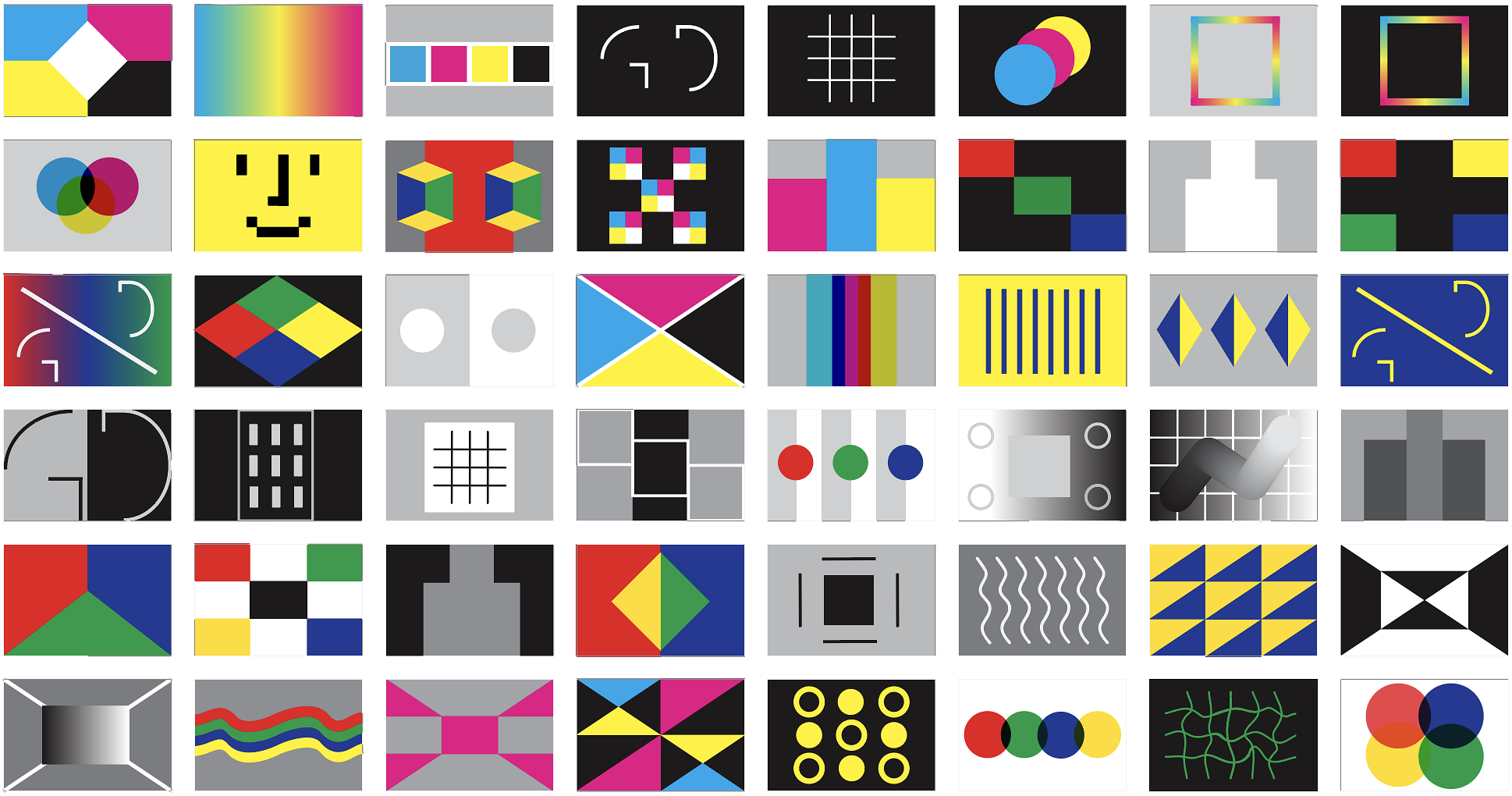


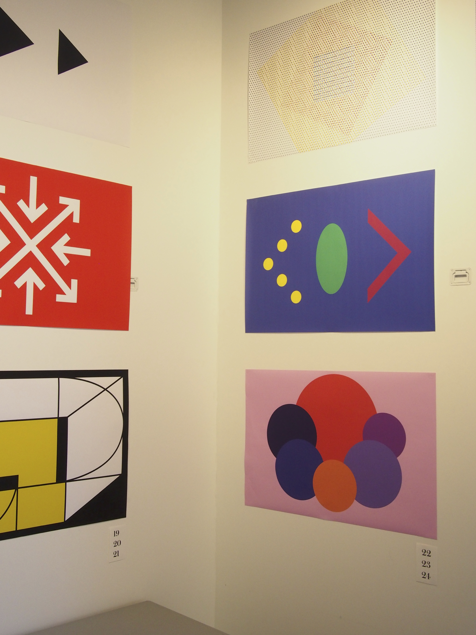


Design Studio culture
The five sections are run on one floor, creating fluid exchanges and collaborative projects. We have walkabouts most weeks, critique formats vary and the work students produce truely pushes on what graphic design is, and could be.


Design Studio Reflective Document
Design Studio requires that each student produces a reflective document at the end of the semester. I have chosen one students as an example of the document and as a window into the other four units from the semester. See the 72mb pdf
Web Programming Workshop
Learning to code by drawing
This workshop teaches students HTML and CSS using drawing assignments. To learn the syntax, they draw Scandinavian flags, small objects of their choosing, patterns and more. The drawings then are put in motion and can be interacted with. See assignments
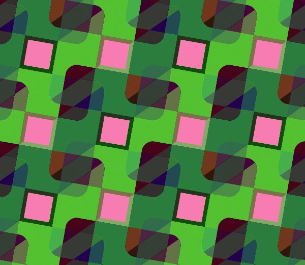


Animated compositions
Students have made animated versions of the patterns as well. The below are from my 2014 HTML Output course, where one student looked at the browser as a tool to generate animations. Scroll this web page Christina Rees.
Typography III
Designing a web interface
Redesign the web version of the Bureau of Labor Statistics’ Occupational Outlook Handbook. See full assignment
The intention of the project was to have students be able to take a user-centered version to government information. It is a classic information design problem (organizing various levels of hierarchy and varying content lengths), but within a contemporary web context. Below are a few students redesigns of the existing Occupational Outlook. Students are working in Sketch, designing responsive width mockups for mobile and tablet.


See additional mockup (72mb pdf). Students use Adobe Experience Design and InVision to make interactive mockups as well. See example .
Animate a static logo
Animate the Poetry in Motion (R.I.) logo. Create either a frame by frame animated gif or a movie in After Effects.
Motion is a common part of designing logos, social media promotion, email campaigns and more. Students were asked to animate a logo designed to accompany poetry on city busses. The animation was to be either for use on either social media or in full motion (YouTube, broadcast, etc). With new javascript frameworks like Bodymovin and Lottie, short vector animations of this sort will begin to appear more and more. See videos on Vimeo channel
The Web & Democracy
Public sites
Pick a public site from our tour or the list being created, and create a website for it that will communicate to everyone (residents, predominantly) what you value of that public possession. How might you translate what you value about the public site to the web? What can the medium of the web (and by extension the Internet) do to help bring awareness to the original? Or might the website subvert, complicate or provide an alternative read of the public site chosen.

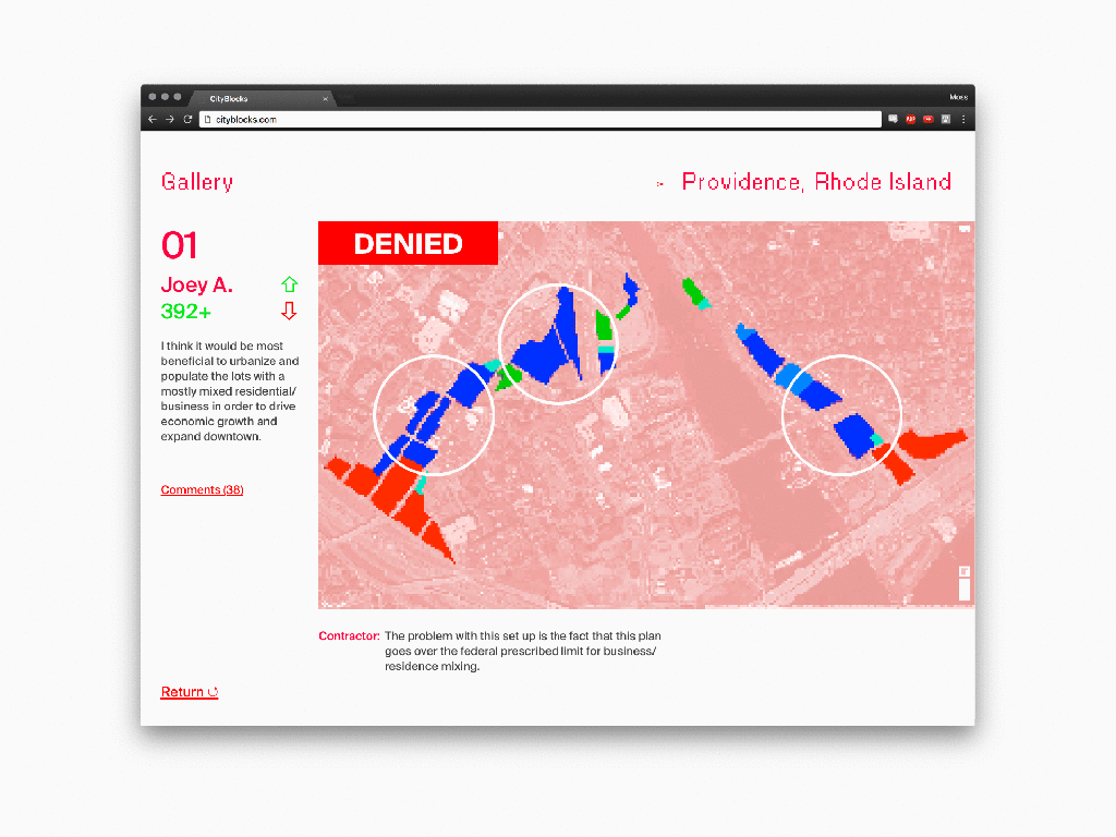
Archive
I have completed only two semesters since my last RISD dossier: Spring 2016 and Fall 2016. I have collected student work four times previously. Below are links to the pdfs of previous student work:
Flag as Civic Symbol
Fall 2017 Design Studio 1 unit given to sophomores and first-year graduate students in Graphic Design at Rhode Island School of Design.
This is the unit of study that I scripted for the fall 2017 Design Studio 1 course. The full syllabus was prepared by Keetra Dixon and includes four other faculty-led units.
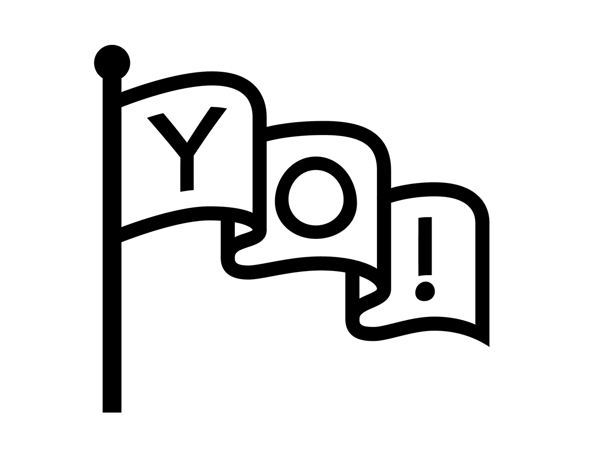
Unit overview
How can symbols communicate who we are?
The creation and appropriation of symbols to create meaning is an important part of a designer’s toolset – whether on a flag, website, emblem, logo or other context. This unit will take a close look at flags as an example of how symbols can connect (or distance) a group of people. Whether for nations, towns, labor unions, or schools, flags make use of the simplest of forms to communicate various cultural, historical or aspirational qualities of a group. This unit asks students to use observational research to better understand who inhabits a specific public space, and to design symbols — sited on flags – to speak to (and for) that public.
Learning Objectives
- Understand how symbols work
- Learn to work with simple forms
- Consider how material and context affects form
- Consider how design operates in public space
Assignment
There are four flag poles located between Design Center and the river. The sidewalk and riverfront is public land. The flagpoles have been unused ever since I can remember; an apt example for the general disregard of public things. This assignment asks you to design four flags that could be mounted there as a set. See Google Map of location.

Format
Four 6′ tall × 9′ wide (or you choose) flags. Flags may be conceived of as sewn or digitally printed; Design one side only.
Choose a concept
- Symbolize change/evolution/growth
- Symbolize community/unity
- Symbolize our divergent or shared history
- Symbolize the people
- Symbolize civic pride
- Symbolize hope (R.I. state motto)
- Symbolize four specific things (that relate or don’t)
Kickoff: Oct 10, 2017
For October 17
Observe the area at different times of day. By whom are the flags seen? From what angles are they visible? How do they relate to other symbols, buildings and the like.
Based on what you’ve observed on the river, heard in the lecture, your own research about public space, flags, symbols, Providence, etc, propose what you would like to communicate to the public on the flags. What are you symbolizing (from the list above). And how?
You will share a presentation of initial designs in your sections. Flags should consider and make use of any of the following: graphic symbols, color, photography, representational imagery, invented forms.
Make a presentation in Keynote or Google Slides that walks your classmates through what you learned, and how this research led to some initial ideas.
For October 24
Refine to one set of four 6′ tall × 9′ wide (or you choose) flags, Print each flag so its vertical dimension is 2′ tall (output at ⅓ size) for a walkabout on week 2.
Write a summary of intentions that fits on a single letter page and is printed and placed next to your four flags. Address how you came up with your solution and what you were trying to symbolize. Upload all work to this Google Drive folder.

Results
Seniors Mostyn Griffith and Ethan Anderson made a website to show off the results.
Resources
- Web resources that informed the lecture
- Providence, RI Censis Info
- Wikipedia entry of Providence
- Good Flag, Bad Flag, North American Vexillogical Association
- Designing a good flag, 99% invisible
- 99% invisible flag episode
- John Oliver on New Zealand flag redesign
- Online flag waver
- A design brief for the ages by Tim Maly
- Scott McCloud on detail/drawings/meaning
- Heller, Steven. The Swastika: Symbol Beyond Redemption? New York: Allworth Press, 2000.
- Make your own coat of arms
- Design Office: Common Flag
- Creative Time: Pledges of Allegiance
The Web & Democracy
Fall 2017 elective at Rhode Island School of Design, Graphic Design Department.
Is the Internet making the world a better place or is it simply remaking the world – peacefully transferring capital from 20th century corporations to 21st century ones? If the digital space is becoming primary, then who is tending to the systems of self-government, defined so articulately in the age of Enlightenment?
This Web research elective asks students to design tools that further the public’s interest online. Can the Web – designed as an open and free medium – reinvigorate our investment in public space and the public good? Students will work together to engage politicians, non-profits, and fellow citizens in the pursuit of these questions.
Assignments will range from Web tools that serve democracy to civic fundraising to information dissemination. Class deliverables will be a combination of prototypes, presentations and coded mini-sites. Students will develop the parameters for the final project and work in teams. Outside collaborators and readings will enrich the conversation and the work. No previous web experience required, but Web Programming workshop strongly encouraged.
Course particulars
- Fall 2017, Mondays, 8am—1pm, D.C. # 404
- Instructor: John Caserta, jcaserta@risd.edu
- Office hours, Tue/Thur 9:30a-12p, D.C. # 704
- GRAPH 3173, 3 credit elective
- wd.risd.gd – https://github.com/risd-gd/wd
Learning Objectives
- To put the Web in service of the common good instead of the marketplace
- To gain skills in Sketch, HTML/CSS and user-centered design methods
- To encourage better citizenry
- To better understand how organizations work and who they serve
- Be empowered to participate in the the web and in public
Guests
- Ryan Laughlin on Open Data APIs, Sep 18
- Danny Chapman on accessibility and the Web, Sep 25
- Councilwomen Nirva LaFortune (Prov) and Meghan Kallman (Pawtucket), Oct. 16
- Prof. Ethan Zuckerman on democratic Web platforms, TBD
Outside class activities
- Cynthia Smith, CooperHewitt Curator, at Better World By Design
- Thursday, October 5, City Council Meeting at 7pm, City Hall
- City Tree plantings, Saturdays in October, TBD
Key Bibliography
- Clay Shirky, Here Comes Everybody
- By The People, Building a Better America, CooperHewitt
- Jean-Jacques Rousseau, The Social Contract
- Bonnie Honig, Public Things: Democracy in Disrepair
Introduction
- How do people organize themselves?
- Activity: What groups do you belong to?
Unit 1: What is public?
Every group shares objects, space, etc — a resource is called ‘public’ when it refers to something state-owned. How the group manages its resources and tends to what is common is critical to the vitality of the group. Democracy is an ideal system of government, but it is rarely justly applied. Who occupies public space in the U.S. has always been contentious. And how many of the institutions we deem public are still publicly owned and managed? This unit seeks to understand the state of our public possessions, in Providence specifically, and a desire to invest everyone within them. An abandonment of what is public is an abandonment of what holds the group together.
- Where is the public? Lecture and city tour.
- Assignment 1
- Guests: Ryan Laughlin, Danny Chapman
Unit 2: From private to public
Capitalism and democracy are strange bedfellows. Capitalism collects wealth and power, with that power seeking growth at all costs. In this unit, we seek how to divert our consumptive and creative attention away from private interests to the common good – to public interests. What can be learned from the tremendous innovation being funded by the private sector? How might innovations meant for ease and commerce be diverted into the social good in the form of tools, systems, and the like?
Project Two
Visit the Providence City Council and propose a project based on the meeting. There are many things you could do (from augmented reality layers, to getting more people to attend, etc). Given the unit quesetion, consider how what the private sector has learned might work for the public.
Readings/References
- Here’s my plan to save Twitter
- The Case for a Taxpayer-Supported Version of Facebook
- Zello tops US app store as walkie-talkie for hurricane volunteers
Unit 3: Digital to physical
Can the Web, a “fast” medium (low effort, high volume), lead to “slower” more meaningful interactions/investments from constituents? In other words, how might the Web get someone off their screen and put their body alongside of others? Can the Web encourage participation from communities that tend to not participate in governance?
Unit 4: Discussion, Conversation and Debate
140 characters plus the like button have destroyed debate on the Internet. Early blogging felt more like publishing. How do we of differing opinions discuss now? How do you change someone’s mind? Can the Web facilitate this discussion, perhaps make the face-to-face discussion more palatable when it does happen. How do concerns over privacy affect free and open discussion?
Unit 5: Open Assignment
The class will hone in on three to four projects. Discuss/vote and work in teams to scope and execute the project. The project should address the basic question: how can the web ameliorate democracy: to inform people, to encourage elevated discussion, participation… all the issues we’ve discussed over the semester. We will also discuss how to put together projects from the semester into a website for distribution.
Class review on Week 12: Dec 4, 2017; Project delivery by Dec 11, 2017
Grading / Assessment
Grades from A to F will be given at the end of the semester with the below criteria. This course is a required course that is seeking a certain level of competency with typography. The criteria above is meant to assess as objectively as possible a student’s proficiency in typography.
- Attendance (3rd absence fails the course)
- Participation to website and in class
- Motivation/Attitude
- Craftsmanship
- Depth of investigation
- Risk taking
- Teamwork and individual growth
Diversity / Civility / Citizenship
No learning can truly occur without accepting each other’s differences — those that we inherit and those that we choose. This course, this Department and this College thrive on self-expression. Students and faculty should feel comfortable using art and design as a means to understand themselves and their work. It is everyone’s responsibility to create an atmosphere of civility.
Additionally, work in Design Center. Contributing to studio culture is an important part of being part of a community. Figure out ways to show your work to your peers between classes, whether informally or at certain points. You will learn as much from each other as you will from your teachers — there are 15 of you after all!
Collaboration / Plagiarism / Appropriation
All work is built upon other work; whether explicitly or not. In this course, there will be opportunities to work with your classmates to build something that is shared. Particularly with many deadlines and when learning a new skill, other people’s work may offer a pathway forward. What you do with what you see is important and can be the difference between riffing, appropriating, copying and stealing. As a general rule of thumb, if you see something you are excited about (in class or outside), understand the context in which it was made. What was the design responding to, communicating, and to whom. A deeper understanding of other people’s work generally produces additional ideas, realizations and starts to “fork” the idea (thank you, Github). It’s rare that your design problem is exactly like someone else’s. It is rare that you share the same values, interests, skills, as someone else. Referencing another person’s work can make sense (logo parodies, etc) if that fits your concept. In a school environment it’s best to check in with your teacher to see how to best make your own work truly your own.
Typography III
Fall 2017 required course for juniors taught at RISD.
In today’s world, the medium is often just the medium, as content seeks to migrate freely across platforms rather than embody the qualities of a specific medium. “Device independence” has become a goal more urgent than the task of crafting unique page layouts. – Ellen Lupton
In this third semester of typography, we focus our attention on two topics: type on screen and typographic systems. Contemporary typography, although built upon the formal inventions of the past, is evolving to work better onscreen. Typography is used in interfaces, stored on servers, rendered on various screens, and increasingly in motion. The screen, although becoming primary, is often paired with printed materials. The typographic system is the set of typographic elements that should work together, serving different audiences, substrates and technologies. This course gets into this new territory while giving students additional practice with medium non-specific aspects of typography like spacing, choosing fonts, composition, etc.
Course particulars
- John Caserta, instructor, jcaserta@risd.edu
- Rhode Island School of Design, Graphic Design Dept.
- GRAPH-3223-04 is a 3 credit required studio
- Fall 2017, Thursdays, 1:10 – 6:10pm in DC 210
- Office Hours: Tue/Thu 10-12p, DC 704
Learning Objectives
- Continued practice with the fundamentals of typography
- Introduce issues and problems related to interface design
- Develop skills and understanding of type in motion
- Deal with problems of designing for multiple media
Course Units
Type in Response
Typography is a mutable material, its properties adapting to the contexts in which they appear. It is increasingly rare for typography to exist in a fixed setting — as Lupton’s quote attests to. This section of the course will push you to become more comfortable with giving up on a single composition as end goal. We will look at how typography works on websites, mobile apps. 4 weeks
- Activity: Reverse wireframe with Sketch
- Project: Civic Design Interface
Type in Motion
With the prevalence of screens, type is constantly in motion. When entering a museum, when entering an application, letters can vary in space and time. In this section of the course, we will look at examples of typography as it has played out in films, television and other “pre-Internet” culture. Students will get experience with AfterEffects as it relates to the Web. 4 weeks
- Activity: Animate type for native Apps and the Browser with Lottie
- Project: Choose a poem, and animate it for a vertical screen that appears on the city bus.
Typographic Systems
The culminating unit in the RISD type sequence is about the ‘typographic system’. A typographic system implies a collection of fonts, spacing guidelines across many media. Institutions of any size require a thoughtful relationship of design artifacts that hold their voice together. Our area of focus will be in the cultural space, working with exhibition collateral. The typographic system will rely on all of your previous work to form a cohesive whole. 5 weeks
- Project: With museum partner. Identity, catalog, website, animated promotional screen, billboard, promotional poster, wall graphics
Additionally as Exercise / Practice
Throughout the semester, I will ask you to produce a few brush-up exercises, meant to give you practice with various aspects of typography. In each case I will ask to see your files, hoping to catch ways to help you make certain types of work better.
- R.I. Driver’s license
- Typeset a reading related to typography from Wikipedia. Make a booklet for everyone.
- Make a flyer promoting an event, selling something, or seeking a lost cat
Ongoing research
- You are responsible for adding links with typographic news/updates/etc to our Arena Channels (and your own) and logging feedback in Slack.
Schedule
Links to specific write-ups will appear here throughout the semester. Be on the lookout for relevant lectures on notices.risd.gd and announced in class.
- Sept 7: Week 1
- Sept 14: Week 2
- Sept 21: Week 3
- Sept 28: Week 4
- Oct 5: Week 5: Project 1 due
- Oct 12: Week 6
- Oct 19: Week 7
- Oct 26: Week 8: Project 2 due
- Nov 2: Week 9
- Nov 9: Week 10
- Nov 16: Week 11
- Nov 23: No class, Thanksgiving
- Nov 30: Week 12
- Dec 7: Reading Day. No class.
- Week 13: Dec 14: Project 3 due. Final review.
Grading
| 20% | Attendance/Participation/Attitude |
| 20% | Craftsmanship/Finish |
| 20% | Risk-Taking/Depth of Investigation/Originality |
| 30% | Timely completion of work |
| 10% | Technical competency |
Grades from A to F will be given at the end of the semester with the above criteria. This course is a required course that is seeking a certain level of competency with typography. The criteria above is meant to assess as objectively as possible a student’s proficiency in typography. Grades from A to F will be given at the end of the semester with the above criteria. This course is a required course that is seeking a certain level of competency with typography. The criteria above is meant to assess as objectively as possible a student’s proficiency in typography.
Diversity / Civility / Citizenship
No learning can truly occur without accepting each other’s differences — those that we inherit and those that we choose. This course, this Department and this College thrive on self-expression. Students and faculty should feel comfortable using art and design as a means to understand themselves and their work. It is everyone’s responsibility to create an atmosphere of civility.
Additionally, juniors are expected to work in Design Center. Contributing to studio culture is an important part of being part of a community. Figure out ways to show your work to your peers between classes, whether informally or at certain points. You will learn as much from each other as you will from your teachers — there are 15 of you after all!
Collaboration / Plagiarism / Appropriation
All work is built upon other work; whether explicitly or not. In this course, there will be opportunities to work with your classmates to build something that is shared. Particularly with many deadlines and when learning a new skill, other people’s work may offer a pathway forward. What you do with what you see is important and can be the difference between riffing, appropriating, copying and stealing. As a general rule of thumb, if you see something you are excited about (in class or outside), understand the context in which it was made. What was the design responding to, communicating, and to whom. A deeper understanding of other people’s work generally produces additional ideas, realizations and starts to “fork” the idea (thank you, Github). It’s rare that your design problem is exactly like someone else’s. It is rare that you share the same values, interests, skills, as someone else. Referencing another person’s work can make sense (logo parodies, etc) if that fits your concept. In a school environment it’s best to check in with your teacher to see how to best make your own work truly your own.
Mumford in the 21st Century
A reading and assignment given to graduate students at N.C. State in mid-March 2017.
The world of technics itself must be transformed: salvation lies, not in the pragmatic adaptation of the human personality to the machine, but in the readaptation of the machine, itself a product of life’s needs for order and organization, to the human personality. — page 14 of Art & Technics
Former New Yorker architecture critic Lewis Mumford gave a series of lectures in the early 1950s titled Art & Technics. His thesis should be clear from the quote above – the eloquence of his argument itself a testament to his humanist beliefs. His criticism remains prescient, even if the specifics have changed. I would like you to read the chapter (lecture) from the volume that covers the history of printing as a way to understand mechanization’s relationship to handwork. It is called “From Handicraft to Machine Art” and starts on page 59 of this pdf.
The chapter, I believe, is appropriate for graphic designers today, who find themselves buoyed by platforms of technology a layer above printing. The 21st century designer must broker the needs of the machine — or system of machines. But on what value system are these platforms built? That of the machine (efficiency, predictability, etc) or of the person (in an idealized state, perhaps)? What is defining our profession that we don’t get to question?
When in Venice, California recently, I feasted on the latest works of great architects – the Broad, in particular. Contrast these rare feats with the humdrum of new residential buildings, which could be described as UX Modernism (see figure 1) — highly predictable, quickly produced and made as palatable to all involved. I discovered that many of the homes were made by leaders of the tech sector nearby in Silicon Beach. Are the factors that create generic contemporary buildings not dissimilar from the factors that make for generic user interface design? Is custom, hand-made design, impossible to manage on a large scale? What is the role of the machines (codebases, templates, rate of change, etc) in how we design? Is the history of Graphic Design no one of the history of machines – a profession defined by its departure from manual lettering?
During my visit to your class, I would like to show you how I’ve attempted to hold onto humanist values in my own work. Following this show and tell, I’d like to discuss how Mumford’s lecture applies to your work in school and beyond (if it does). Where do human values play into design? How do they come in conflict with the values of machines — and, now, automation? Are you excited about the role of machines in your work?
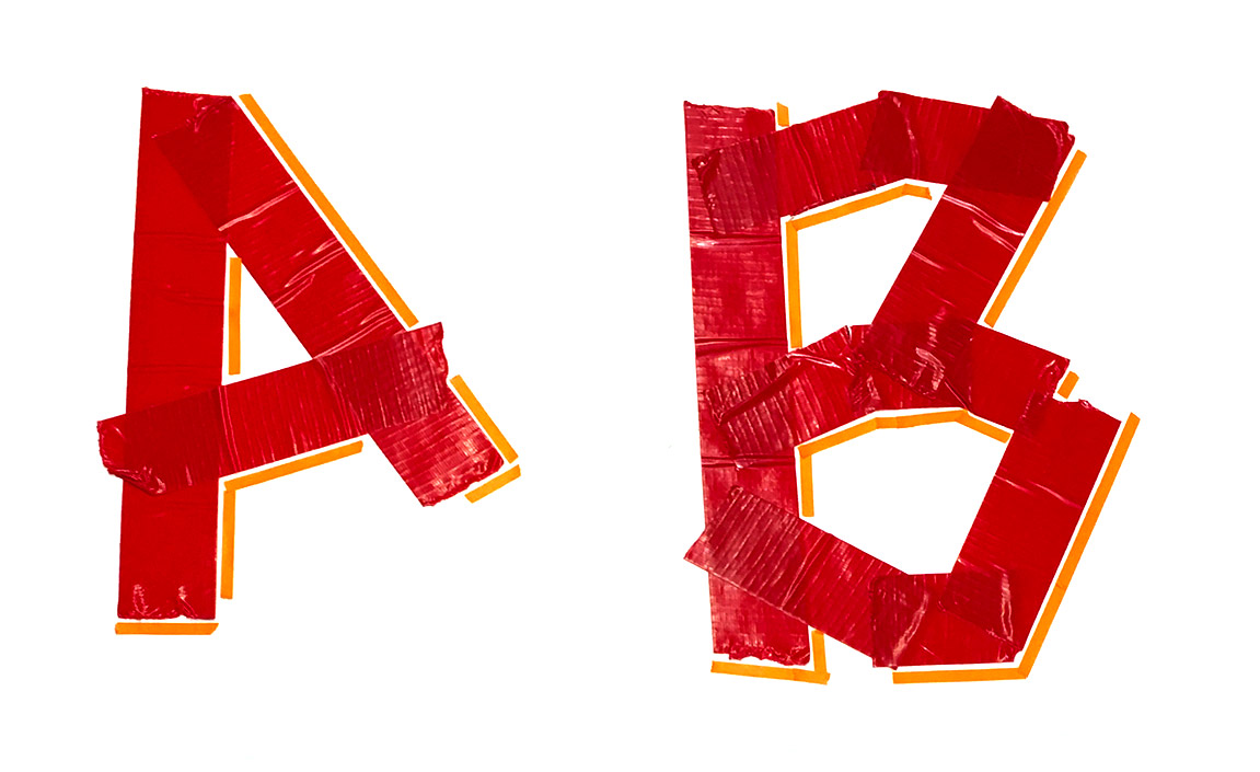
Type and Materials
Activity and talk given at Brown Design Workshop on Wednesday, March 15, 2017, 5pm – 7pm
The shape of letters is dependent on tools and materials. Materials are involved in two ways: the material used to inscribe letterforms, and the material into which the letters are inscribed. Letters are made by something and exist on something (or in it). The history of typography shadows the history of printing presses and papermaking. But given the boon in digital fabrication options, letterforms themselves are finding new shapes. Whether on plastic, styrofoam, wood, vinyl, metal or made by hand, letters can look like almost anything if you work with the material to shape the letterform.
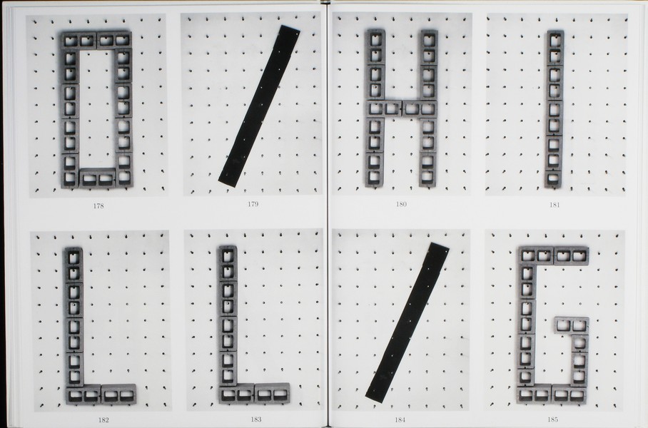
I will show digital and physical examples of typography made with various tools and materials. Attendees should bring their laptops in order to fabricate their own letterforms in the Brown Design Workshop. Some materials will be on hand, but attendees are encouraged to bring their own.
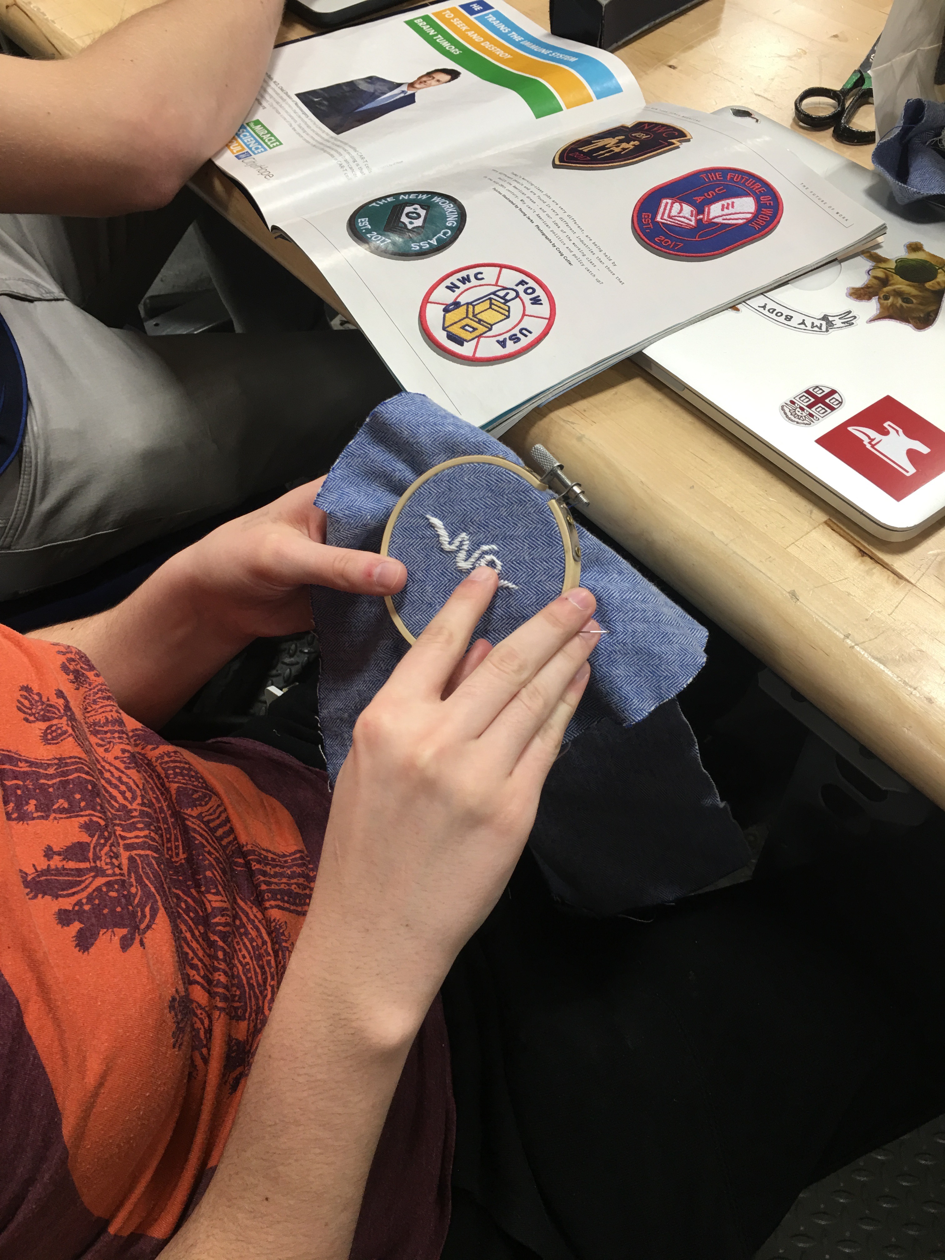
Index of works
I have started a Type & Materials collection on arena. Anyone is welcome to add to this open collection of bookmarks. Each block (bookmark) is tagged with a material or tool below.
- bike chain, brick, building projection, caution tape, cement, clay, computation, desks, dots, earth, everyday objects, fabric, fence, flag, flowers, food, furniture, granite, hair, hands, hot dogs, LED, lego, letters, light, lips, light, light bulb, marble, meat, metal, milk crates, neon, newsprint, organic, people, perforation, plastic, powder, router, rubber stamps, scissors, sheets, stencil, stairs, sticks, stone, styrofoam, sword, tape, thread, traffic light, water, wax, weave, wire
Let’s make something
In the time remaining, design and fabricate the word “we”. Pick a machine and a material (clean or used) first, then make a design based on your choice. How can you push the conventional shapes of the letters based on the material, the machine and your own desire to stay something. Instagram pix of your final images with a mention of “@designofficepvd” and hashtag “we-made-type”
Design Studio 1
Fall 2016 required course at Rhode Island School of Design, Graphic Design Department.
Graphic design occupies an ever-expanding, ever-redefined territory at the intersection of verbal and visual languages. Its media spans everything from websites to postcards, film to signage, typefaces to billboards. Its methods make use of both sides of the brain: pairing logic, critical analysis, research, and planning with intuitive search, mark-making and visual expression. Graphic designers are inquirers, observers, poets, editors, curators, analysts, researchers, commentators, and critics.
Rather than attempt to codify this expansive landscape, or to delineate a sequential path through it, this course takes this ambiguity as license for experimentation, discovery, and play. You will encounter and engage the tools, materials, and processes of graphic design in functional context, as means to self-directed ends.
The emphasis will be on methodologies of making — observation, analysis, ideation, translation, curation, research — and on developing personal voice.
Design Studio will take the form of a series of question-based units, each initiated by a faculty member and contextualized by a presentation, event, or workshop. Units may span the entire term, a few weeks, or a single class period. Design Studio is a fast-paced course that necessitates a self-directed, open-ended, experimental and playful mindset. Units will not define outcomes or prescribe processes, but rather will aim to inspire lines of enquiry, challenging students to explore unfamiliar subject matter, tools, media, and processes by their own initiative.
Course particulars
- Rhode Island School of Design, Graphic Design Dept.
- Graph-3210, Fall 2016, 3 credits required studio
- Tuesdays, 1:10 – 6:10pm, DC 210
- Instructor: Assoc. Prof. John Caserta, jcaserta@risd.edu;
- Office Hours: DC105, Mondays 10:30am–1:30pm
- ds1618.risd.gd
Overview
DS1 pushes students into a variety of directions, introducing critical tools, methods and content areas in the field. DS1 assumes no prior knowledge of tools or skills, but is not designed as ‘introductory’. Finished projects are not the intended outcome of DS1.
Learning Objectives
- Develop habits for self-directed research and inquiry
- Develop critical thinking skills
- Develop rhetorical, communication and presentation skills
- Encourage a pluralistic approach to design problems
- Encourage work with emerging media
- Address and participate in contemporary social and cultural issues (in design)
- Place present day challenges within historical context
Semester-long Deliverables
- Sketchbook. Collect your thoughts, sketches and observations somewhere
- Research/Inspiration Blog. Think of this as the digital equivalent of your sketchbook. Collect digitally native material (websites, videos, etc) somewhere. May we suggest: tumblr, arena, dropmark, pinterest, google drive
- Reflective Notes as insights or awareness on a curiosity, excitement, or experience. Writing notes about your previous work will help to compile the reflective document at the end of the semester.
Units
Unit 01: Keetra Dixon
How can you translate what you see into a graphic language?
In 1919 Kandinsky wrote an essay in which he used the metaphor of verbal “language” to discuss the laws of visual form, calling simple geometric shapes “forms belonging to the first sphere of graphic language.” He came up with the full metaphor of “visual language” not long after and it has since become a foundational concept in the study of graphic design.
In this unit, we’ll use the basic structures of language to lead an interpretive deconstruction of our surroundings, transforming them into a distinct graphic language. Just as paragraphs can be broken into words and words can be broken into letters, we’ll break photos of our environment into their basic formal elementals. We’ll translate those elements into new forms, exploring a variety of materials and tools as we go. Your collection of forms will then be used to create new compositions, a graphic language all your own. See more on Unit 1
Unit 02: Tom Ockerse
How can the graphic medium enhance, enrich and deepen the verbal message?
In engaging with the world around us, and our routine to “make sense” out of complexity, we take for granted the perceptual and holistic principles this interaction involves. That perception of parts and configurations as a holistic system depends greatly on the use of so-called “gestalt” principles (i.e., figure-ground, similarity, closure, etc.) and how these serve the purpose to communicate. Since graphic design presents ideas primarily via graphic means, awareness of these perceptual principles is critical for designers to help their products stimulate clarity and unity, curiosity and interest, inquiry and insight. We will look into this power of graphic design to discover how an abstract (non-visual) object like a “word” (i.e., a verbal means to represent an idea) can be enriched significantly toward a deep sense of poetic insight due to its combined graphic/visual delivery, and thus provide a lasting impression of value for the ideas it holds. See more on Unit 2
Unit 03 John Caserta
How can we use symbols to unify a group?
The creation and appropriation of symbols to create meaning is an important part of a designer’s toolset – whether on a flag, website, emblem, logo or other context. This unit will take a close look at flags as an example of how symbols can connect (or distance) a group of people. Whether for nations, towns, labor unions, or schools, flags make use of simple forms to communicate cultural, historical or aspirational qualities of the group. This unit asks students to perform basic ethnographic research to better understand the values of a group, and to design symbols — sited on flags – that communicate those values. See more on Unit 3
Unit 04 Thomas Wedell
How does the sequencing of information affect communication?
One of the main concepts necessary to understanding the design process is the use of time. Careful ordering and distribution of information is essential to successful communication.
In the expanded world of graphic design, time plays a major role. Not only in how we engage in the design of an exhibit or screen based project, but also in the considerations a designer must build into two-dimensional “fixed” surfaces, such as signs, books, posters, and charts.
The graphic designer today must learn to master the art of pacing. How a viewer encounters information in a specific sequence and the pace at which that information is viewed, is one of the basic elements of communication. The order in which ideas are accessed is at the essence of any project. See more on Unit 4
Unit 05 James Goggin
Does design imply the idea of products that are necessarily useful?
In 1969, the French curator Yolande Amic posed this very question to designer Charles Eames. His reply? “Yes, even though the use might be very subtle.” The unit will question divisions and overlaps between beauty and utility, and between art and design. What makes something useful? What kind of use is deemed valid in design? Should design solve problems, eliminate labour, and/or aid in the creation of capital? Can a design that simply makes us laugh be considered “useful”?
We will conduct experiments and make proposals, aiming to challenge thinking about utility and beauty, and subvert conventions of common tools, formats, systems, and objects. With the overview we are often afforded as connectors between — and participants in — authorship and production, graphic designers have the power to challenge expectations and provide utility in unexpected but entirely appropriate, even delightful, ways. See more on Unit 5
Grading
| 20% | Contribution: Attendance, participation, motivation and personal commitment |
| 20% | Inquiry: Research, search, study, and networking of knowledge and insights |
| 20% | Breadth: Range of experience, willingness to experiment, take risks and broaden horizons |
| 20% | Depth: Attention to the quality of ideas, critical thought and authenticity and voice |
| 20% | Finish: Demonstration of skills in craft, visual design, presentation and communication |
Grades in D.S. do not emphasize end products, but the necessary work that leads to successful end products. Evidence of your effort and competency are visible in the research blog(s), sketchbook, participation in class, and completion of the unit assignments as directed by the faculty. The below categories are meant to make assessment more clearly measurable by student and faculty alike.
Etiquette
Be present. Consider taking notes with pencil and paper, it has been shown to help you remember – and unexpected doodles may occur. Students should arrive on time and prepared for each class. Three unexcused absences will result in failure of the course.
Web Programming
Four session workshop that used drawing to teach HTML and CSS.
This three-session workshop combines the tactical skills needed to structure web pages with a looser more playful compositional mindset. Students are introduced to the structural elements and properties of HTML and CSS through hands-on demos, in-class exercises and take-home assignments. Tight technical HTML drawings in week one give way to full-screen abstract compositions in week two. Week three incorporates interaction, introducing CSS3 transform, animation, and other user-controlled properties. The final assignment for week four will allow you to combine what you learned in the first three weeks.
Although written with HTML/CSS, the assignments are inspired by the contemporary and historical print works of Bradbury Thompson, Karel Martens and Paul Elliman. Paramount is that students become attuned to the vocabulary and possibilities of graphic form in the digital age. The digital age, similar to the era before in its capacity to precisely arrange or playfully experiment.
Course particulars
- Wkshp: Web Programming; RISD GRAPH-3188
- Spring 2016, 1:10–6:10pm, Fridays, DC 404
- 1 credit elective
- https://github.com/risd-gd/wp16
- Instructor: Asst Prof John Caserta, jcaserta@risd.edu; DC105, Mondays 10:30am–1:30pm
- TAs: Brian Hicks (session 1); Marie Otsuka (sessions 2 and 3)
Course objectives
- Be introduced to HTML and CSS syntax to help conceptualize future projects
- Encourage use of the browser as a place for experimentation
- Introduce both analytical and playful working methods
- Be introduced to instructions-based making — HTML being one of many coding methods
- Be comfortable editing existing themes or websites
- To learn how to find answers online to coding problems
- Learn to work collaboratively in an open-source model
Schedule
Week One: Concrete Forms
Week one emphasizes the strategic and deliberate construction of space on a web page. There is a certain mindset and process in making what you’ve sketched/imagined.
- Assignment 1: Drawing a flag
- Assignment 2: Draw found objects
Week Two: Abstract Forms
Week two encourages a different mindset. How can you work with the code and the browser to discover designs as you make.
- Assignment 3: Abstract compositions
- Assignment 4: Patterns
Week Three: Active Forms
Motion is an incredibly important part of a site. Here you learn CSS properites for movement and how to activate events using jQuery.
- Assignment 5: Movement and interaction
- Assignment 6: Responsive animation
Week Four
- Review assignment 6
- Lecture: From sketch to code
- In-class activity: Putting it all together
- Possible future assignments
Software needed
- Textwrangler or other HTML editor
- Join GitHub and let’s add you to the team!
- Download GitHub Mac client and clone class repo
- Safari or Chrome browser
Grading
| 40% | Attendance |
| 40% | Completion of all assignments |
| 20% | Risk-taking/quality of end forms: |
- You are expected to experiment, iterate and form innovate designs with the coding that you’ve been shown. Because work from previous sessions is available, you are able to appropriate code, but in service of your own ideas and forms.
- Missing one class without permission fails the course
- Although we are “wired” throughout the workshop, avoid being plugged into Facebook, email, etc.
Teaching: 2006—16
Academic appointments with links to course materials where available. Teaching appointments are at RISD unless otherwise noted.
A list of teaching appointments with links to course websites or class documentation where available.
2015-16
- Web Programming: 4-week (once-a-week) one-credit workshop, spring semester
- Design Studio 2: Year two of the new GD undergraduate sophomore studio, spring semester.
- Design Studio 1: Year two of the new GD undergraduate sophomore studio, fall semester.
2014-15
- Web Programming: 4-week (once-a-week) one-credit workshop, spring semester
- Design Studio 2: Spring semester studio for sophomores
- Design Studio 1: Maiden voyage of the new GD undergraduate studio, fall semester.
2013-14
- HTML Output: Elective exploring the web browser as general interest design tool
- Digital Bits: 3-day workshop for sophomores introducing web programming
- Graduate Studio (with Bethany Johns)
2012-13
- Call for Proposals: Interdisciplinary elective looking how to form and communicate ambitious projects.
- Visual Systems: Three credit spring studio for juniors
- Relational Design: Three credit spring studio for juniors
- Digital Bits: 3-day workshop for sophomores introducing web programming
- Making Meaning: Six credit core studio for juniors
- Web Design: Two week summer course taught at RISD
2011-12
- Degree Project: Senior Degree Project
- Visual Systems: Three credit spring studio for juniors
- Data-Driven Design, Taught at UConn over 4 weeks (once-a-week) and during the summer at RISD (for 2 weeks)
- Web Design: Two week summer course taught at RISD
- Graduate Open Research, Wintersession
- Graduate Typography 1
2010-11
- Degree Project: Senior Degree Project, spring (I taught two sections)
- Visual Systems: Three credit studio for juniors, spring
- Web Design: Two week summer course taught at RISD
- Graduate Open Research, Wintersession
2009-10
- Visual Systems: Three credit studio for juniors, spring.
- Graduate Open Research, Wintersession
2008-09
- Visual Systems: Three credit studio for juniors, spring.
- Graduate Open Research (with Achim Weiland), Wintersession
- Graduate Form & Communcation
- Expressive Form with HTML and CSS Workshop: 3 session workshop using HTML and CSS to make graphic form
2007-08
- Graduate Typography I
- Graduate Open Research (with Jeffrey Lai), Wintersession
- Serendipity in the Digital Library Workshop
2006-07
- Graduate Form & Communication
- Graduate Open Research (with Ernesto Aparicio), Wintersession
- Serendipity in the Digital Library Workshop
2005-06
- Graduate Open Research (with Bethany Johns), Wintersession
- architecture
- Aki Nurosi
- AIGA RI
- AirBnB
- Anais Missakian
- Andrew LeClair
- Anther Kiley
- bench
- Ben Shahn
- Benjamin Shaykin
- Bethany Johns
- Black Mountain College
- blob
- Bonnie Honig
- book
- Brooks Hagan
- bullshitter
- button
- Catherine Schmidt
- civic
- Clambake
- clown
- collab
- CSS
- Dan Wood
- David Reinfurt
- democracy
- Design Office
- Design Observer
- Dieter Roth
- Doug Scott
- draw
- election
- Evan Brooks
- flag
- font
- FontSquirrel
- for/with/in
- Gerd Arntz
- GitHub
- Greg Nemes
- Gwen Farrelly
- Harold Taylor
- HTML
- iPhone
- Jacquard Loom
- James Goggin
- Japan
- Jiminie Ha
- Jon Rinker
- John Seely Brown
- Jose Menendez
- Joy Ko
- Karel Martens
- Keetra Dixon
- laser
- Lewis Mumford
- library
- Lisa Maione
- LGBTQ
- Locally Made
- Lottie
- Lucinda Hitchcock
- Lukas Eigler-Harding
- machine
- Meghan Kallman
- Micah Barrett
- Michael Bierut
- Model T
- Moo
- Moore's Law
- Nancy Skolos
- Nic Schumann
- Nirva LaFortune
- Noun Project
- Other Means
- Paper Football
- Paul Soulellis
- Peter Yeadon
- philosophy
- pictogram
- podcast
- poster
- Providence
- public
- RISD
- RISD Works
- Riso
- Rhode Island School of Design
- Rousseau
- Ruben Rodriguez
- Rudolf Modley
- Salih Abdul-Karim
- Sarah Rainwater
- Sarah Verity
- Shannon Ebner
- Snowglobe
- textiles
- Thomas Wedell
- Tom Ockerse
- tool
- Various Projects
- Wall-E
- web
- website
- weft
- William Stafford
- Work-Shop
- workshop