The web browser has evolved quite a bit since it appeared in 1991. First there was text-only, then images, then table layout, then CSS, then javascript, then font embedding, and now almost anything is possible. I have been designing websites since the mid-1990s and they used to be just that, websites. Occasionally there were print and web deliverables for a project running in parallel.
In 2012 a couple things happened: The Design Office moved to a new space that would allow events and public programming. And the Web was becoming a more important way to distribute information than paper (we were passing the tipping point). Immediately after opening the new space, we started hosting events. We would create posters to promote them. But the poster became a fetish/speciality object (identity for event) more than a useful piece of promotion. The core visual character of the poster would make its way online as an image (with a “like on Facebook” button below it).
When we began to run events about once-a-month, a custom poster was too much and so I looked to our Website to communicate the details of the event (with some flair), but also to see if a printed flyer could be printed from the site.
This body of work comes out of a desire to see more avant garde websites: ones that have the voice and sophistication of a printed poster, but can be accessed on the computer at a URL. By producing a paper bi-product of the browser version, it would make the screen version better – holding it to the standards we’ve come to expect from printed ephemera.
And fundamentally, I do not want to give up on the physical environment. Coffee shops should have posters, flyers and the like. The majority of posters in coffee shops are made by printmakers and illustrators – as designers have moved their work onto the screen. A printed website is an interesting offering to that culture, I think. And the piece of paper tends to outlive the web counterpart. The original DO web template is no longer, web font providers for other projects have gone under, a tool that embeds Google Sheets data on websites is no longer supported. In short, at least half of these projects can no longer be browsed.
I continue to investigate this browser as a general purpose design tool. Below are projects that fit within this investigate — some done collaboratively.
Design Office events
This format was used from 2013 until 2015 to promote events at The Design Office. It used Wordpress to edit the content and had custom styles for printing to paper. The flyers varied in composition depending on the content. The screen versions of the posters would feature animated gifs or variations on the same imagery. Although the webpages output to flyers, the website itself changed depending on screen size. Some examples of event layouts are below.


DO Summer Fellowship - 2014
Single page website created with Catherine Schmidt to promote The Design Office’s summer fellowship program – which was in its first year. The URL was sent to heads of MFA programs around the country with the note: print this webpage to a tabloid piece of paper. A scrolling feature distorted the sun icon into abstract shapes.


HTML Output
for/with/in is a website and book that collects projects, interviews and code produced by the students and myself within a three-month course at RISD. The course and final project investigates the web browser as a general purpose design tool. The website outputs to a book. Book printed by IngramSpark and was available from Draw Down Books, Printed Matter and William Stout Books.


DO Summer Fellowship - 2015
Single page website for The Design Office 2015 summer fellowship. Designed to print to a letter-sized flyer for posting. The main typography was a css animation using a color flare. Depending on when the flyer was printed, the color was different.


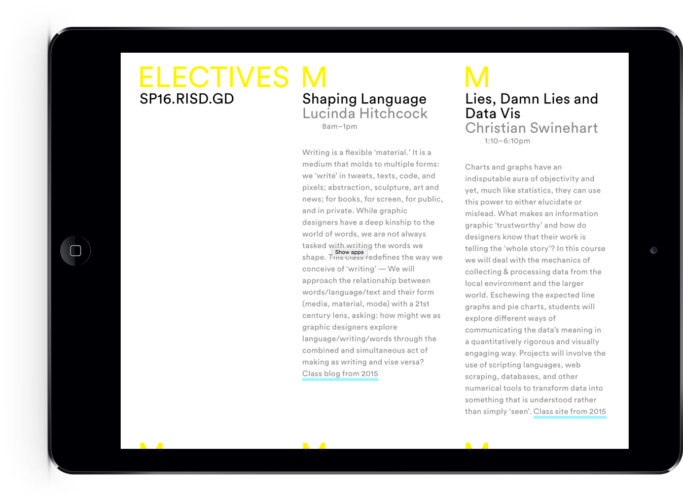
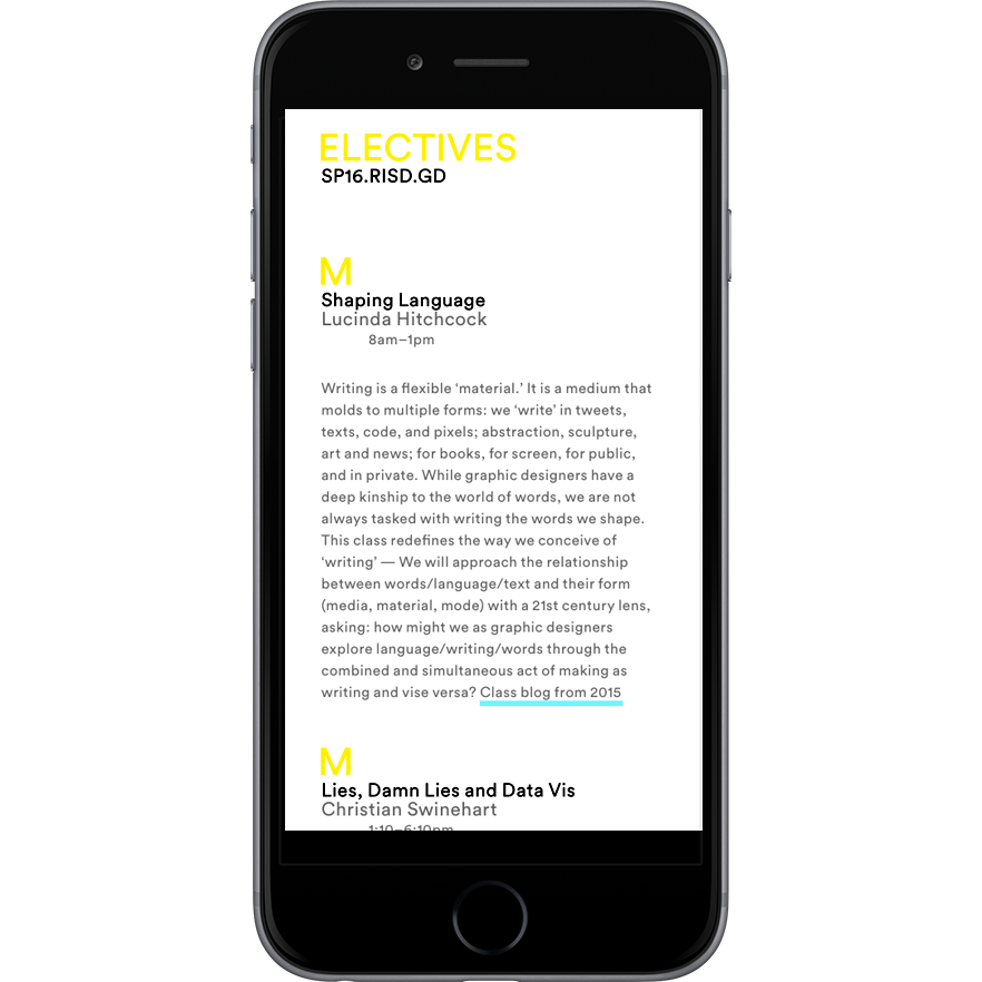
Spring 2016 Electives
With electives gaining importance at RISD GD – as sites for research, specialization, experimentation — it seemed appropriate, and celebratory, to announce our elective offerings. Given the community is based only in two buildings, a digital poster seemed like the right format. But also useful to that community would be a single serve website, where the information could be reviewed in depth no matter where the student was located. The information would also be of interest to the greater design community: What is RISD offering? What is the state of Graphic Design education? I designed a web to print solution to satisfy both scenarios. The website used Google Sheets as its content source, so edits could be made to course information by several people, and it is formatted for mobile, desktop and a 35″ × 47″ poster.

Cyan, Magenta and Yellow Google Images overlay
How does Google understand color? How do words and color relate? These questions led to a variety of Google Image searches. Ultimately, I enjoyed how the results of a color were almost monochromatic… search for yellow produced a virtually yellow page. This print combines the three primary colors used in printing: cyan, magenta and yellow. Each page is output to pdf from Google Chrome and overlapped in Photoshop. Printed on a rug by Society6.


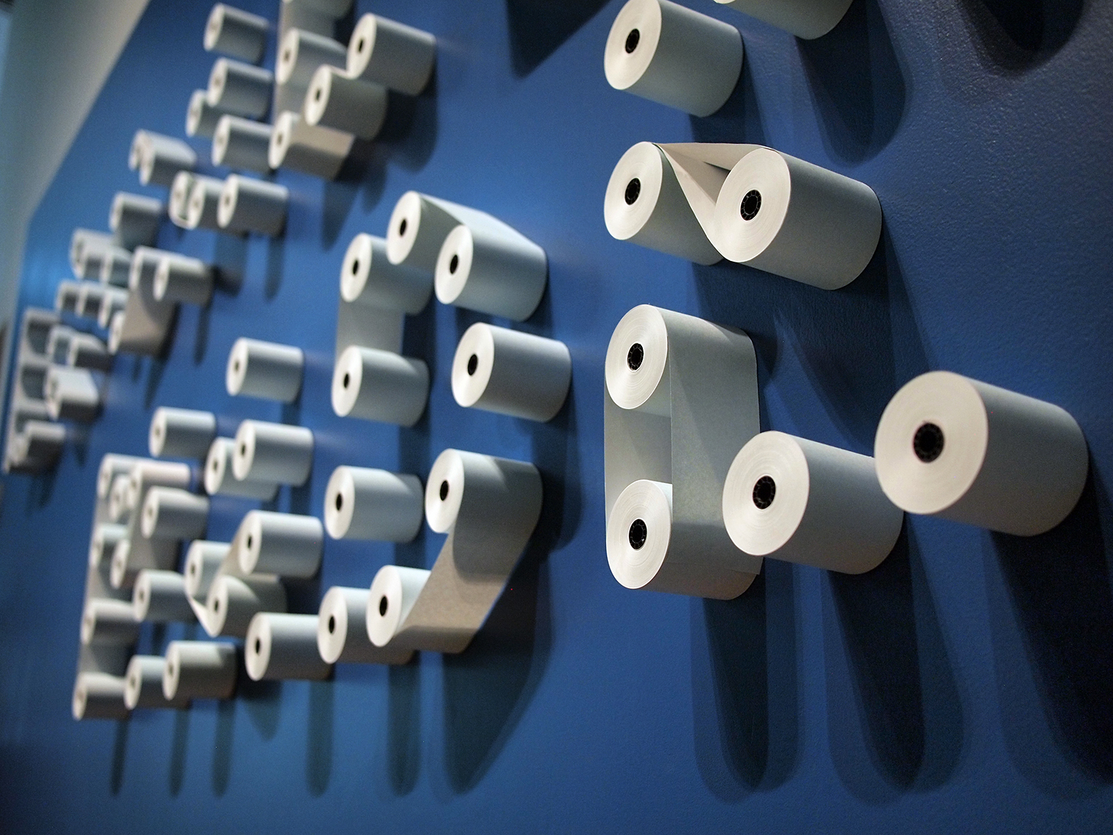
Locally Made Daily Guide
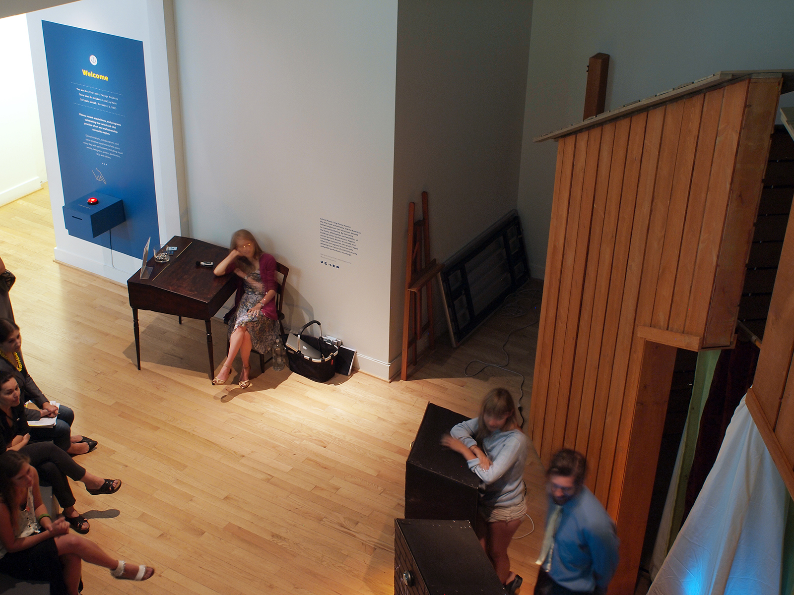
Exhibition graphics and print-on-demand daily guide for the summer 2013 RISD Museum show, Locally Made. A receipt printer outputs an up-to-the-minute guide of the day’s events, the weather, and show information. In collaboration with six fellow Design Office members. See three videos showing the daily guide.


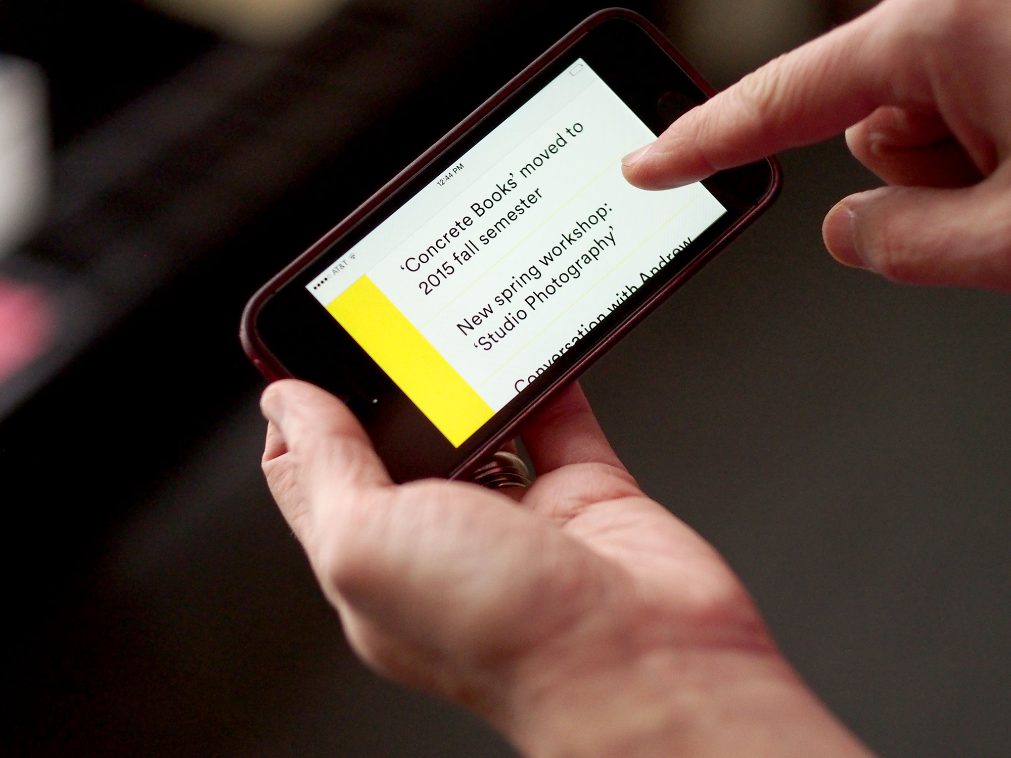
RISD GD Notices
‘Notices’ is a tumblr theme that generates a simple website, printable pdfs and an animated full-screen slideshow. Designed so notices reach people in real space, but features a rolling archive in the cloud. The flyers can be distributed around campus, overprinted with other imagery and printed by folks offsite. I initiated the project and commissioned Andrew LeClair and Adam Lucas to design and develop the project.


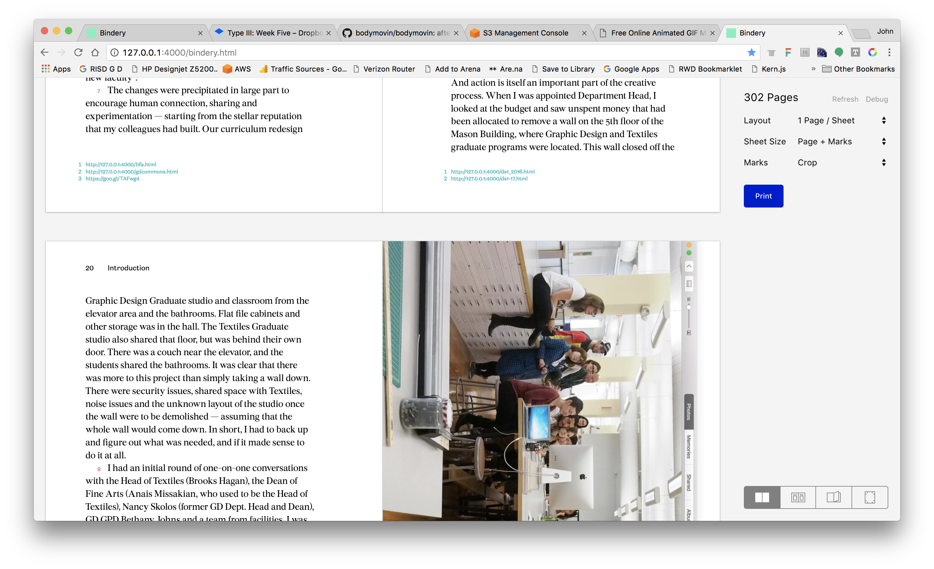
Bindery 2.0
This site (and book) have been generated with the latest version of Bindery.js, developed by Evan Brooks. The current 2017 version balances ease of production while giving the more technically oriented designer options to rotate, index work and more.