Modern Pictograms grew from the need to have crisp and consistent icons on the Web. In 2010 I was working with Andrew LeClair on Flatfile, a Wordpress theme for artists. We wanted to let artists customize the color of the theme pretty easily; including the icons to email the artist, to post to Twitter and Facebook. Embedding fonts was supported in newer browsers, so having a small set of icons in a font solved our color customization problem. Most icons at the time were pixelated images and rarely worked well together (see figure 1).

There was only one icon font available at that time: Pictos. The price for licensing it was too high, so I decided to draw my own. What started as a few icons for the Flatfile theme (released in 2011), evolved into a free font of 80 icons — the first free interface icon font available on the Web.
The font was distributed by various services and embedded into tools. Encouraged by its popularity, I added another 200 icons and licensed the updated version for $25 in 2013. I continue to add drawings to the set, driven less by the needs of interfaces and more by the symbolic meanings that can be read into everyday objects.
Given advances in web browsers, I now draw icons in layers for easy animation and color use.
Drawings
The initial version 1 set was drawn to work small, down to 18 pixels for the Flatfile theme. There were no retina screens, either. Some of the icons worked fine larger, but many were simply too crude. When I began to add new icons to the set, I revisited some of the originals. The driving principle for the drawings was – and continues to be — low contrast weight like a body font but with details like a display font. Details fall away at smaller sizes, but come through at larger ones. A good example of this is the lock icon, with its tapered dashes, which bring out the shape of the knob when seen on retina screens or enlarged.
Version 1 of the font is still available on FontSquirrel. It has been downloaded more than 290,000 times. The Design Office hosted a project page with a link to the free download.


Version 2 website
A single serve website was launched in conjunction with the release of version 2 of the font. There have been three sites since the 2013 launch, each with its own mission. The version 2 site was there to showcase the set and sell fonts. One way I described the font was that it is the Helvetica of icon fonts — usable in most situations and fairly neutral.
The website design was meant to play up a Modernist aesthetic while not falling into the visual troupes of Modernism. The site was geared toward encouraging web developers and designers to buy the font and specimen. Site developed with Greg Nemes.

Version 3 website
By 2015, the icon market became saturated – many fonts from major companies and frameworks were available for free. Ruben Rodriguez of The Design Office and I worked up a new site that emphasized the breadth of meanings of the icons. The website switched from a marketing site into a tool that highlighted a searchable tagging system, so icons could be found easily through typing. Users could buy single icons (as SVGs) or the font. Users could suggest icons right from the site as well. The site was a specimen, encouraging existing buyers to return to find new meanings in the set.

Version 4 website
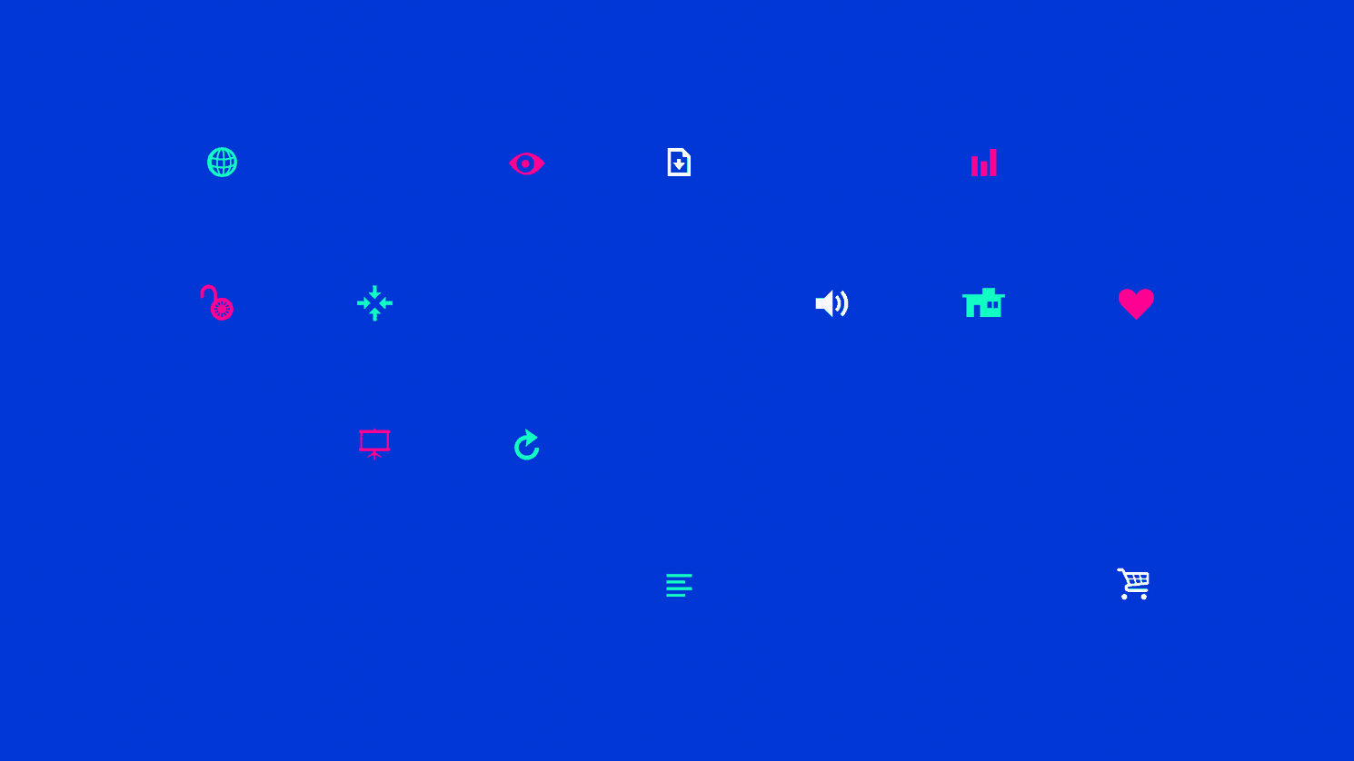
In 2017, the Modern Pictograms website was updated to show off some of the collaborative projects that have resulted from the icons. AirBnB Design has animated a bunch of icons and made their files available. The website aims to show off the craftsmanship of the icons and their potential uses. The drawings have become more symbolic in nature; suitable for presentations, signage or most any use online or off. See the website.

Resulting projects
Version 2 specimen
Designed with Micah Barrett, the offset printed specimen folds up into an iPad sized booklet. Given away at lectures and sold online, the specimen aimed to get the icons offscreen and into high resolution and physical space.


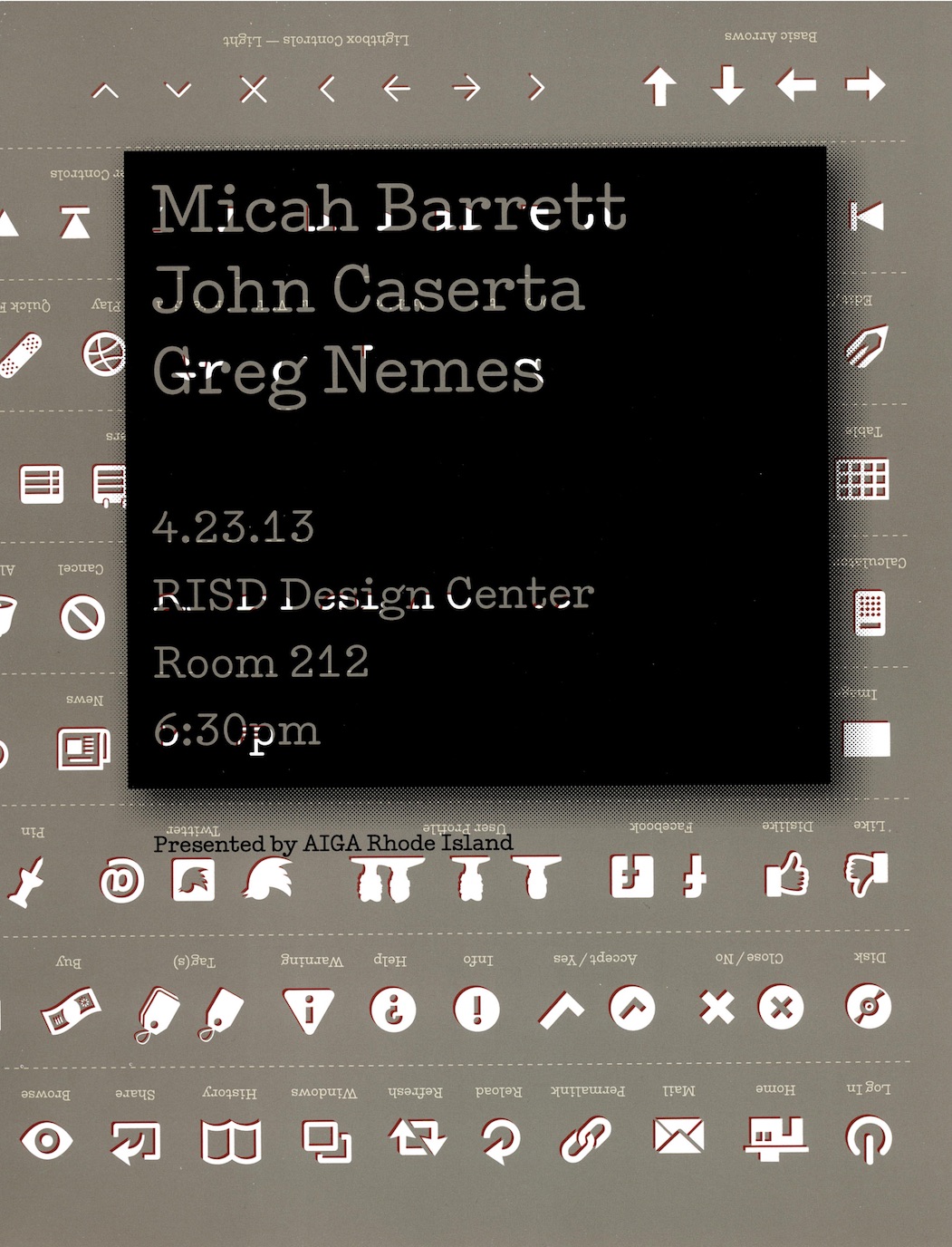
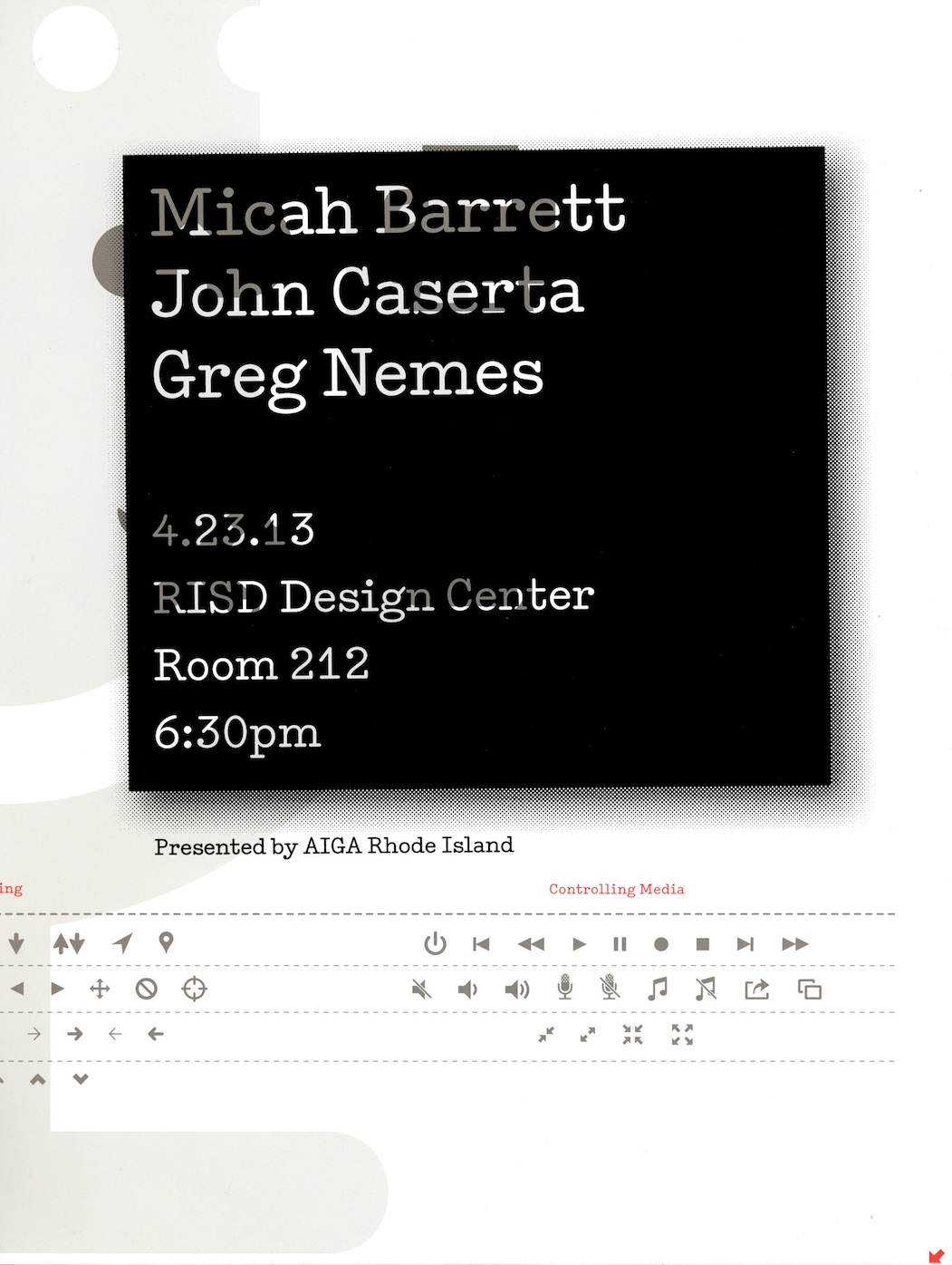
Lecture and poster
Micah and I made flyers from the press sheets to promote our talk for AIGA RI.


Airbnb animations
The Noun Project and Airbnb Design collaborated to bring Modern Pictograms into motion. Airbnb has developed an open-source animation tool for designers called Lottie. Read about the process of animating the icons for Lottie on Airbnb design’s blog.

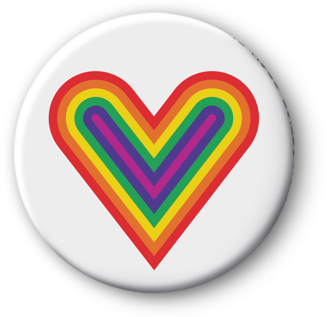
AIGA RI Button
Created to support LGBTQ rights for Valentine’s Day, the heart symbol was put on buttons and made into a print for AIGA Rhode Island’s See Us exhibition.
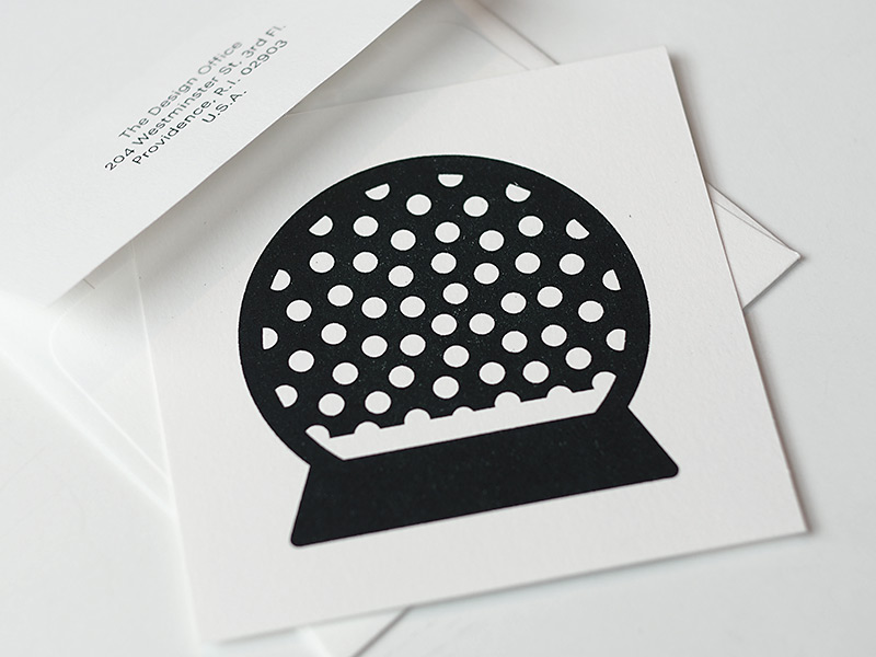
Snowglobe Risograph print
Printed with Benjamin Shaykin at The Design Office, the snowglobe print marked both 2017 and the latest addition to the set. Risographs create a misty surface, a printing process appropriate to render the dreamy snowglobe. Buy the print
Lasercut office supplies
I have lasercut some of the pictograms to see how they might operate back in real space. Certain ones have a pseudo-functional element to them. The paperclip is usable if it’s rotated. The key opens no doors, but works on a keyring. The scissors could be used to stab someone, but not to cut anything. The unlock icon cannot lock a locker, but it can claim a locker – becoming a symbol of trust, the opposite of what it was intended to do.

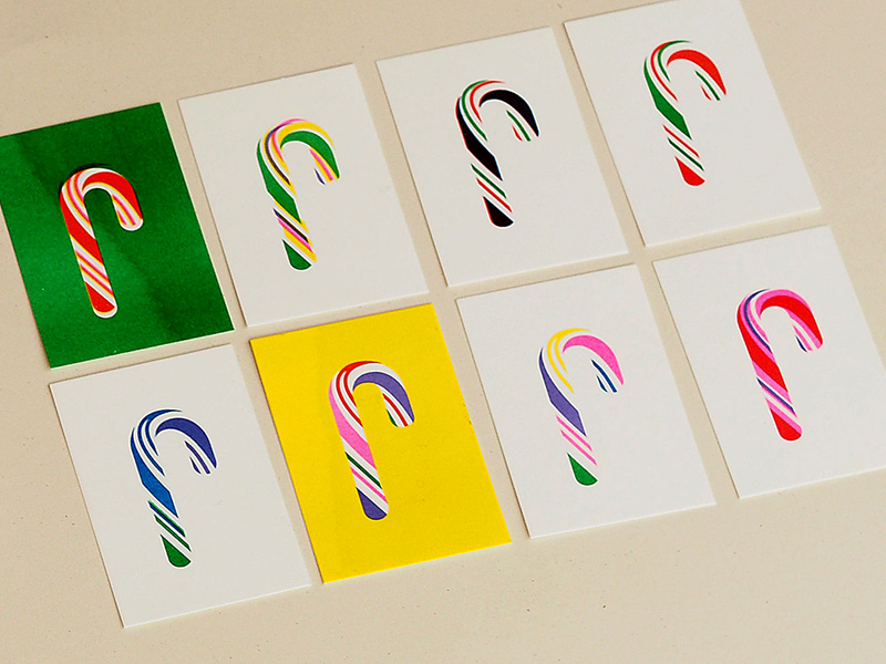
Candy Cane Risograph prints
These eight six-color prints marked the release of version 2.78 in the winter of 2018. This release promoted support for layered SVGs, making it possible to easily target parts of the normally red candy cane.