In the spring of 2017, Providence Ward 3 Councilman Kevin Jackson was ousted in a recall election. Providence native Nirva LaFortune stepped up and ran on the platform that she would bring the various factions of the Mt. Hope and Summit neighborhoods together. Having a female candidate (and person of color) run so quickly after Hillary Clinton’s defeat energized many of us. I also knew Nirva, and was convinced she would represent the people well. I jumped in to help, working with Campaign Manager Kath Connolly to create the identity and templates that could be used to target the neighborhood. She won both the primary and the general election. Did the graphic design contribute? Maybe.
Purple
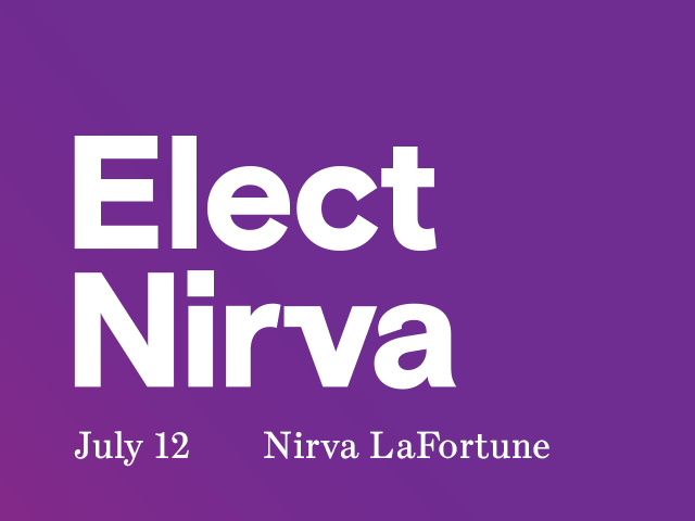
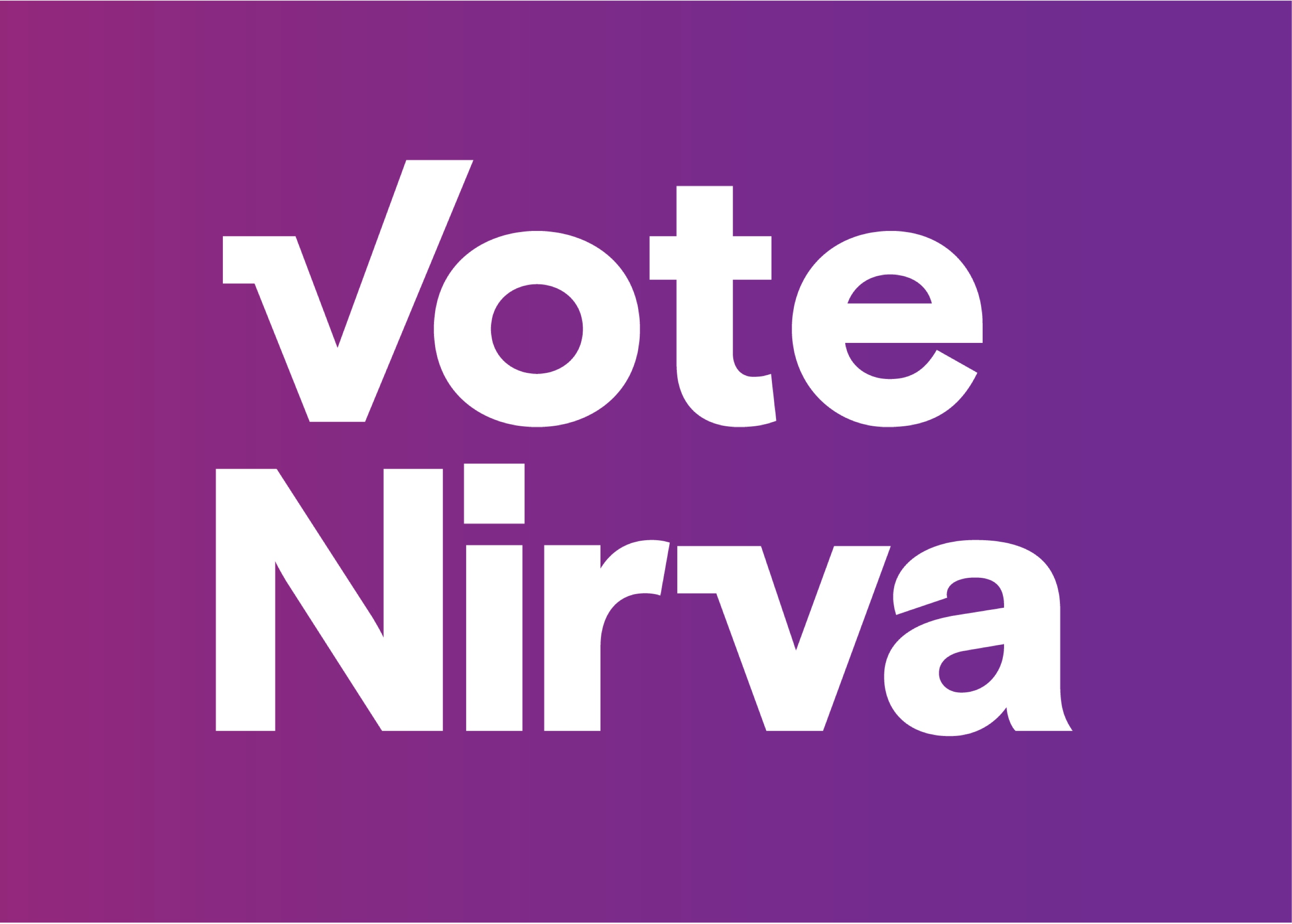
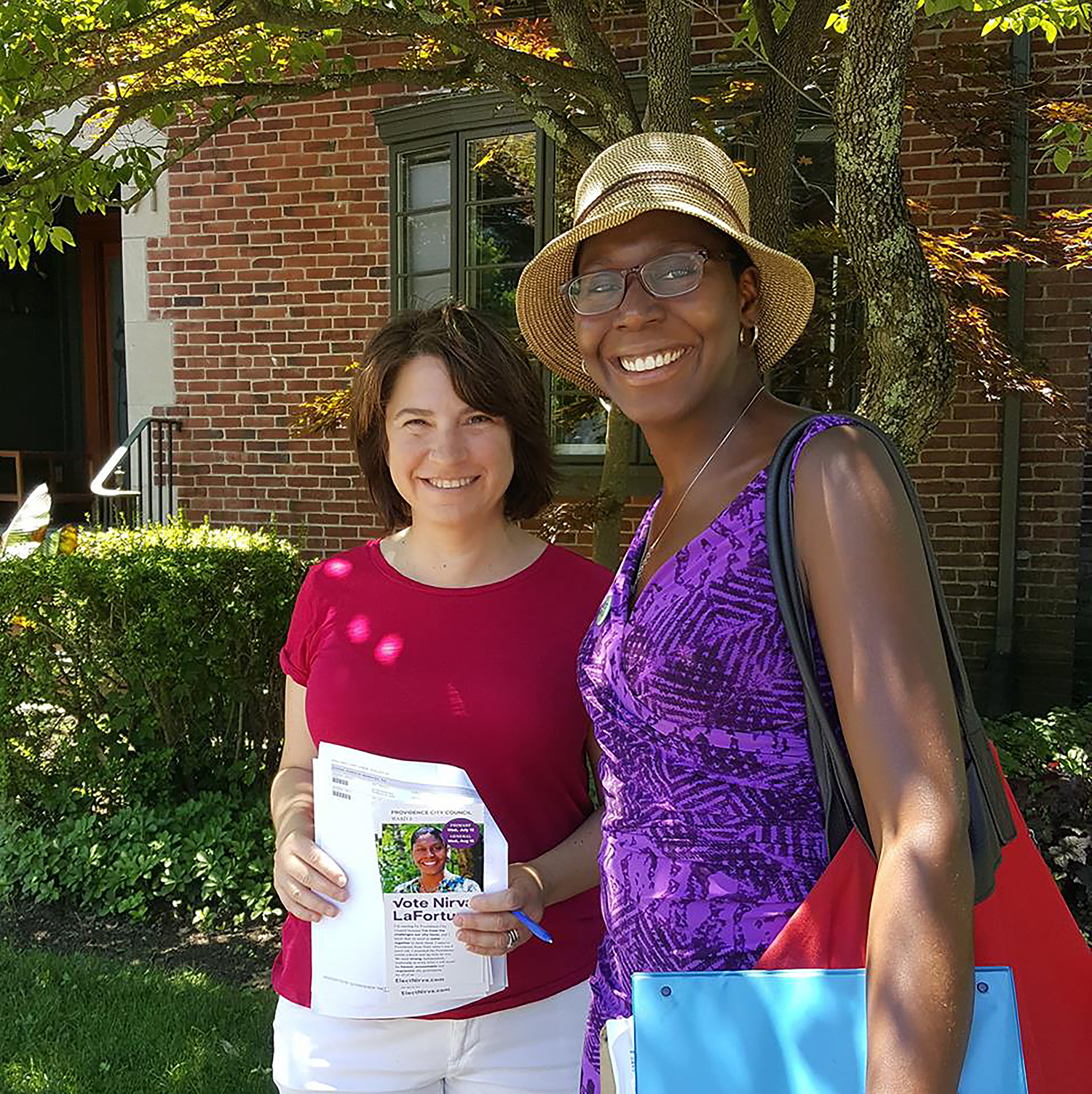
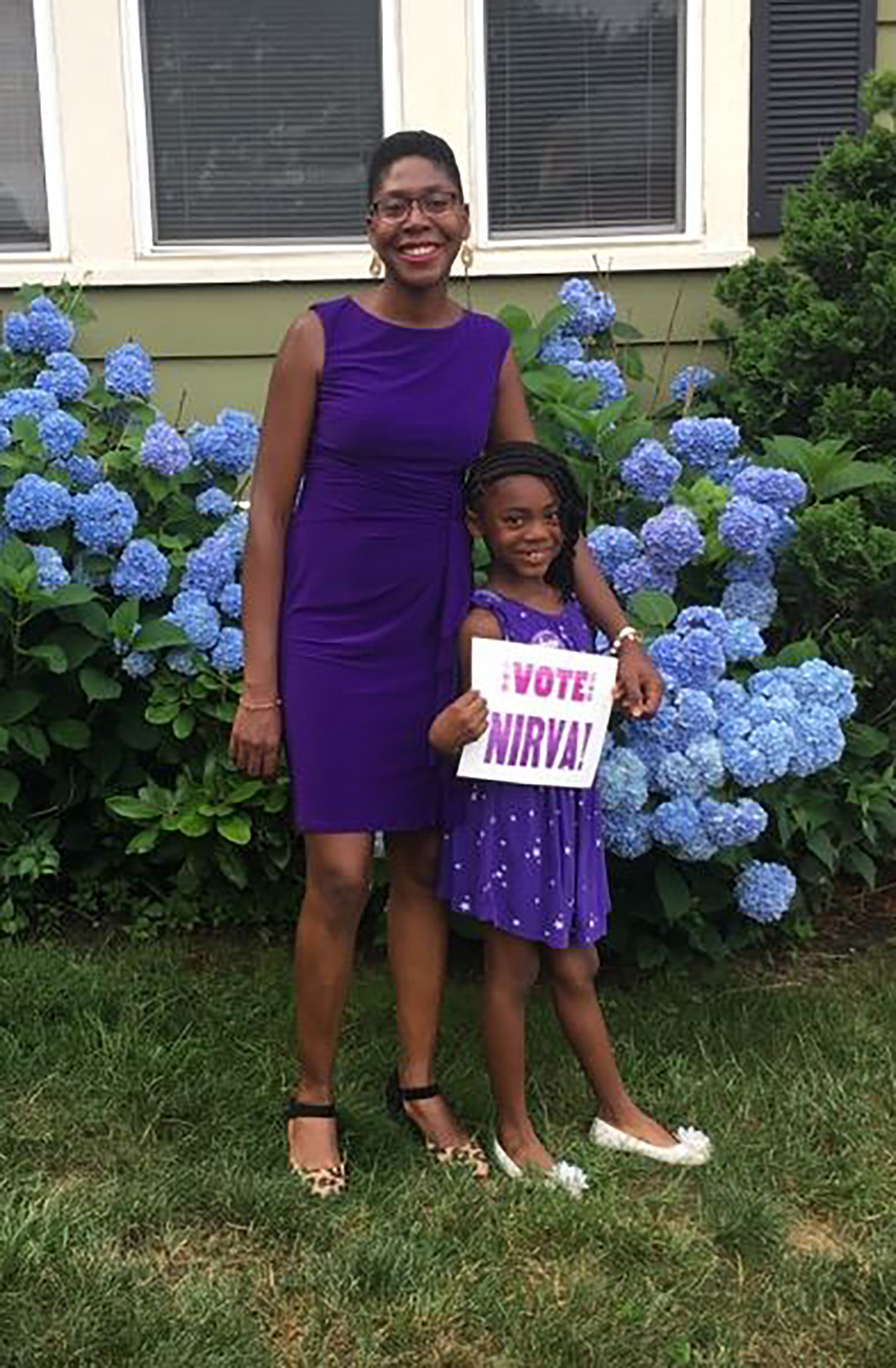
Nirva loves purple. It is a part of her everyday look. More than the typography, the color purple was identifiable with Nirva. People dressed in purple to support her, and even made their own signs in purple.


Typography & Mark
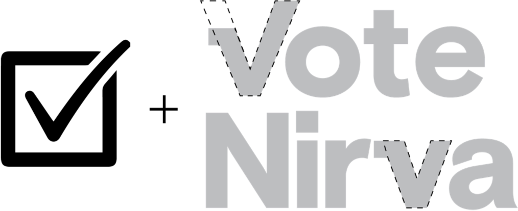
I will fight was a slogan she used often. It was important to have the typography be strong. The typeface is Basis Grotesque, a font I licensed previously for The Design Office. After choosing it for its punchy clean modernity, I noticed it had a checkmark in it. I adapted the mark so it would work as a capital “V” and for the lowercase “v” in Nirva. Given the purple, I didn’t mind getting a bit playful or overtly political with the checkmark.

Ephemera
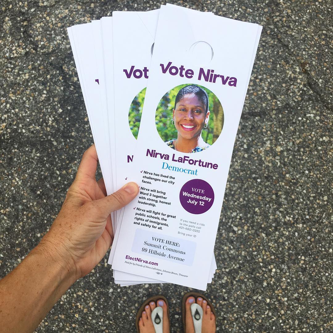
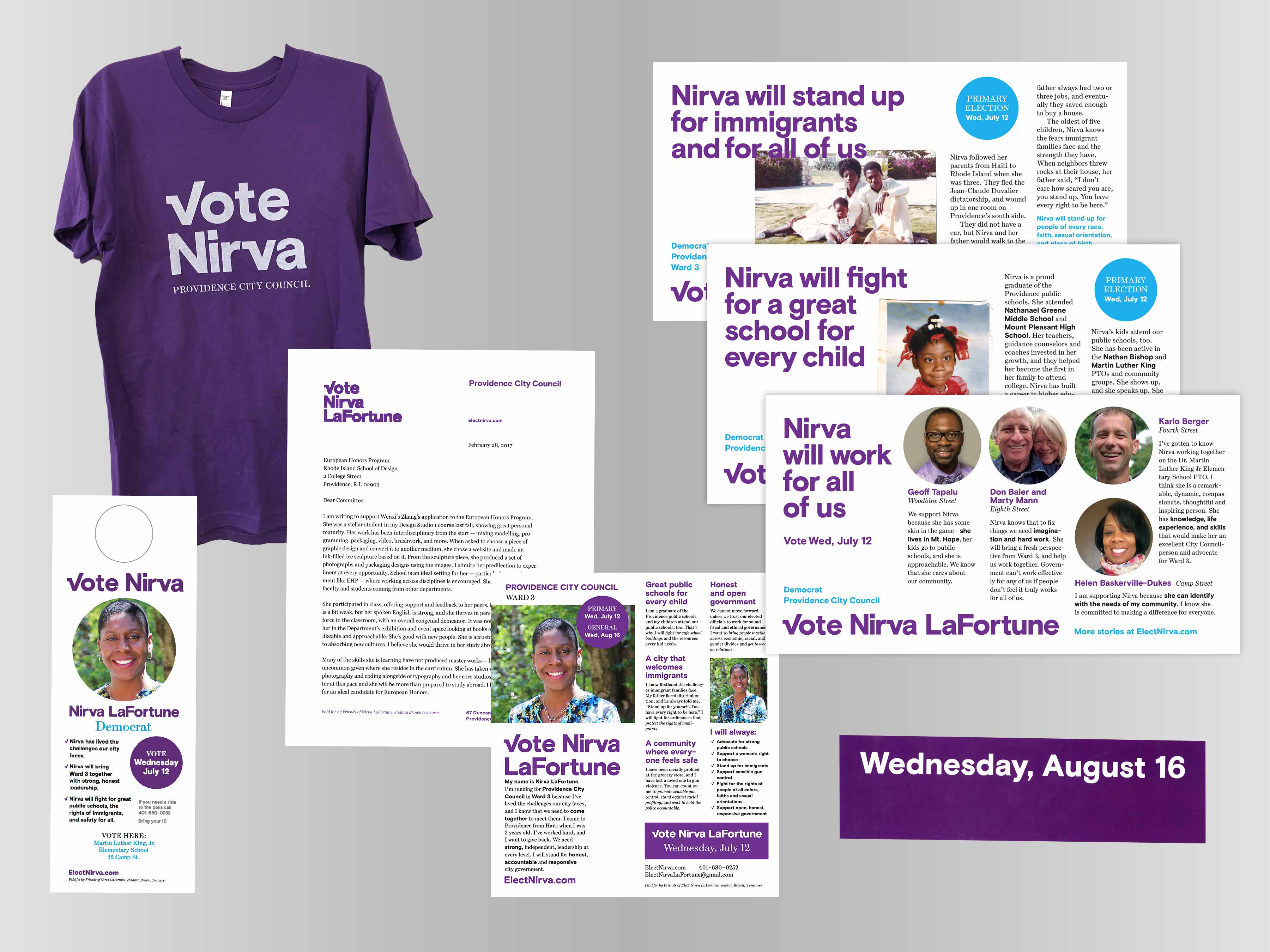
A lot of paper gets printed in a local election. Door hangers, mailers, letters, and more. I was not creating all of this, but would set up templates for key materials. The font and the purple were what could hold it together. We did not produce t-shirts, but we made one to see what it would look like.
Animated / Social
Animated slogans and the wordmark on purple were used on Facebook and Twitter. Facebook sharing was used quite often, particularly in the days before voting. I generated animated and static typographic treatments and put them in a folder for campaign staff to use when they wished.